Create a great mobile experience for your website today. Please.
People are fascinating with making mobile web sites. It's amazing that we're not impressed with the fact we carry tiny supercomputers in our pockets but we're amazed when a website looks decent on our phones.
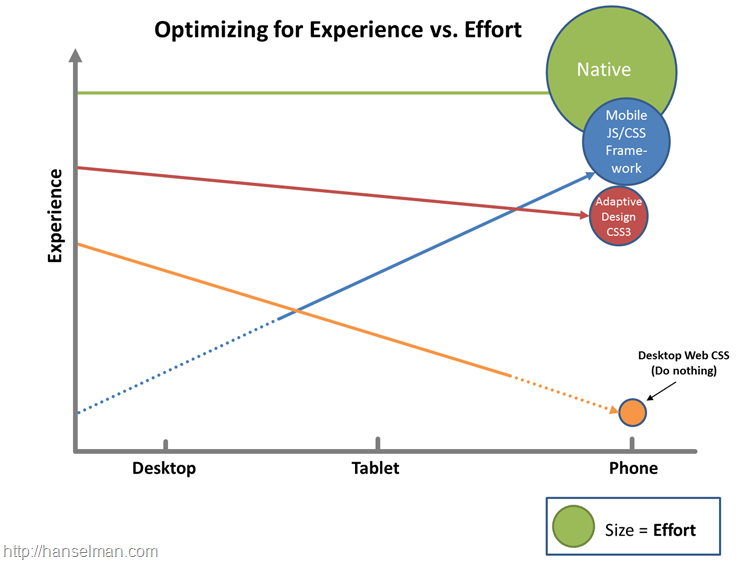
There's a few directions you can go when going mobile for your site, and the key is finding balance. You can:
- Do nothing. Your site will probably work on a mobile device but each day it will look worse and worse to a discerning public with increasing expectations.
- Use Adaptive/Responsive Design. This is my favorite option. If your site is read-mostly (rather than a data-entry application) you can get a great experience on all devices by adaptively rendering your site based on screen-size. If you're focused on performance you can add a server-side component and resize image for mobile as well. Visit http://mediaqueri.es for inspiration.
- Use a mobile framework. There's lots great frameworks like Sencha, Kendo, jQuery Mobile and others. These frameworks can get you near-native looking applications using HTML5 techniques.
- Write a native app. For the time-being while it's cool to try to get native experiences using non-native tools, it's hard. The best native experience on a mobile device will remain a native-built application. This requires the most work with arguably the best experience. However, you CAN get 90-95% of the experience with less than 90% of the effort if you use some of these other techniques. Plus, you'll anger fewer users by not forcing them to download a crappy mobile app by just making a lovely mobile website.
If you take a moment and visit my site (this site) on your phone, or just resize the browser to a smaller size, you'll see that this blog is using a "responsive design" by designer Jeremy Kratz. The blog will change it's look based on if it's on a large monitor, an iPad or medium tablet, or a narrow phone. Watch the navigation bar turn into a drop down as the browser gets really narrow, for example.
This was a relatively small - although thoughtful - change that instantly made my blog more accessible to the 8% of people who visit my site from a mobile device.
For larger data-focused sites, or sites that are "almost applications" you will want to consider a custom mobile version of your site. This is often done with the help of a mobile framework as mentioned above. I'll use jQuery Mobile as an example here. Let's say I have a conference browser application that looks like this on the desktop. I can navigate by date, speaker, tag, as well as view session details.
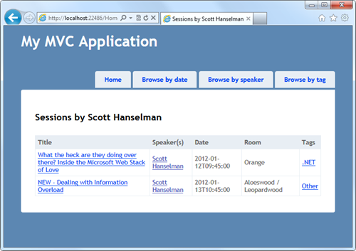
If I look at this same page on a mobile browser or something like the Electric Plum Mobile Simulator, it looks like crap.
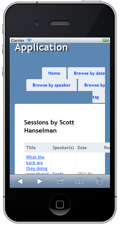
I could use a mobile custom stylesheet just for phones, or I could use a CSS3 media query to make my existing stylesheet more mobile friendly...for example:
@media only screen and (max-width: 1024px) and (max-height: 768px)
{
    /* do something, hide something, move something */
}
Or I could use a mobile framework along with a display mode in ASP.NET MVC to render a different view while still using the same controller logic. For example, I could have a _Layout.cshtml (that's like a "master page") and then a _Layout.Mobile.cshtml for mobile devices.
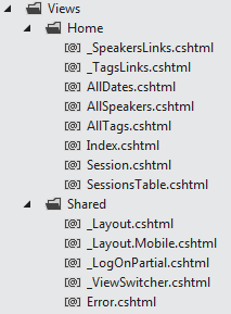
Mobile is just a included "display mode." You can create your own however you like. Here's one for Windows Phone. You could theoretically have ones like "tablet" or "nokia." I think you should have as few as you can get away with. Try to avoid complexity. This is just an example.
DisplayModeProvider.Instance.Modes.Insert(0, new DefaultDisplayMode("WP7") {
    ContextCondition = ctx => ctx.GetOverriddenUserAgent().Contains("Windows Phone OS")
});
That "WP7" string is what you put in place of * in filename.*.cshtml. So that's _Layout.WP7.cshtml, or Index.WP7.cshtml, etc. For my example I'll just make a _Layout.Mobile.cshtml that will automatically be used when most mobile browsers like Mobile Safari, Blackberry or Windows Phone hit my new site.
Here is a new _Layout.Mobile.cshtml as a starting point for my conference browser mobile site. Remember that you can just File | New Project in Visual Studio with ASP.NET MVC 4 and select Mobile Site to get started on your own.
<!DOCTYPE html>
<html>
    <head>
        <meta charset="utf-8" />
        <title>@ViewBag.Title</title>
        <meta name="viewport" content="width=device-width" />
        <link rel="stylesheet" href="@Url.Content("~/Content/jquery.mobile-1.0.min.css")" />
        <link rel="stylesheet" href="@Url.Content("~/Content/Site.Mobile.css")" />
        <script type="text/javascript" src="@Url.Content("~/Scripts/jquery-1.6.4.min.js")"></script>
        <script type="text/javascript">
            $(document).bind("mobileinit", function() {
                // jQuery Mobile's Ajax navigation does not work in all cases (e.g.,
                // when navigating from a mobile to a non-mobile page), especially when going back, hence disabling it.
                $.mobile.ajaxEnabled = false;
            });
        </script>
        <script type="text/javascript" src="@Url.Content("~/Scripts/jquery.mobile-1.0.min.js")"></script>
    </head>
<body>

    <div data-role="page" data-theme="a">
        @Html.Partial("_ViewSwitcher")

        <div data-role="header">
            <h1>@ViewBag.Title</h1>
        </div>

        <div data-role="content">
            @RenderSection("featured", false)
            @RenderBody()
        </div>

    </div>
    </body>
</html>
Now that I have a custom _Layout.mobile.cshtml for mobile, THIS file will be used when I hit the site on a mobile device rather than the main _Layout.cshtml.
OK, here my application is using the mobile layout, but the existing session HTML which looks, again, like crap. I'm using a mobile layout with a desktop view.
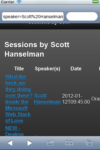
The desktop view for a session uses a table (and that's OK you tableless-CSS people because it's a table of information):
<table>
    <thead>
        <tr><th>Title</th><th>Speaker(s)</th><th>Date</th><th>Room</th><th>Tags</th></tr>
    </thead>
    <tbody>
        @foreach(var session in Model) {
            <tr>
                <td>@Html.ActionLink(session.Title, "Session", new { session.Code })</td>
                <td>@Html.Partial("_SpeakersLinks", session)</td>
                <td>@session.DateText</td>
                <td>@session.Room</td>
                <td>@Html.Partial("_TagsLinks", session)</td>
            </tr>
        }
    </tbody>
</table>
But I need a cleaner mobile layout that respects a smaller screen size. I'll copy my SessionsTable.cshtml and make a SessionsTable.Mobile.cshtml with contents like this:
@using ConferenceSessionsBrowserMvc4.Models
@model IEnumerable<Session>

<h2>@ViewBag.Title</h2>

<ul data-role="listview">
    @foreach(var session in Model) {
        <li>
            <a href="@Url.Action("Session", new { session.Code })">
                <h3>@session.Title</h3>
                <p><strong>@string.Join(", ", session.Speakers)</strong></p>
                <p>@session.DateText</p>
            </a>
        </li>
    }
</ul>
There are a few things to note in this HTML. First, I like that it's not littered with CSS that describes the look and feel of the site, but rather it uses the data- attributes from HTML5 to express the "role" of an element. The UL uses data-role="listview" that tells me it's a listview but doesn't dictate what it looks like.
Within the UL I've got some LIs that use standard semantic tags like A, H3, and P along with STRONG and along with the default theme it looks nice on mobile.
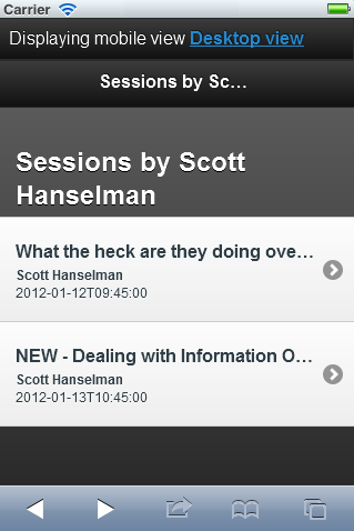
ASIDE: See the the "Displaying mobile view" link at the top of the image there? With ASP.NET MVC 4 you can make a View Switcher easily with a partial View like this:
@if (Request.Browser.IsMobileDevice && Request.HttpMethod == "GET")
{
    <div class="view-switcher ui-bar-a">
        @if (ViewContext.HttpContext.GetOverriddenBrowser().IsMobileDevice)
        {
            @: Displaying mobile view
            @Html.ActionLink("Desktop view", "SwitchView", "ViewSwitcher", new { mobile = false, returnUrl = Request.Url.PathAndQuery }, new { rel = "external" })
        }
        else
        {
            @: Displaying desktop view
            @Html.ActionLink("Mobile view", "SwitchView", "ViewSwitcher", new { mobile = true, returnUrl = Request.Url.PathAndQuery }, new { rel = "external" })
        }
    </div>
}
And a ViewSwitcherController to change the "overridden" browser when you click the link. This is all in the jQuery.Mobile.MVC NuGet package that we will update for the final release.
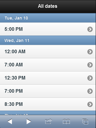
public class ViewSwitcherController : ControllerOK, back to the Dates view. I can apply the same data- jQuery Mobile techniques to other screens, like the list of dates. I've got a data-role="listview" and a data-role="list-divider" as the dates change.
{
public RedirectResult SwitchView(bool mobile, string returnUrl) {
if (Request.Browser.IsMobileDevice == mobile)
HttpContext.ClearOverriddenBrowser();
else
HttpContext.SetOverriddenBrowser(mobile ? BrowserOverride.Mobile : BrowserOverride.Desktop);
return Redirect(returnUrl);
}
}
@model IEnumerable<DateTime>

@{
    ViewBag.Title = "All dates";
    DateTime lastDay = default(DateTime);
}
<ul data-role="listview">
    @foreach(var date in Model) {
        if (date.Date != lastDay) {
            lastDay = date.Date;
        <li data-role="list-divider">@date.Date.ToString("ddd, MMM dd")</li>
        }
        <li>@Html.ActionLink(date.ToString("h:mm tt"), "SessionsByDate", new { date })</li>
    }
</ul>
And get a nice result like this:
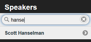
You can even get cool data filtering "as you type" features for jQuery Mobile list views by using data-filter="true" on a listview.
Because these templates are all mobile specific they don't affect the way the site looks on the desktop. Also because these are simply new views for existing URLs and Controllers, I don't need write any new business logic.
It is worth reminding you that it won't always be the case that an application will have its controllers and URLs map neatly such that one desktop view = one mobile view. Sometimes you may need to split up a complex single page desktop interaction into multiple mobile views. This conference application ended up with six views for desktop and six for mobile (Index, Dates, tags, Session(Detail), SessionsTable, and Speakers.) It's conceivable if the application included data entry that I would need to break up some views as well as create some custom methods just for mobile, although with some planning around User Experience you can usually keep this to a minimum.
If the default browser sniffing that decides what's mobile and what's not isn't enough for your project, consider using a 3rd party database of mobile devices like the one provided by 51degrees.mobi. Their 51degrees.mobi mobile framework will help your site adapt to support all mobile devices as they include a database of devices as well as their capabilities. They can even compress images and improve low-bandwidth performance.
They have a NuGet package I can install like this:
51Degrees and libraries like it will add new capabilities to the Request.Browser object. These are just a few examples, there's dozens.
Screen Width: <% =Request.Browser.ScreenPixelsWidth %></li>
Screen Height: <% =Request.Browser.ScreenPixelsHeight %></li>
LayoutEngine: <% =Request.Browser["LayoutEngine"] %></li>
AnimationTiming: <% =Request.Browser["AnimationTiming"] %></li>
BlobBuilder: <% =Request.Browser["BlobBuilder"] %></li>
CssBackground: <% =Request.Browser["CssBackground"] %></li>
CssBorderImage: <% =Request.Browser["CssBorderImage"] %></li>
CssCanvas: <% =Request.Browser["CssCanvas"] %></li>
CssColor: <% =Request.Browser["CssColor"] %></li>
CssColumn: <% =Request.Browser["CssColumn"] %></li>
CssFlexbox: <% =Request.Browser["CssFlexbox"] %></li>
CssFont: <% =Request.Browser["CssFont"] %></li>
CssMediaQueries: <% =Request.Browser["CssMediaQueries"] %></li>
You can use this information on the server side to augment these other techniques. For example, if the requesting device supports CssMediaQueries, great, you should use them, but it not, perhaps you need to fall back to another technique. If you know the screen-size on the server and it's below a certain size you can resize the image before you send it.
Thanks to Jon Galloway, Damian Edwards and Erik Porter for their brainstorming and Steve Sanderson for the sample application.
Sponsor: I want to thank my friends at DevExpress for sponsoring this week's feed. Do take a moment and check out a free trial of CodeRush, one of my favorite products! Introducing CodeRush by DevExpress. The Visual Studio add-in that helps you create more reliable applications. Tools to build & maintain your code without getting in the way of your IDE.
About Scott
Scott Hanselman is a former professor, former Chief Architect in finance, now speaker, consultant, father, diabetic, and Microsoft employee. He is a failed stand-up comic, a cornrower, and a book author.
About Newsletter
I wonder, if it is worth effort to create a custom set of *mobile* controllers (say, in "YourAppNamespace.Controllers.Mobile") that inherit your *core* desktop controllers and load mobile versions using a custom ControllerFactory. I mean, I see this is possible and *most likely* will make your controllers' code cleaner(i.e. no "if(mobile)" flags and no *mobile* routes), but not sure, if it is the *intended* way for handling different controller logic between mobile and desktop in ASP.NET MVC + brings a certain amount of similair code between desktop and mobile controllers(that may bring complications during modification).
Thanks,
Ivan
Also, they all try to look like iPhones, and designing a website to look like an iPhone app is like designing a pizzeria to look like a high-end clothing store. It just doesn't look right.
I am visiting your website through my Samsung Galaxy S 2 wih Android Gingerbread but it seems media queries doesnt work. It first load mobile optimized then changed to desktop view automatically.
It would be very nice if you could check into this problem as I like your blog even on my Android.
Thanks.
I would say that while Kendo is awesome, it is 100% completely useless in its lack of support for Windows Phone 7. If I am going to spend time writing an mobile interface with native chrome, etc. WHY would I use one that completely ignores a key (but lowly) player? Their "reasons" are just excuses. Compromise would be better than sulking. Really disappointed in Telerik for this.
Right now I am much more clear, and know what to do.
Thanks!
"The desktop view for a session uses a table (and that's OK you tableless-CSS people because it's a table of information)"
You call this a table of information because you made it look like a table, while actually it's a list of sessions. This becomes clear when you see the mobile view. In the mobile view you show it as a list, and it just makes sense. I think you should have a list in both mobile and desktop view (you could actually use one view) and just style it differently according to the device. The meaning of the information does not change depending on the device you are watching it on, so the markup should not change either.
Still, great article though!
http://channel9.msdn.com/events/BUILD/BUILD2011/TOOL-803T
great stuff in asp.net mvc 4
Now I've ICS on my GS2 and the blog looks great with the default browser.
So instead of adding a class to a ul to define how it looks, you add a data- attribute?
http://twitter.github.com/bootstrap/
A fully responsive HTML5 web framework - I suck at web design and it super easy to get started, and best of all all of the out-of-the-box components looks really great.
I highly recommend it.
We've got to do better than a small set of discrete categories. Beginners, like me, may find this Webmonkey article useful.
Mobility is just one of several attributes developers will have to deal with in The Coming Zombie Apocalypse and it's only loosely correlated with issues like screen size and resolution, interaction methods, sensor capabilities.
My focus is B2B/Enterprise, and tablet is the _primary_ target for my apps, replacing previously implemented laptop solutions. Whenever I see reference to 'mobile', I've come to realize that the author really just means 'phone'. This article is a great example. Search for 'mobile' and replace with 'phone' and all will be spot on. (Well, except for the chart.)
MVC's new approach to delivering mobile views would also be improved, IMHO, if 'phone' was used in the filename placeholder instead of 'mobile'. In time I expect 'mobile' to be replaced by 'phone' and 'tablet' (or we might just see 'tablet' added - I know, I can roll my own). On a related note, I think 'jQuery Mobile' could be more appropriately named, 'jQuery Phone'.
Just like your chart, I do see three distinct target platforms here.
Regarding the use of the term 'mobile' instead of 'phone', maybe the problem is really with me; I should just understand that tablets are not really mobile, and I need to take a breath and be patient while we all figure out how to address the tablet as a device.
Thanks again for all of your valuable contributions and for being a MUST READ.
The immediate issue is that the tablet, which is the most significant platform for many of us, falls through the cracks when you have a design based on two view silos labeled "plain" and "mobile." The larger issue is that we're confounding concerns that need to be separated.
The current crop of mobile devices has introduced a number of challenges including small physical size, small pixel counts, touch-based interfaces, and new sensor classes. These issues arrived together on the mobile phone, but they are largely independent of each other and, for the most part, have nothing to do with mobility. That's why I threw in the fridge, which I expect will have a small touch screen, and the Windows 8 conference table, which I expect will have a very large touch screen (and perhaps some brand new sensors and input methods, as well), although neither is mobile.
The biggest issue (and it's a really big one) that I see that's specifically related to mobility is designing for offline operation. Mobile connections aren't always on. That's OK, if you're using an online music app. It's not OK if you're using an application to get an important job done in the deserts of Arizona or the canyons of Manhattan.
Oddly, to me, intermittent connectivity is the one concern that's almost never mentioned in discussions of mobile design.
jQuery Mobile (and perhaps other frameworks, I'm just getting started with this) is attempting to address this issue and, revealingly, is being criticized for being too script and AJAX heavy. I don't have a lot of experience with jQM, as yet, but I suspect they're on the right track.
A robust mobile design isn't going to be realized by tacking "mobile" views onto an otherwise conventional design. It will begin with how data is delivered. In MVC parlance, "mobile first" will start with the Controller, not with the View.
Scott, given the scarcity of information on this aspect of mobile design, why don't you jump in and work your magic? I would love to see a blog post on design for intermittent connectivity.
Some people should be dragged into a dark deep pit and beaten to death with chunky archaic 1990's web development books.
Sorry to rain on the parade, but heavy sigh, deep depression.
Thanks,
Can you tell me how to create this mobile pages and also where to learn
Give me some examples
Obviously your blog is aimed at people with technical expertise. However, as I'm sure those not so experienced in the world of mobile web development may view your "few directions" as definitive. Of course, there are many companies such as Dudamobile, Ginwiz, Contentys, Zimbile, Heart Internet and, obviously our company, that offer simple to use, but relatively powerful, mobile website builders.
We've seen many small companies require mobile websites fairly quickly and don't have the management capacity to spec and commission full-featured websites and feel adding this type of solution should perhaps be included in your list of options.
Regards,
Lee
Any chance we can get some information on how the unordered list was turned into a dropdown list? There doesn't appear to be a very clear explanation of how that gets accomplished.
I see the data-role attribute, but I'm assuming there's a media query involved with the transformation. Or perhaps I'm just missing something because I'm not familiar with MVC.
Thanks,
Daniel Crane
TekProfesional
http://hanselman.com/blog/themes/Hanselman/scripts/convertListToSelect.js
Comments are closed.


