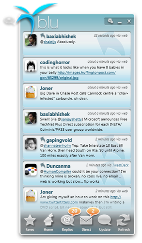
Hanselminutes Podcast 149 - Deconstructing "blu" - a new WPF Twitter client from thirteen23
 Scott talks to Doug Cook, Hal Saville, and Lee Brenner about their dramatic new Twitter client, called "blu" (formerly "chirp") with a jelly aesthetic you have to see to believe. How do they find developing in WPF? What's their workflow? What's coming for the next release of blu? Let's put the pressure on them to make it even better, eh?
- Download: MP3 Full Show #149
- Play in your browser.
Do also remember the complete archives are always up and they have PDF Transcripts, a little known feature that show up a few weeks after each show.
Telerik is our sponsor for this show!
Building quality software is never easy. It requires skills and imagination. We cannot promise to improve your skills, but when it comes to User Interface, we can provide the building blocks to take your application a step closer to your imagination. Explore the leading UI suites for ASP.NET and Windows Forms. Enjoy the versatility of our new-generation Reporting Tool. Dive into our online community. Visit www.telerik.com.
As I've said before this show comes to you with the audio expertise and stewardship of Carl Franklin. The name comes from Travis Illig, but the goal of the show is simple. Avoid wasting the listener's time. (and make the commute less boring)
Enjoy. Who knows what'll happen in the next show?
About Scott
Scott Hanselman is a former professor, former Chief Architect in finance, now speaker, consultant, father, diabetic, and Microsoft employee. He is a failed stand-up comic, a cornrower, and a book author.
About Newsletter
1. Can't resize the application. That's a WPF 101 failure.
2. No scrollbar. Even if the list is scrollable by other means (and in the "chirp" iteration, it fell down bad there), the scrollbar is still important for usability, as it's the only visual cue for where one is at in the list.
3. Keyboard support is lacking. blu does better than chirp in this respect, though there's still issues.
4. Focus isn't visually displayed. This is especially important when using the keyboard for input. It's surprising when the new keyboard support for scrolling in blu doesn't work, until you realize it's because the list isn't focused. Hard to know when the keyboard will work, when focus isn't visually displayed.
5. No shell icon.
These are fundamentals for any application (except 5), not specific features for a Twitter client that you could argue about whether or not they must exist, much less in a V1 release.
Myself, I think it's a fantastic effort and a great example of the future of Windows UX. It's obvious that a good deal of work has gone into it.
No, it's not perfect (multiple accounts please! :) but I'll certainly be keeping an eye on it.
Chris
Comments are closed.


The only problem is that I haven't figured out how to view replies, it has a button for direct messages but when I start it up after I have been a away I usually check if someone has replied.