Scott Hanselman

Hire and Pay a Designer and Be Happy

August 19, 2011 Comment on this post [76] Posted in Musings
Sponsored By

I got a haircut today. And I hired a designer to redo my blog theme. Both of these things put a pep in my step. I feel SO much better now.

I hear that there's supposed to be some kind of unicorn out there called a "devigner" that is both an amazing designer AND an amazing coder. I can only assume these mystery people are also pretty, well dressed, socially adept, and good at Halo. All I know is that I'm NOT that person.

When you meet a designer who really "gets" you, you've found a gem. I explained the feeling, the texture, the style, and the elements of what I wanted to designer Jeremy Kratz. Jeremy also designed Stack Overflow, in fact, although I only learned of that after I hired him. Isn't that an amazing coincidence? Funny how these things work out.

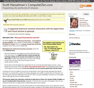
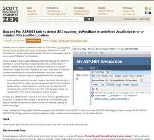
My old blog sucked     My new blog doesn't suck

Of course, if you are reading this post via RSS, you don't care and that's fine. If you are actually here on the site, you'll see that the new design has a light CSS media query and some specific widths and min-width's set to make the site look better on your mobile device or tablets, as well as low-resolution screens. Basically any browser that supports CSS media queries will have the right bar removed when resized to under 1024 pixels wide, while still looking pretty nice at sizes as small as about 700 wide.

Here's how you do a CSS media query. This is basic, certainly, but it's a clean way to get a good looking site on a large monitor, tablet, and most smart phones.

@media screen and (max-width:1024px)
{
#bars
{
padding-right: 0;
}

#mainbar
{
border-right: 0;
margin-right: 0;
padding-right: 0;
}
#sidebar
{
display: none;
}
}

There's a new navigation bar and search at the top with quick access to podcasts and videos both here and on Channel 9. Also check out the newly styled Calendar View if you want to see posts by month or year. There's also the ridiculous Archive of every post I've ever done by category. Comments are styled more cleanly and are easier to follow now as well. In the upper corner is the Feed, Twitter, Facebook, and Google+.

There's no way I could have done this. I'd been messing about here and there with my blog over the last few years trying to update it, remove some things, make it fresher. I was fooling myself into thinking that skills with CSS were design skills. I was fooling myself that having good taste and style meant I could design myself out of a web paper sack. Just because you like nice shoes doesn't mean you'd make a good shoe designer.

I was even thinking I'd have to move off of DasBlog onto something like WordPress. I wasn't sure if DasBlog (which is pretty long in the tooth right now) could handle it. The thing is, though, that this has been a pretty high traffic few weeks and DasBlog has pushed a million page views on this single little box since the first if July. It has survived two Slashdottings, a FireBalling, and being on the home page of HackerNews three times in that period. At the same time, I've watched sad little WordPress blogs get decimated when they got similar traffic, tipping over easily.

The fact is, I like DasBlog. It's got no database, it's fast as hell, and it's more flexible than I give it credit for. I was thrilled that Jeremy was able to create a new DasBlog-specific theme and I was able to drop it in and get it working in 5 minutes. I'm still tinkering here and there, but it's done and it's lovely.

This new site design looks great in every awesome browser like Opera, IE9, Chrome, FireFox, and even all the way back to IE7. It looks like a steaming pile of ass in IE6. As it should.

Coincidentally there's new other designs coming on some sites that I'm either directly involved in or orbiting in an advisory capacity, so expect to see some dramatic changes on sites like http://www.asp.net and mini-sites like http://microsoft.com/net over the next few days and weeks.

Thanks, Dear Reader. Now, go hug your friendly neighborhood designer. They are better at this than you.

About Scott

Scott Hanselman is a former professor, former Chief Architect in finance, now speaker, consultant, father, diabetic, and Microsoft employee. He is a failed stand-up comic, a cornrower, and a book author.

facebook bluesky subscribe
About   Newsletter
Hosting By
Hosted on Linux using .NET in an Azure App Service
August 19, 2011 13:38
WOW that's a beautiful design ... +10 to design
August 19, 2011 13:41
Much better, let's hope your hairdresser/barber was as good as your designer. :)
August 19, 2011 13:44
Wow, what a lift from your previous design (which frankly looked like it was from 1990). There's only one thing i would change, and that's the font color. It's a little to light now, #333333 is, in my opinion, much better.
August 19, 2011 13:44
The new design looks great, however I'm not sure about the huge blob of links at the top of the archive page. Also, your calendar seems to think I'm French! I'm in the UK and passing "en-GB" in the request headers, so how is the wrong language being selected? Maybe IP address? (this happens on all browsers)
August 19, 2011 13:46
Much better alright.

I never bothered to comment on the (cough)crappy(cough) layout before (is that ever useful?), but I'll take the time to applaud the change instead !

Nice touch (with the info) about the media query.

Cheers
August 19, 2011 13:49
Site looks great Scott. I didn't realize that the old design was lacking until I saw the new one. Don't ever pretend to be an Accountant, a Lawyer or Web Designer I suppose.
August 19, 2011 13:52
Just WOW. This looks so much better.

I am a big Asp.Net fan for a very long time now. The www.asp.net Website is maybe one of the ugliest pages out there, no harm intended, and it surely could use a re-design ;)

I can't wait to see it.
August 19, 2011 13:58
Neat and beautiful design! Good job!
August 19, 2011 14:05
Dude, site look great now but PLEASE use something, anything to enlarge images.

Lightbox, fancybox, (any) box :D
http://fancybox.net/
Just dont redirect me every time I click on image.
BB
August 19, 2011 14:12
Cool new design it gave me a shock. Couple of small suggestions though:

You have a comments link at the top and bottom of each article which is good. But the top one is in orange with black mouseover. Where as the bottom one Black with orange mouseover. I honestly didn't notice it at first just with a quick visual scan. I would say the bottom one is used more because you will generally read the post and then click through to the comments so it should be highlighted.

Also change your save comments button to match the style.

August 19, 2011 14:12
Great theme, clean like razor view engine in ASP.NET MVC, I can now find content(s) with ease.

-Shahnawaz
August 19, 2011 14:28
Love the new design, inspired by Metro?
August 19, 2011 14:51
Looks good mango with Windows phone 7, except for oversized li element... Way oversized.
August 19, 2011 14:59
Very, very nice! I honestly hated the old design and tried to stick to reading the RSS while for most blogs I usually click through to read the article :) Also, I'd like to second the color: #333333 suggestion. I tried it with FireBug and it's much easier on the eyes. http://contrastrebellion.com/ !! :)
Obi
August 19, 2011 15:13
This is an improvement. It is clean, light, inviting... Contemporary.
August 19, 2011 15:41
The design is extremely beautiful and minimalistic. Really worth visiting than the cluttered design before.
August 19, 2011 15:42
I love it! I laughed aloud at your unicorn explanation; I read it to my girlfriend and she exclaimed, "That's you!" I'm OK at Halo.

I think I'm average at design, enough to handle creating and managing my own sites. I know my limits and I know what I don't know and I know I'd hire a professional designer if I was serious about making my sites as sexy as can be. I am in the process of revamping my latest site to have media queries and support mobile devices better.
August 19, 2011 15:43
Not usable on iPad. When page is zoomed text goes out of the screen horizontally.
August 19, 2011 15:52
Did you think of implementing http://www.modernizr.com/ for dynamic display generation?

THis theme is in terms of colors and UI elements definitely on par with google's current lean-and-clean designs efforts.....if not even perhaps inspired by it.
August 19, 2011 15:59
I third for a darker text color. Although I mainly read via RSS so it won't affect me much.
August 19, 2011 16:06
Nice design, was worth to pay. I agree with some comments here, that text could be "a bit" darker.
gs
August 19, 2011 16:15
Simple and clearn design. I like the style.
August 19, 2011 16:37
Like partario above, the calendar isn't sending me the right culture. It thinks I'd like Spanish, even though I'm in Missouri. Otherwise, looking great.
August 19, 2011 16:38
Just a minor proof read correction, I think "socially adapt" may have been intended to be "socially adept".

However, on the design front - good work on getting in a pro.

I can do some plumbing, just about - but it is so much better if I get in a plumber and not only does it all look better than what I would have done, it lasts longer too!
August 19, 2011 16:49
Actually, a huge fan of the new design and I read both the site and it over RSS. Also, nice logo.
August 19, 2011 16:58
As a designer is always nice to hear this kind of recognition. Especially when it come from folks as respectable as you.

It's good to see the recognition that design is not only to make something look good, but also make easy and compelling experiences, focused on people.

Congratulations to you and Jeremy Kratz for the new design. It looks amazing and it's responsive, as every website should be nowadays.
August 19, 2011 17:01
Now I think you should help Phil Haack to change default asp mvc template )

ps Nice design, easier to read etc.
August 19, 2011 17:09
Looks great. I agree with the call for slightly darker text. Also I think the header takes up a bit more than its pay grade worth of vertical screen real estate.

Now if you could just get your designer to poke his head into Eric Lippert's cube... :)
August 19, 2011 17:20
Love it. Congrats!
August 19, 2011 17:21
I've been an advocate of this approach for many years. I too am in the "rubbish at design" camp. I do, however, have about 16 friends who are top notch designers, and one who is a "Devigner". I tend to pay them for their work, rather than ask them to do things for free, for the simple reason that it's most certainly worth it... I'm terrible at anything even slightly UI or design related. I can ruin a perfectly good photoshop design by putting it in to HTML... because I don't really focus on the user experience... I focus on making my c# work like a sexy, lubed up machine :)

I'm in the middle of my first personal MVC project at the moment, and I've been really struggling with design. I paid one designer to design the site, and another one to cut it up in to modern html and css (I get it, I just struggle to care that much about how a site looks ;)). I must say £275 later (bargain!) it's looking extremely sweet! It's just a shame I've had no time in the past 6 months to actually work on it!
August 19, 2011 17:21
Excellent job. I must say: Way better than before.

I've been meaning to do a makeover on my blog since forever, but never find the time to do it. Now, seeing this and after listening to the latest "This Developer's Live" about Taste, I decided to do it at once.
August 19, 2011 17:34
I 'third' the MonthView rendering issues. I am seeing fr-CA (or fr-FR, not sure) even though my browsers are set to en-CA.
August 19, 2011 17:37
Did you place clippy in the first screenshot on purpose to show how much of an improvement the new layout is? :P
August 19, 2011 18:03
I'm glad everyone seems to be happy so far; no rage yet!
August 19, 2011 18:24
Kudos to Jeremy for the slick new design! Funny because I've been messing around with designs with a similar color scheme and "feel" lately...I guess great minds think alike. ;) And thank YOU for bringing up the "devigner"...you just made my day! I'm struggling on the path to becoming exactly that, and it's definitely not easy. Also, I'm trying really my very best to be all of those other things you listed, minus the Halo part. Maybe Little Big Planet instead. :)
August 19, 2011 18:28
Like the new design, very well done. I especially like your new profile picture!
August 19, 2011 18:42
I'll chime in with an nth request for a darker fron color. It took me about 2 seconds to decide on that.

But overall I like the redesign. My main fear about designers is that the page design will come back with all lower case headings and a view that it is better. You have clearly done much, much better with Jeremy.
August 19, 2011 19:05
I was fooling myself into thinking that skills with CSS were design skills.


That's some profound shit right there, excellent point and the cause for some introspection on my part...
August 19, 2011 19:29
No Sir, I beg to differ, since it is your personal blog not your primary source of income, you better design it yourself unless you are afraid of angle brackets and I can bet with the new CSS3 features you can really deliver a nice looking professional blog without even touching any image editing software.
August 19, 2011 19:48
Much better! I am much less likely to send you CSS changes this time :-)

So you can appreciate Jeremy even more, the improvements he made that folks connect with are not primarily color -- they are alignment, visual hierarchy, consistency, balance, appropriate whitespace. The colors rock too, though.

These are principles that any developer can learn and apply. They're not voodoo. But don't tell my team, because I prefer they be kept in the dark.
August 19, 2011 19:52
"I am a failed stand-up comic, cornrower, and book author."


Perhaps you meant "I am a cornrower, book author, and failed stand-up comic." or perhaps "I am a failed stand-up comic, a cornrower, and a book author."?

Developers aren't English teachers either, but I have a lot of them in my family!
August 19, 2011 20:15
Hey Scott, I know I tweeted that I wasn't sure about the new design last night. After playing with it more, I have to say I really like it. I did notice the improved mobile view and that was much appreciated. Now I can get my Computer Zen on while away from my computer too!
One thing I would note, and I see others say the same, is the blob of links at the top of the "Posts by Category". The links underneath are top-notch, but to jump to a section I find myself hitting Ctrl+F a lot.

Overall it's a really nice update to an already awesome blog. :)
August 19, 2011 20:43
I like the redesign a lot, great improvement! Excellent choice to hire a designer.

One thing what I found to have a heavy ScottHanselman™®© feeling on it was the previous font; Segoe UI. Especially since you use a lot of bold and italic to emphasize parts in your text, something Segoe UI does very beautiful, clear and in its own characteristic way, in my opinion.
August 19, 2011 21:33
You made a typo. "Funny out these things work out" should probably be "Funny how these things work out"
August 19, 2011 21:47
Jeremy updated:

* Body text is now #333 for better contrast
* Changed the post footer comment link to orange for consistency
* Made the post comment button match the search button style

Thanks everyone!
August 19, 2011 22:23
Saw this magnificent changes last night. This is awesome.
August 19, 2011 22:24
Really nice design. Hiring designer is much better way then design somethink by developer. Every pro should do what they do best.
August 19, 2011 22:27
Hey Scott, the new site is gorgeous! It even makes me want to read it on site over Google reader. The navigation bar is a huge improvement and everything else just feels very good to look at. One suggestion I have, On the home page, it would be very useful to have just little previews of the post, not the whole thing. This makes navigating through pages very easy, specially when looking for a recent (or not so recent). My 2 cents.
August 19, 2011 23:00
http://www.hanselman.com/blog/monthview.aspx does not return any results.
August 19, 2011 23:08
Looks like Channel 9 now :) but very cool indeed.
August 19, 2011 23:28
Looks really great!
Some design changes are not good, like Lifehacker, with the new deisgn I went from checking several times a day to maybe once a week, or DotNetKick (where the design looks like a travel agency from 1972) where I completely turned over to DotNetShoutout. Your site is not in the risc zone.
August 19, 2011 23:38
My likey. I am also in the category of can't design, but sometimes think I can.
August 19, 2011 23:40
Great work! Simple and elegant!
August 20, 2011 0:23
BB - I added FancyBox. Comments on image links now?
August 20, 2011 1:26
Scott, you need a link to the archive on the nav bar, and in the archive, I would like to see them listed in chrono order.

Thanks.
August 20, 2011 1:27
That's chrono DESC
August 20, 2011 2:37
I think that you broke the standard links with FancyBox
August 20, 2011 3:18
Can you refer Jeremy Kratz to Eric Lippert's Fabulous Adventures In Coding?
August 20, 2011 4:08
Love the new design, it looks great!
August 20, 2011 4:33
Kudos Mate! I feel like the new design allows the blog to breathe and really highlights your body of work. The new photo is really cool too - it's dynamic. Feels like we're at one of your talks. Like you're a coding Emeril Lagasse and you just sprinkled some oregano on some ASP.Net MVC (BAM!).

I hear that there's supposed to be some kind of unicorn out there called a "devigner" that is both an amazing designer AND an amazing coder.


HA! I nearly spilled my tea when I read that. Make no mistake, the elusive "devigner" is indeed elusive. I call them Sweepers: http://techoctave.com/c7/posts/35-designer-developer-sweeper
TVD
August 20, 2011 6:20
Devigners are too busy hanging out with The Most Interesting Man in the World to work on anyone's blog.

A devigner once tuned up his mother's computer. Now they call that computer Watson.

A devigner proved that P != NP but didn't have enough space in the margin for the whole proof.
August 20, 2011 10:38
Scott,

Good one on changing the text colour.

On the iPhone the right column is dropping as you expect. However the text is ridiculously small and unreadable without zooming making the scrolling unbearable.

This wouldn't be a big deal if your RSS feed worked with MobileRSS. With your RSS feed MobileRSS feed only displays your disclaimer. I follow about 30 blogs and there are only 2-3 other feeds that have a similar problem. Anything I can do to help resolve this issue?

Regards,
Tim
August 20, 2011 11:14
Thanks scott. Nice site design. Really exting about http://www.microsoft.com/net/.
August 20, 2011 18:21
Here is a good place for developers to become devsigners: http://www.microsoft.com/design/toolbox/school/
August 21, 2011 3:34
Great new design, Scott!
August 22, 2011 4:20
When you re-do the asp.net website, I really hope you actually support Opera browser, otherwise it's a waste of time.
August 22, 2011 6:41
On your before/after shots you conveniently leave out the right sidebar full of ads in the after shot, which improves the look significantly. The new look is a big improvement but this seems a little disingenuous.
August 22, 2011 13:19
Hi Scott, I just scrolled over a couple of your images in previous posts, and found that they all have a colored (transparent) background. For some images this looks okay, but for some it looks wrong as the color should be white. Maybe a default background color for images would be a quick fix, or just update all your previous screenshots. Or, just ignore this comment... ;-)
August 22, 2011 15:03
Scott, well done, it seems you have pulled off something quite rare here. Every time a major website gets a redesign you normally see a flood of I hate it comments but your feedback seems to be mostly positive/constructive!

One little thing, I see it has been mentioned by a few people; I checked out the month view thing and I am seeing it in Russian in FF5 and my computer is en-GB.
August 22, 2011 20:48
Martin - Ah, that's not "convenient," sorry, it's automatic. My mistake. The ads disappear when you resize the browser below 1024. Thanks for catching that!

rtpHarry - Try again with a clear cache? Should be forced to English now on that page.

Bart - Example? How far back? Colored is the opposite of transparent so I'm confused.
August 23, 2011 6:18
Please ignore my previous comment on the color issue, turns out my monitor at work was not properly calibrated. DOH!
August 23, 2011 13:23
Hi everybody else !!! The blog was totally fantastic! you all do such a fantastic job at such Concepts..., for one appreciate all you do!
August 23, 2011 15:08
RE: BB - I added FancyBox. Comments on image links now?

Now It's perfect ;)
August 24, 2011 7:47
Nice design. Looks great.
August 25, 2011 7:28
I dont even know how I ended up here, but I thought this post was good. I dont know who you are but certainly you are going to a famous blogger if you arent already Cheers!
September 17, 2012 21:26
I love the redesign. Do you have any tips for finding a good designer? Where to look if you don't know any yet? Preferably something a little more scientific than asking everyone at your local Starbucks. Thanks.

Comments are closed.

Disclaimer: The opinions expressed herein are my own personal opinions and do not represent my employer's view in any way.