Scott Hanselman

Installing Helvetica Neue Fonts with Google Chrome on Windows considered harmful

April 18, 2013 Comment on this post [36] Posted in Bugs
Sponsored By

A few days ago, I visited the Xamarin.com website and noticed this. The word "Pricing" looks like "Prioing."

The C looks like an O in Chrome

It's not an illusion. It looks wrong in Google Chrome. See this zoomed-in shot.

The C looks like an O in Chrome

Here's the same menu in IE. Note the subtle"bites" that have been taken out of the g and s, but the c is OK. The hinting is OK, but the font is somehow "wrong."

It looks OK, if a little choppy in IE

I emailed support@xamarin, and mentally blamed Google Chrome as it's well know they've been having trouble with their Web Font rendering of late. In fact, Jin Yang (@jzy) had to abandon Montserrat, our Web Font of choice, for a more conservative one whilst doing the Hanselman.com redesign due to Google Chrome's poor font rendering on Windows. (It's lovely on Mac.)

I also happened to be at the Xamarin Evolve conference this week, so I mentioned it to the team down there, thinking they could pick another font.

Fast forward, and I'm on the plane, checking my email with Gmail Offline (the HTML5 offline version of Gmail) and noticed this.

These fonts look like crap too!
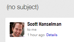
Helvetica Neue has messed up my Gmail Offline

What's going on here? What's changed? Doesn't it seem like "What's changed?" is the question we engineer-types ask the most?

Well, what's changed is that I gave a talk at Xamarin Evolve this week, and in preparation, installed Helvetica Neue. It's a lovely font and I think it worked nicely for my talk and looked great in PowerPoint.
Helvetica Neue is a nice font for presentations

However, Helvetica is super common font that is mentioned in Stylesheets - often explicitly when CSS is designed on a Mac - and Arial on Windows usually steps in as the replacement on Windows.

The Helvetica Neue font that I installed for my presentation is very poorly hinted (if at all) at small sizes like the one's being used. It's just not a Web Font, and while it's great for the giant sizes I needed for my talk, it's lousy for the web.

Both  IE and Chrome were picking up that my system had a Helvetica available on the system and used it instead. The Stylesheet said "hey, gimme Helvetica" and the browser said "Cool, here's one."

While it's obvious it would have major effects in retrospect, I had never realized that a machine-wide "common" font installation like this could mess up font rendering in my browser. I think the best solution (even though I'm deleting Helvetica Neue) would be to use an explicit Web Font in your stylesheets when possible rather than relying on a system font like Helvetica, even though they are the ultimate fallback. Any designers want to  weigh-in the comments?

Here's Chrome now on Windows with Helvetica Neue removed:

Chrome on Windows looks nice

And IE

IE on Windows looks nice

I hope this post helps someone who might bump into this font issue. My sincerely apologies to the lovely Xamarin employees who took my "bug" seriously! Thanks to Damian Guard for his Font insight!

About Scott

Scott Hanselman is a former professor, former Chief Architect in finance, now speaker, consultant, father, diabetic, and Microsoft employee. He is a failed stand-up comic, a cornrower, and a book author.

facebook twitter subscribe
About   Newsletter
Hosting By
Hosted in an Azure App Service
April 18, 2013 3:22
I have experienced similar issues; see here and here for example.

You might also want to check out (or chime-in) this issue and this issue.
April 18, 2013 3:25
It's because you use Helvetica Neue wich is meant for print not for web display. Go buy yourself a Helvetica font that is actually meant for web - Neue Haas Grotesk. This is Helvetica done right for web ;)
April 18, 2013 3:25
No problem, now we don't have to come up with another word for Pricing!
April 18, 2013 3:29
Sander - Ah! Excellent explanation, although this wasn't obvious to me. I was assuming fonts are fonts. Certainly not intuitive! Is "Neue Haas Grotesk" a lot better than the default?
April 18, 2013 3:33
I had noticed that sites like IGN and other really common sites had looked really funky. Once I removed Helvetica Neue, everything was back to normal! Glad you figured it out.
April 18, 2013 3:43
I had the same problem the other week. We ended up setting Arial as the default font and having Helvetica Neue as the fallback. I just assumed it was because whoever designed Helvetica Neue was a Mac user and didn't bother to test on Windows.
April 18, 2013 4:01
On Windows and Linux fonts need to be hinted for on-screen to look good. Sounds like Helvetica Neu is not.

Mac pretty much ignores most of the hinting so doesn't suffer this problem.

[)amien
April 18, 2013 4:59
"Doesn't it seem like "What's changed?" is the question we engineer-types ask the most?"

Amen brother.
April 18, 2013 5:15
What will really blow your mind is that you can specify plain old "Helvetica" and still get "Arial" thanks to some obscure font substitution dating back to the 90s ... http://blogs.msdn.com/b/michkap/archive/2005/03/20/399322.aspx
April 18, 2013 5:38
Hah - this reminds me of a bug I had a customer report a few months back.

He had installed Helvetica (regular, not Neue) on Windows 7 and was using IE9. Our stylesheet's font stack was "Helvetica, Arial, sans serif", so his system was also defaulting to his local Helvetica font. For some crazy reason IE9 simply wouldn't render the input fields on the site's login page. It's like they weren't even on the page.

Took forever to track this down and reproduce, but it did come down to the locally-installed font; removing it caused the inputs to immediately reappear. So we added an IE-specific stylesheet rule that swapped the font stack to "Arial, Helvetica, sans-serif" and all was well.

Maybe we should all just use Open Sans from now on...
April 18, 2013 6:26
I ran into this exact problem on my work PC last year. I had to install Helvetica Neue in order to use it in an ASP.NET application that needed to generate some dynamic PDFs that used the font. Not long after this I noticed a lot of web sites started to look terrible. It took me a while to realize what the problem was. It seems to me that designers need to do a little bit of browser and OS testing on their designs just like us developers do on a daily basis.
April 18, 2013 7:15
Font experience with Chrome has always been like this for me. Fonts rendered in Firefox and IE looks much more clear and smooth than Chrome.

Open Sans and Roboto are the only way to go :-)
April 18, 2013 8:14
Jeremy - I'm Open Sans here and it's apparently got issues on Chrome 27 beta. Chrome needs to fix this.
April 18, 2013 8:59
Okay, I really wish that people wanting the most appropriate sans-serif font in web browsers would just use font-family:sans-serif;

In Windows browsers, you get Arial, on OSX you get Helvetica, on Android you get Droid Sans, etc... Very similar fonts that look great on their intended devices. Helvetica/Arial/Sans etc are set as the respective "sans-serif" default in most browsers on their respective platforms... leave it that way.

/rant
April 18, 2013 10:47
@Michael: +1
April 18, 2013 11:40
Michael - are you saying it's not OK to want a specific font or aim for a certain use of typography?
April 18, 2013 20:19
It's just not a Web Font, and it's while it's great for the giant sizes I needed for my talk, it's lousy for the web.

One word too many I think. Fun article though.
April 19, 2013 0:16
Eek! Thanks, Clayton.
April 19, 2013 0:45
I was just going to mention the FontSubstitutes registry entry. I've used that for years to rid myself of stubborn fonts after turning on ClearType.

To answer your question Scott, if you care, then really care:

Arial, Helvetica, Droid Sans, etc., etc., etc.

If you don't care that much:

sans-serif
April 19, 2013 2:32
For years, I've always relied on the 8 Definitive Font Stacks post on SitePoint. I really like how each stack degrades font-family in a predictable order: "exact font, nearest alternative, platform-wide alternative(s), universal (cross-platform) choice(s), generic".
April 20, 2013 21:00
Hi Scott
There is a solution for Chrome that doesn't require you to uninstall the font.

http://thomaslittle.tumblr.com/post/13973246295/chrome-helvetica-bug-fix-for-windows-7
April 23, 2013 20:31
This problem haunts me daily and I've decided to blame the web developers/designers who work on Macs. Helvetica Neue is not a web safe font and they shouldn't be using it. It's another example of designers on Macs not thinking about their users best interests - like when they use completely unreadable light grey fonts on slightly lighter grey backgrounds.
May 03, 2013 21:32
I had enough with the Helvetica Neue font family - windows 7, and prior will not let you delete the font from the font manager.

The reason is the fonts are loaded into memory as part of the post boot sequence.

Here is what I did and solved it.

1) start windows in safe mode -> command prompt -> admin account
2) cd over to the ( >cd %windir%\fonts ) or if you have a default install (99% of the world >cd c:\windows\fonts\)
3) del "Helvetica Neue..." whatever fonts you want to remove


FIXED. More details are on the blogs site of mapjects.com
May 06, 2013 4:58
Vedran, thank you!
May 24, 2013 0:24
Thanks Vedran, that worked!
http://thomaslittle.tumblr.com/post/13973246295/chrome-helvetica-bug-fix-for-windows-7
June 10, 2013 19:46
I was experiencing the same thing. I use the Tumblr website and the default font is Helvetica Neue, and it looks SO BAD at that small of a size. I literally had to put my browser to 150% the read anything.
June 24, 2013 11:49
I been troubled reading 'c' as 'o' on my chrome for sometime now, kept fiddling with chrome font setting with no luck.

I have lot of fonts on my PC and need them as a designer.

Little did i know Neue was the reason the designs looked a mess on my chrome but fine on the clients.

Should i remove the entire Helvetica Neue Family or just that one font.
Wish there was an option to disable the fonts in PC and not removing Helvetica Neue. (tried the hide option in fonts directory, but no luck)

edit:Going to try THOMAS LITTLE's option as Vedran mentioned above.
June 26, 2013 17:59
I'm getting this problem in the dashboard of my blog, making posts almost impossible to edit. I use a wordpress dashboard, running standard theme. Any ideas for that, other than uninstalling the font?
June 26, 2013 23:30
Forget my ?. The Little solution above fixed it:
http://thomaslittle.tumblr.com/post/13973246295/chrome-helvetica-bug-fix-for-windows-7
July 17, 2013 1:53
http://thomaslittle.tumblr.com/post/13973246295/chrome-helvetica-bug-fix-for-windows-7

worked for me as well (Chrome on Windows8 pro). Thanks a ton!
August 30, 2013 0:51
i tried the solution above (shared by mapjects on 5/3/13) but it didnt work to remove the helvetica neue medium font installed on my windows 7 pc. it didnt even find it.

here's a screenshot of the steps: http://prntscr.com/1o6hhb

any idea what i'm doing wrong?

please advise. thanks in advance!
Jay
September 22, 2013 2:03
Okay, so here is the question...what if I want to KEEP Helvetica Neue, and still use FireFox and IE?
Seems that this install didn't just mess up Chrome but it messed up all my browsers.
The fix on "https://gist.github.com/thomaslittle/1452379" Did work though (for Chrome).
Suggestions?
October 06, 2013 23:52
"It's because you use Helvetica Neue which is meant for print not for web display."

Right! (so why can't I simply have Chrome ignore it since I installed it for Photoshop).

This is a Chrome problem regardless of PC .. I'm on a Mac.
October 16, 2013 21:05
I thought I was alone! Removing the culprit font.
November 07, 2013 18:35
Thanks for explaining this -- I thought I was going crazy.

Installing a "web font" is fine -- unless you are a print designer (as I am). Do I need to install and deinstall fonts as I need them to avoid this?
November 18, 2013 5:20
I've read about the font renderer in Windows. The fonts are poorly rendered, only in Windows. That time I was playing around with my friend's Mac, and Helvetica Neue seems truly beautiful. Tahoma and Arial are most commonly used in Windows itself (that's what I think), but they still look ugly and distorted. The problem went away when I downloaded a replaceable font renderer: MacType. It offers a variety of choices on how you want your fonts to be rendered. Before I use MacType, Helvetica Neue looks like another Arial, but now with the help of it, the font looks perfect. Guys, you should try it! I'm using it for my OS, web font, and others. You can read the words clearly even in small sizes.
Website: https://code.google.com/p/mactype/

Comments are closed.

Disclaimer: The opinions expressed herein are my own personal opinions and do not represent my employer's view in any way.