Stop Doing Internet Wrong.
Some days...some days it's frustrating to be on the web. We're compiling C++ into JavaScript and running Unreal in the browser but at the same time, here in 2013, we're still making the same mistakes. And by we, I mean, the set of web developers who aren't us, right Dear Reader? Because surely you're not doing any of these things. ;)
All of these are solvable problems. They aren't technically hard, or even technically interesting. I consider these "will-required" problems. You need the knowledge that it's wrong and the will to fix it. As users - and web developers - we need to complain to the right people and help fix it.
Redirecting a deep desktop link to a mobile home page
Google has decided that the practice of taking perfectly good deep links like foo.com/something/deep, detecting a mobile device, then redirecting to m.foo.com is user-hostile. In fact, the GoogleBot is going to declare these "faulty redirects" and ding sites in the search result ranking. Stated simply:
Avoiding irrelevant redirects is very easy: Simply redirect smartphone users from a desktop page to its equivalent smartphone-optimized page. If the content doesn't exist in a smartphone-friendly format, showing the desktop content is better than redirecting to an irrelevant page.
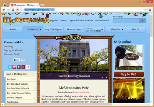
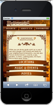
For example, if I want to go to the http://www.mcmenamins.com/Pubs page, but I do it on mobile, they ALWAYS redirect me to /mobile. Always. Even though I have a quad-processor pocket supercomputer with gigs of space I've still surfing a second-class internet.
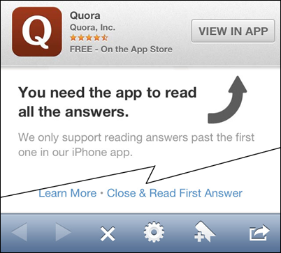
I don't want your crappy app
That means you Quora. I am in my browser, unless I'm going to the App Store, let's assume if I'm in the browser, I want to be on the web.
Giant Interstitial Ads
I'm looking at you, Forbes.com. I GET IT. YOU HAVE ADS.
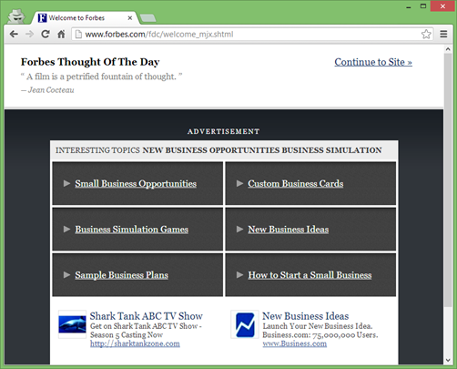
Stay classy.
Labels for Input Forms
I hate seeing a checkbox and only being able to click on that exact checkbox.
<p>Which fruit would you like for lunch?</p>
<form>
  <input type="radio" name="fruit" id="banana" />
  <label for="banana">Banana</label>
  <input type="radio" name="fruit" id="None" />
  <label for="none">None</label>
</form>
It's so easy to just associate a label with an input. Please do it, then we can all have something larger to click on.
Breaking Hyperlinks
We're still doing this. Haven't we learned that Cool URIs Don't Change? It was true in 1998 when that was written and it's true now. The web as we know it was created in 1990 and made truly open in 1993 and the link to the First Web Page (yes, Capital Letters) is still http://info.cern.ch/hypertext/WWW/TheProject.html. I love that they've done the work to keep that link alive.
There's just no excuse for this. With .htaccess files and web.config files, maintain a list of redirects and do your best to test them. Maintaining deep and complex links can be complex, but if you're companyname.com/about link dies because you switch from PHP to Rails, there's just no excuse for that. I'm your User and I have always typed /about. Don't' give me a To Do like "Update your bookmarks!" I didn't come here for a To-Do, I came her for your damn about page. YOU figure it out.
Click the Flag that represents your Language
I've often been asked to "select my language" from a list of country flags, and ended up clicking on the Union Jack to represent "English." I'm sure the actual English don't appreciate an American declaring they speak English. ;)
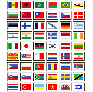
but I know I'm not the only one who realizes that a Flag is a lousy representation of a language, especially since your browser is announcing what languages you speak with every web request.
Accept:text/html
Accept-Encoding:gzip,deflate,sdch
Accept-Language:en-US,en;q=0.8
There can be a whole list of languages in the Accept-Language header, in the order the user prefers them! Use that data, it's there for you to use.
You know my Zip Code, why am I entering my State?
For folks living in the states, we're always asked to enter our postal code (ZIP code) and our city and state, even though there are dozens of great APIs and Databases that can give you that information.
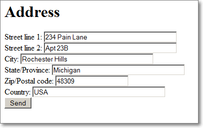
The meta-point is this: If you can reliably determine something from the user (language, location, country, preference) without invading their privacy, do it! Save them a little time!
Resizing Giant Images with width and height attributes
Perhaps take a moment and remind your boss that the 6 megapixel photo that he or she took with their new Canon EOS is not a good background image for your corporate site...especially if it's a 4 megabyte JPGs.
Oh, that's OK, we can just <img src="bigassfile.jpg" width="100" height="100"> and that will make it smaller. No, that just downloads the giant file and then makes your browser do the work to resize it on the client.
Resize first, and squish often. Also run all your PNGs through PNGGauntlet or PNGOut.
Serving pages from both www. and naked domains
If you've got example.com/something AND www.example.com/something both serving up the same content, consider "canonicalizing" your URLs. You can do this with rel="canonical" in your META tags, but that only hides the problems and makes the Googlebot happy. Instead, why not PICK ONE and serve a 301 redirect to the other? Did you know that there are rules built into IIS7 that will set this up for you? You can even remove your .aspx extension if that makes you happy. You can do it!
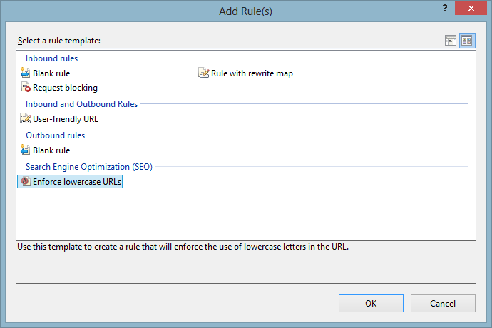
The same is true if you do the same thing for / and /default.html. Pick one if you can, and redirect the other.
<system.webServer>
    <rewrite>
      <rules>
        <rule name="CanonicalHostNameRule1" stopProcessing="true">
          <match url="(.*)" />
          <conditions>
            <add input="{HTTP_HOST}" matchType="Pattern" pattern="^hanselman\.com$" ignoreCase="true" negate="false" />
          </conditions>
          <action type="Redirect" url="http://www.hanselman.com/{R:1}" redirectType="Found" />
        </rule>
          <match url="blog/default.aspx" />
          <action type="Redirect" url="blog/" redirectType="Found" />
        </rule>
      <rules>
   <rewrite>
<system.webServer>
Others?
What are some great examples that you think Break The Internet...but that are easily fixed if we have the will?
Sponsor: Big thanks to RedGate for sponsoring the feed this week! Check out Deployment Manager – app deployment without the stress. Deploy .NET code & SQL Server databases in one simple processfrom a web-based UI. Works with local, remote and cloud servers. Try it free.
About Scott
Scott Hanselman is a former professor, former Chief Architect in finance, now speaker, consultant, father, diabetic, and Microsoft employee. He is a failed stand-up comic, a cornrower, and a book author.
About Newsletter
I blogged about a bunch of common usability issues. http://examinemysite.com/blog/category/Web-Usability
For the web sites which pop up a modal window informing the user about their 'great' mobile app, may I suggest that you do not do this at the user's first visit to your site but use a counter in their cookie and pop it during their x visit. There are many sites which I use infrequently and I don't wish to install their app, no matter how great it is. I install apps very judicially.
OR
put a link on the site about the mobile app like in the page's footer.
- This is an IOS thing, if I zoom in on a page, then navigate to another page on the same domain, remember my zoomage.
- Small one, why waste bytes/bandwidth. Sites that serve a chunky 404 page when the browser requests favicon. Also, http compression is a no brainer these days.
- Once I've answered a captcha correctly, don't ask me again on the next form, I'm human.
I'm turning into a grumpy old man.
Hey, who moved my cheese ?
One thing I love is when sites accept either your username or email address to authenticate. I have tons of different logins, a little visual clue reminding me which credentials to enter - be it a funny logo, or parenthetic text saying to use my email - really helps with speed.
Heck, we can't even get it right when we try to use it with the machine-readable part of the transaction:
http://bitworking.org/news/WebServicesAndContentNegotiation
http://norman.walsh.name/2003/07/02/conneg
In cases where bandwidth is not an issue and the browsers do smart resizing, it may actually make sense to send the high-res version and let the client present it in the best way possible.
That being said, neither solution is perfect. Adjusting more intelligently is obviously better for lower bandwidth and lower end device situations.
Just something to think about.
Just a thought, maybe in addition to the not so good examples that you've listed here you can add examples of some websites that do things right, that from your point of view you think developers should follow. Where you would say something like "if you are a good web developer your sites should look like this ... or that ..."
Probably one typo in your code example for Labels for Input Forms.
<input type="radio" name="fruit" id="<b>None</b>" />, the capital N only works in IE but not for firefox and chrome.
Also web pages should not have "intro" pages any more. I can't believe I still see those.
On another note, sites that are completely in flash. I thought we'd moved on past this.
Using GET requests that modify the state of the your application (like a delete link).
Real users neither know nor care how to configure Accept-Language headers. And in an Internet Café you might just get the preferred language of the previous tech-savvy customer.
A multilingual site should always provide some kind of UI to switch languages.
Furthermore, i think something that is missing from your article is a very dangerous point that many integrators and programmers fail to follow: Accessibility and graceful degrading. I have to make my point once if not twice a month in my agency regarding this point. Broken javascript should not prevent your from using a site. I think a whole article on the subject would be good actually.
meta http-equiv="X-UA-Compatible"
Not mobile friendly.
Mobile friendly sites that do not provide anywhere near the same info as desktop sites.
Finally my biggest pet peeve, although not strictly breaking the internet, regional pricing. Many companies (eg Apple, Microsoft & Adobe) charge Australians 40+% more for digital products compared to US customers.
Other times I just surf the web the normal way: using fiddler.
The ethnologue website, despite its latest redesign continues to suffer from link Canonicalization woes. The entire website assumes links are case insensitive and runs as such, however spiders do not see it that way. Every link has a canonical URL ending with /***EDITION*** despite that the actual site links aren't like that. Furthermore there is a cache buster on lightbox.js on every page.
Continuous scrolling list of arbitrary content -> reading arbitrary content -> going back to list of arbitrary content -> doesn't bring me back to where I left off.
._.
Advertisers: if you don't want people to use as blocking software, then don't make your adverts obtrusive and annoying.
I'll also add "sites that require you give an email address", which thankfully this site doesn't do.
Did you know that there are rules built into IIS7 that will set this up for you? You can even remove your .aspx extension if that makes you happy. You can do it!
A user can't even upload a profile pic to Spotify w/o requiring the Facebook API. Too cheap/lazy to hire a developer to write their own file uploader for their users?
Requiring Facebook to do anything standard on the web, like shop, comment, login, etc. is just as dumb as requiring an AOL "Keyword" instead of a normal email address.
Aren't the awful proprietary AOL 1990's over? Didn't open standards and www pages win? I'm having my doubts.
Well, I don't have to say that this translation is not perfect. To get rid off it, I changed my Accept-Language to english. So in my case this information is not meaningful anymore.
"So, what's English in Chinese?"
2. Sites that offer to save your ID/PW for future visits often remember that data even after it's changed. I update my password, enter it into the login screen, but it has already remembered my old password, rejects my login, then fails to remember the new password.
3. My apologies if this is too specific, but if I use Yahoo as my default search engine in mobile Safari, enter the search term 'Yahoo' in the search box, then click on the result "Yahoo! Search - Web Search", I get the mobile search page, and am then immediately redirected to the desktop Yahoo with the message "Sorry, the page you were searching for could not be found on Yahoo! Search." Not a confidence-inspiring experience.
Also, while it doesn't break, something simple that *strains* the internet is the lack of reasonable caching for static resources.
Ads with sound mean I'll close the tab and never go near your site again.
Using Flash when it really isn't necessary.
(One problem with the login page of my bank's mobile site was, apparently, not tested with Windows Phone 7.5's IE, since I always have to zoom in to click the password field. When, oh when, will WP sales catch up to iOS and Android???)
I haven't done much HTML lately, but back in 2000, I discovered that I can make the CheckBox Label usage even more "contained" (Please correct me if I've mis-remembered):
  <input type="radio" name="fruit" id="banana">
    <label for="banana">Banana</label>
  </input>
I like this because it allows me to think of the label+checkbox as a single unit (as it really should be), as I did in Win32, WinForms, WPF, etc.
  <input type="radio" name="fruit" id="banana">
    <label for="banana">Banana</label>
  </input>
I like this because it allows me to think of the label+checkbox as a single unit (as it really should be), as I did in Win32, WinForms, WPF, etc.
I PREFER that I get a mobile-specific website from my phone, since my phone's screen is much smaller than my desktop. Plus, touch is far less accurate than a mouse click. Why not redirect to it?
(One problem with the login page of my bank's mobile site was, apparently, not tested with Windows Phone 7.5's IE, since I always have to zoom in to click the password field. When, oh when, will WP sales catch up to iOS and Android???)
@John Tasler: HTML <input> tags are like <img> and <br> tags - they are empty tags. Putting content inside empty tags is not technically allowed, weird things will happen if you try.
1) Don't present users with preset password reminder questions. ESPECIALLY if they are specific to a point-in-time. "What is the name of your favorite [pet]/[food]/[Movie]/[etc.]?".
These things can be superceded. If you dont remember your password you may not remember what the answer to the question was when you created your account.
2) Don't store user passwords [or other sensitive data] in clear text [or even encrypted with a reversable algorythm]. Nothing scares me more about a web site than when I click the forgot password link and I get an email with the password I typed. if they are overlooking that security basic ... what risks am I running ordering from them?
This means that 95% of my users from Iceland state they're English from the browser data I get, yet only 1% of my client base switch the language of the site to English (I have to default to Icelandic).
- Requires real names
- Requires signing up to READ stuff
- Obnoxious as fuck if you don't
- The App thing you mentioned
Just use one of the Stack Exchange sites instead. Seriously. There is one for pretty much everything. And you can use a nickname and read everything without signing up - hell, on most sites you can ASK stuff without registering.
Disclaimer: I'm a Stack Overflow mod.
For all other links, you can make them resources inside a directory. This gives you the advantage of using whatever technology you want (static HTML, dynamically-generated HTML, JSP, ASP, whatever) without having to leak that implementation detail into the URL. The link http://example.com/foo/bar stays the same, regardless of whether you use .../foo/bar/index.html or .../foo/bar/index.aspx.
It also lets you incrementally upgrade your site completely transparently to your end users -- you never have to take the site down.
I can't tell you how many times I hated links breaking because the site administrators decided ColdFusion wasn't worth using anymore.
UX tests have shown that trying to guess address data based on zip/postal code is bad. Aside the mistakes that the locating service can make, some small cities may share the same code.
Users know their address and don't have any trouble completing this information in few seconds. If you add some delays because fetching some data on a WebService, that may even slow them down and creates confusion because some data is showing magically.
Tab indexes : always have a good code semantic instead of trying to mess with the tabindex attribute. This leads to all kind of problems and destroys any re-usability or maintenance ease.
Don't add hover states to unclickable items.
Put some air in your layouts. This is not wasting any paper to use a scroll bar. Font-Size should be 13px or more with a decent line-height.
Target _blank is bad in most cases, if not all. I'll open a new window/tab if I want one! Don't worry, if the user have the intention of coming back to your site, he will hit the back button (instead of having to find the right tab when many are already opened).
Most of the time this "technique" is used to inflate analytic data.I know you want high stats on the visits duration, but keeping the site open and hidden behind the new window will not give you the real data, hence breaking the advantage of collecting it. Analytics data should give you hints on improving the site; it's not for showing fancy charts and graphics to your client.
- Providing instructions for how to enter in a number and also validating that it doesn't contain any of the illegal characters (like hyphens or spaces in a phone number) when it would be far more elegant and not that much harder to just write the logic to remove the offending characters. We should be asking the user to enter in the number like they are used to seeing it in the real world.
- Writing out the credit card expiration months even though every credit card on the planet lists the month as a two digit number.
- I waiver on autodetecting the credit card type based on the first digit, because I've always assumed the reason it asks for you which credit card is a confirmation that the user is entering in card information that the vendor accepts. If the vendor accepts only MasterCard/Visa and the user has a AmEx card, the user knows right away this won't work for them.
- Bank websites tend to be the ones that accept the most limited and weakest passwords. Eeek!
Part of your statement is a bit counterintuitive though. Looking up someone's address based solely on postal code (or reliably determining similar information from other data) may be more privacy-invasive than directly asking for it because the user doesn't have the option of opting out of the look up. Though I suppose you didn't say address, but rather the state which is potentially less focused.
From an experience perspective I wonder which would be better. Ask for address and postal code and determine state/country, or ask state and postal code and determine address (in Canada postal codes can easily apply to just half a dozen street addresses).
They ought to at least encourage their users to downsize their ridiculously huge camera phone images, hell, even give them some tools to crop the image client side, THEN upload. Not a huge deal for me as I don't browse much by smartphone, unless I happen to be torrenting and I click an image to find it loading like I'm on a 2400 baud modem in the early 90s. Is that a finger? Arm? Sideboob?? Nope, it's a freakin' cat.
AdBlock Plus (particularly its Element Hider) and Ghostery have been great tools in the battle against lots of ads, annoying floating social networking buttons that I never click anyway, and interstitial garbage.
Non secured login pages (yes please send my password unsecured over the internet!)
You have SSL but don't use it on the rest of the site (yes no problem to send my address and personal info unsecured over the internet!)
No possibility to delete your account (yes I want to look into every option of account settings and the Help/FAQ pages to find out this is impossible...)
No possibility to order tickets without setting up a whole new account with all my personal info etc. (Yes I want 2 tickets for 'Band playing once' an account I can't delete and spam from your theater please)
The only possible way to get a new account is via another website I don't use (Yes off course I want a new Facebook account to use Spotify)
Don't say a word to your users when your website is hacked and all data is stolen. (yes I want to read it a week later in the news that my T-mobile/Linkedin account is hacked, instead from the company itself)
1. Overriding browser's native shortcuts (Ctrl + something).
2. Especially, adding a keyboard shortcut like "next/previous article" to the mouse arrow keys (I use caret browsing - F7 in Firefox - to move in the text, or [Ctrl+] Shift + arrows to highlight read text).
I'm sure the actual English don't appreciate an American declaring they speak English.
Erm, why wouldn't we? That is what you speak. I'm not saying you're wrong about using the Accept Language header, but no English person would ever get upset at an American for saying that they speak English, because it's a true statement. They might get upset if they say they speak "American", because that's not a language.
I can't let that one slide - this is perhaps the only website I've ever seen where the size of the site scales to fit any size browser, if the browser properly handles standard code.
If your browser fails to properly handle the scaling, that's not really the site's issue.
So, on YouTube, videos deleted from Watch Later magically reappear, and captions keep turning themselves back on.
One that is particularly annoying is restarting a paused video every time the screensaver kicks in. Pause a video to go and have dinner, it's finished playing by the time you get back.
And then there's all the stepping through pages of step by step help chasing settings on different configuration pages to accomplish something that should be possible with a single checkbox. I really think Google (and Facebook) have no overall design plan and just let every developer loose on a single page to do whatever they think is best without regard to the rest of the site.
On other sites, insisting that credit card numbers have no spaces and telephone numbers have no formatting characters (when it is trivial to strip them), or worse, insisting telephone numbers be validated as integers or a fixed number of digits.
I used to think that sites which presume US addresses were a pain, but credit card companies don't block payments from an address in the USA if all the details except country and postcode match a local address. This solves the nasty problem of software costing up to 6x as much if you live outside the USA.
Whether it is replying or commenting or reviewing, if we have to login or become a member before we can talk it sucks pretty much...if you don't like my review are you going to punish me...we should be able to speak without membership...you can block the problem people without their email address and username and password...
What?
Also one you're guilty of Scott: not using type="email" on email inputs. Battling with my phone's autocorrect to get my email address corrects. Beyond frustrating. Just to add a o that, also not trimming a string before validating. A space at the end of my email address just caused it to fail...
For example, Google. I'm Thai and I live in Bangkok but I don't like Thai translated website for some reason. So, even I set my preferred language to en-US, when I open google.com they will always redirect me to google.co.th unless I told them to use to google.com (the have a link to google.com directly).
Thanks for great post as usual, Mr.Scott :)
It all depends on a business case. We decided to make it dead simple for 99.99% of our users, so we'll live with 0.01% unhappy about it.
This is bad. Specially whe you are holdiy in asia and use hotel's computer. Then you get all those weird chars and dont know what to do. Even in google and gmail and so on.
Simple dropdown or flags would have been better
Others have addressed the "download our app!" crap, so I'll leave it at that.
(Well, OK, he's using dasBlog - or IS he?)
(That would have been much funnier had he not replied 3 comments above pretty much owning up to it...)
If you've seen IIS 7 or 8, you would reconsider your view that it's wrong. Leaps-and-bounds from 6, I tell ya. Leaps and bounds!
People don't do it because the tools suck. All of them.
Give them a simpler way to do this, an easier way. Don't ask them to edit complicated xml files. Xml sucks for these types of things.
You work with the ASP.NET guys, right? Get this info to them. The tools to solve this problem suck. In all platforms. Make it better.
When you decide to change your extension from .aspx to .mycompany, some tool should tell you that you should record redirects. It should be in a file that is checked into source control. It should be unit testable. All these use cases should be like that. They aren't and so people don't do it, and they will not start because you posted it on your blog. Some who read it might, the other 99.9999% won't.
Get the tools to help.
Cheers!
What if I want to keep a bookmark to the content or send a link to a friend - how will that work if you don't have a real link, but have everything obfuscated under layers of JavaScript to make my browser no longer act like a browser?
I also have to learn a new set of rules to interact with the pop-ups on for your site: will it close with Command-W or Ctrl-W like all my other windows, or do I press the Escape key instead? If I'm a mouse user, will my normal movement of the mouse to the top left of the window find the close button, or did you move the close button to the top right because you assumed I was using MS-Windows? Or better yet did you have some secret button that's only visible if I hover over it, or a keypress that I'm expected to use my psychic powers to figure out? I've even seen sites where different popups have a close button in different positions. Do you really expect me to remember the rules for every individual site? Of course I can't - I just get it wrong every time.
Skype is even worse: they use geo-ip and they set their communication language for e-mails etc using the IP used when subscribing. They only support one language per country, and guess which one they picked for Belgium... And neither you or their support is capable of changing this later on! Hopefully you didn't subscribe when you're abroad in a country which language you don't understand...
Zip codes: All 90% of all counties have these, correct? So if I type 0043 how can I expect you to know where you are?
Flags issue: Guy complains that he does not like to select flag then the next wants it due to the fact that his location is based of geo-ip, now the language that is selected to for him is wrong.
Damn stop complaining an find ways to improve this, in this age stop whining like little girls...wake up and do something about it.
Also people who capitalize WEB drive me nuts. It's not an acryonym. And I chuckle every time a spell checker tells me I need to capitalize internet (this one doesn't). It's nobody's name, it's not owned by anybody, it merely describes a thing, not a single thing.
Also web sites that pay absolutely no attention to keyboards and have input fields in scrambled tab order. Charles Schwab's site for most of the 7 years I've been using it has had the tab order messed up on the main screen to log in with. At one point you had to hit tab 57 times to get between the dropdown for your initial page and the check box where you tell it to remember it. This became 77, then 90, and was fixed for about a week, then broken again, and eventually the checkbox didn't have a tab stop at all, and in fact the second time around, the tab order was different from the first. Don't put tab stops on static text! Not everybody uses a mouse for EVERYTHING, in fact it's extremely inconvenient to have to take you hand off the keyboard just to go to the next input field.
Every time I use, or try to design or implement any browser based data entry, I'm reminded what a lousy data processing medium the web is. It was never designed for it, any more than cobol was designed to have a GUI. Of course that hasn't stopped *everybody* from embracing it and writing slow data entry apps that make an IBM keypunch machine seem like light speed in comparison.
Just give me a SSL cert to verify me, please?
(Loosely related, I wished more commerce/banking sites would give a standard API so I can use a website/program I like. I'd be estatic if my banks let me download data into GnuCash.)
And the second one. I have bad eyes. While websites are wonderful with their tiny, cramped text, not everyone can see them well. Contrast is also important for those with failing eyesight. Gray on gray is brutal to older folks (statistically), those who experience some eye surgeries (I have a permanent haze), and color blindness. Being aware of that helps, if anything to accept cranking up the font size on pages without breaking everything else.
But, awesome list of things to consider.
1. Zip codes are collections of points rather than shapes, they do not have borders and are not subject to borders.
2. Cities and states are irrelevant to the zip code. They are more for human readability than location. They really are only used when there is a zip code / address mismatch.
3. Solely for readability, pride, and typos, a zip code can be called by multiple city names when multiple cities share the same post office. This is typical for major cities and suburbs. 53222 is a Milwaukee type 0 zip code that has Wauwatosa as a suburb (type 1). The mis-spelled variant of Wawatosa is also accepted as a type 2.
It gets to be even more fun when you start calculating taxes solely based on zip code. As zipcodes cross borders there are multiple tax rates for the same city-state-zip combo.
Thank you to the government for not making a developers life easier.
Don't know how many times I've seen an article on a website that has no date on it, anywhere. Not even in the URL. All too often the article starts with something like "In the past week or so..." and it's maddening. If I can't find the date it was either written or last updated then I do not read the article.
The one that really drives me nuts lately is when I am just about to click on something on a page, and an ad or other content -- loading long after the rest of the page -- pops open just before I click and I end up clicking the ad, or just end up clicking nothing.
For example, gameinformer.com. When you click next, then click on a detail, then use the back button on your browser, you're back to page 1. This is very irritating when I'm on anything other than page 1. Oh, but the list loads in dynamically! Cool! Not...
Related gripe -- ANYTHING dynamic that can't be recalled and served up via a URL. This, in my opinion, breaks the web.
I have a question about serving pages from both www. and naked domains: how do I redirect, knowing that my web site is a WordPress Azure website, so I can't (obviously) do anything on IIS?
- When a website considers my tablet to be mobile. I'm using a screen that's at least 1024x768. I don't want your mobile website, I want your desktop website.
- When a CAPTCHA is impossible to read.
In Canada bilingual people often will switch between English and Français depending on who they are dealing with. Switching system settings back and forth is a pain when all you want to do is view the French version of the page that you`re on.
And another .NET peeve: what's wrong with 404 and server error pages? Sorry, I know that things are changing at Microsoft but it seems that the end of "embrace and extend" has yet to reach all the ASP monkeys out there.
Also, we do speak English, what is wrong with an English flag to represent that?
Skype is even worse: they use geo-ip and they set their communication language for e-mails etc using the IP used when subscribing. They only support one language per country, and guess which one they picked for Belgium... And neither you or their support is capable of changing this later on! Hopefully you didn't subscribe when you're abroad in a country which language you don't understand...
Like Xbox LIVE that forced us to use French for years.
Especially annoying on mobile.
Remarks in the article are overall pertinent. Especially those about mobile redirection & adds in full page.
About zip code, you have to remind that outside US Zip code is not necessary for 1 location (2 villages can share the same Zip code for instance in France).
About language, I use sometime my brother in a different language that my native one, so it's convenient to be able to choose "manually".
Otherwise, again very interesting article.
Best regards
Lionel
<system.webServer>
<rewrite>
<rules>
<rule name="CanonicalHostNameRule1" stopProcessing="true">
<match url="(.*)" />
<conditions>
<add input="{HTTP_HOST}" matchType="Pattern" pattern="^hanselman\.com$" ignoreCase="true" negate="false" />
</conditions>
<action type="Redirect" url="http://www.hanselman.com/{R:1}" redirectType="<b>Permanent</b>" />
</rule>
<rule name="CanonicalHostNameRule2" stopProcessing="true">
<match url="blog/default.aspx" />
<action type="Redirect" url="blog/" redirectType="<b>Permanent</b>" />
</rule>
</rules>
</rewrite>
<system.webServer>
Maybe you could write next articles referring to this article.
I wish to read even more things about it!
Comments are closed.
