Supporting high-dpi pixel-dense "Retina" Displays like iPhones or the iPad 3 with CSS or IMG
I'm loving responsive design and am slowly updating all my websites to support mobile browsers as well as tablets. Currently Hanselman.com (this site), Hanselminutes.com (my weekly podcast), SpeakingHacks.com (a video I sell on how to be a better presenter) as well as LostPhoneScreen.com (where I sell my Windows Phone 7 application.)
All of this "mobilization" has stemmed from my frustration with other folks' sites that look lousy on my phone. It's SO frustrating to reach a site that could take 10 minutes and make its mobile experience 100% better.
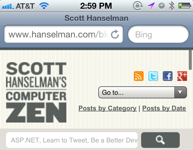
Now that I've updated my main sites I'm tidying up a few things that continue to bug me. On my iPhone 4S with a DPI of 326 dpi, the logo on my site and a few other graphics look lousy. Why?
Well, for example, the image for the logo is a PNG that is literally 100px by 100px. This is a foreground image (not a CSS background image on an elements, yes, people still use those) and it has its height and width both set to 100px. The size of the image and the img tag are both really 100x100.

You can see that not only is the logo blurry but the search magnifying glass and social icons are as well. That's because the browser has scaled up the images to manage the super high-res display of this device. Better that they scale it up than make it too tiny. The overall size of all the other elements on the page are scaled up as well so the fonts and form elements like the dropdown are crystal clear.
There's a few ways to fix this.
Support (High DPI) Retina Display with CSS Background Images
Since I am already using CSS Media Queries to change my site's CSS for smaller screens like this already:
@media screen and (max-width:720px)
{

}
I can certainly do the same and detect high resolution displays. It's not just the iPhone. A lot of the newer Nokias and HTCs have displays over 200dpi.
I could create a media query like this:
@media screen and (min-device-pixel-ratio: 2) {

}
Or do conditional inclusion like this (or -webkit-min-device-pixel-ratio):
Do your testing and be aware you likely need to use both the webkit prefix and one without:
only screen and (-webkit-min-device-pixel-ratio : 2),
only screen and (min-device-pixel-ratio : 2) {
}
You may decide that 1.5 is a better ratio for you.
The WebKit folks are thinking about this and I could use background-size like this:
div {
  background: url(logo-low.png);
  background: url(logo-high.png) 0px 0px / 100px 100px;
}
Handling Foreground Images (with the IMG tag)
Ideally I should be using SVG (Scalable Vector Graphics) for my images like the magnifying glass and they'll scale everywhere. Until that day (and until I'm willing to redo all my images), I can take advantage of the way the IMG tag has always worked. We know that nothing is sadder than a small image that has been scaled up by incorrect width= and height= tags.
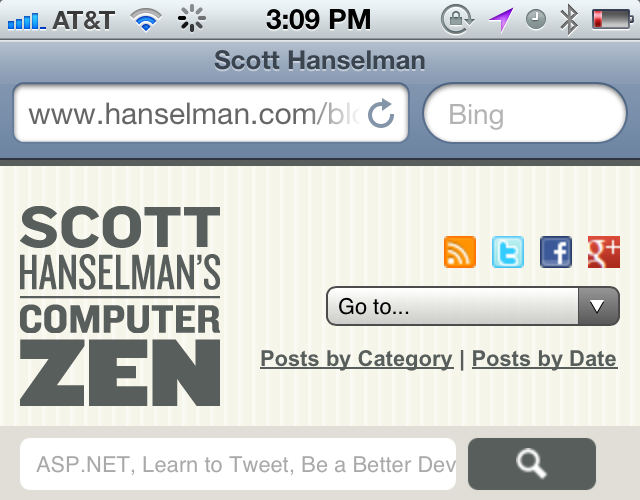
Since my image is only 4k, I decided to make a high-res 200x200 image and mark the width and height attributes to 100px. Stated differently, I'm sending more pixels than needed and scaling them down. The result is that it looks clear on high res displays and the same as it did before on regular displays. Here is a screenshot with the retina Logo file.

It is true that I'm sending more data than I need to here. I am sending a 4kb image when the 100x100 original is 2kb. I can solve this by swichign to a background image and using the conditional CSS options outlined above.
In this case it's a reasonable tradeoff and I'm happy with the result. It's a good solution for small images like this. For the social images I will likely want to sprite them and create both regular and "@2x.png" versions of the sprite.
Small, Medium, Large, FullSized
The problem isn't just with high-res images, it's also that we want to send the minimum number of bytes across the 3G wire while still offering the mobile user the chance to download the full sized images if they want.
I really wish that LowSrc still worked. I was talking to Jeremy Keith about this last week and he mentioned he just blogged the same thing! This was how we did things when we were all still on dialup. (And as Jeremy points out, we also often used ALL CAPS and omitted quotes! ;) )
It seems that LOWSRC just died, however. Ironically LOWSRC only works in OLD browsers. This is a shame as it was/is useful.
Mat at AListApart mentions another side of this idea using a fullsrc attribute, except with data- for HTML5 compliance with an idea from Scott Jehl.
It's unfortunate that there isn't a clear and comprehensive technique yet to handle both the low-res, fullsrc and highdpi solution. Today you can achieve them all with some CSS3 and some jQuery/JavaScript.
A correct image tag should take into consideration:
- Connection speed (detected as well as user-overridden)
- Screen DPI (pixel density)
- Responsive design image resizing
I think a solution clearly needs to be baked into HTML5 with a solution like the ones that Mat Marquis outlines. The question before us is do we update the IMG tag or are we talking about a new tag?
Related Links
- Hire and Pay a Designer and Be Happy
- Easy steps to a mobile-friendly responsive design with an embedded YouTube video and a fluid resize
- Skip Intro - CSS3 is the new Flash
About Scott
Scott Hanselman is a former professor, former Chief Architect in finance, now speaker, consultant, father, diabetic, and Microsoft employee. He is a failed stand-up comic, a cornrower, and a book author.
About Newsletter
What does the logo serve on a mobile device with a small screen? Nothing. Then drop it. Ask the same question for every element on the screen. The mobile page needs to be very minimalist as screen real estate is very valuable.
Every element either conveys highly useful data or used for some action. Everything else is just noise and distracting.
My idea of a effective responsive design is as the screen gets smaller, the less useful elements get dropped. Not smaller.
1)
- give your img tag an id or class
- still set the size
- set the src to a 1px transparent gif/png
- set the background in your conditional CSS
I like that one (which you mentioned in your post), but another approach is this:
2)
- I see you're loading jquery
- set the src to a tiny 1px transparent gif/png
- give it an id/class
- if low-rez then load the lower rez img using script
- if high-rez then load higher rez img using script
See...
http://www.w3.org/community/respimg/2012/02/21/a-sample-picture-implementation/
It's extremely annoying to see images, some of which were already stretched at strange aspect ratios, get blown up and pixelated even more. Personally I wish everyone would switch over to SVG as soon as possible, but I know that's a pipe dream.
And I definitely appreciate designing for mobile. According to wikipedia, my <a href=http://en.wikipedia.org/wiki/HTC_Evo_4G">Evo 4g</a> has a 240 ppi display. Text looks gorgeous when done right. Unfortunately, as you've discovered, most sites simply haven't designed for this just yet.
Did it really only take you 10 minutes to redo your site?
now I work in a Windows Phone application.
but the source to pull data web serviceslerinden
I can not find. According to a site specified in the application at any time
information to be taken. How do I make it ..
saygılarmla
background: url(logo-low.png);
background: url(logo-high.png) 0px 0px / 100px 100px;
Position is required to set size using the shorthand form.
Comments are closed.


It would be great if you updated your examples to include browsers besides WebKit. Media queries are supported on other browsers too.
This kind of post is the reason there's been such a kerfluffle lately (1, 2) about vendor prefixes and the WebKit mobile monoculture. Please do your part :).