The Floppy Disk means Save, and 14 other old people Icons that don't make sense anymore
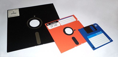
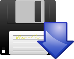
The Floppy Disk Icon means "save" for a whole generation of people who have never seen one.
— Scott Hanselman (@shanselman) May 9, 2012
What happens when all the things we based our icons on don't exist anymore? Do they just become, ahem, iconic glyphs whose origins are shrouded in mystery?
Floppy Disk - Save
Save? Save where? You know, down there. Adding the Arrow to the 3.5" floppy makes me smile. Is it pointing to under my desk? What's a floppy? Why not a USB key? Maybe a cloud icon? That will be easy since there is only One Cloud Icon in the world.
Radio Buttons - Mutually Exclusive Choices
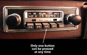
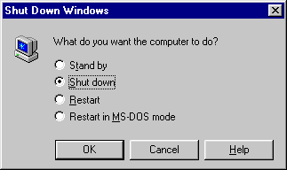
Why are they called Radio Buttons? Because my car radio used to have buttons where only one could be pressed at any time. I miss my 8-track.
Clipboards
Seriously, short of a doctor's office or the DMV when are we coming in contact with clipboards? And why is the clipboard the icon for Paste? Why not Copy? Or "fill out form?
![]()
Bookmarks
We used to use smaller flat dead trees to keep our place in between the dead trees we would read from so that we didn't lose our page. No, books didn't "keep our place when we turned them off."
Address Books and Calendars
We would write down all our addresses and phone numbers in a dead tree and carry it around with us. Sometimes we'd manage our calendar that way also. Everything was bound together with metal spiral loops. Let me check my Filofax.
![]()
![]()
Voicemail
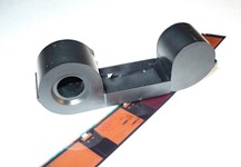
I assume that the Voicemail icon is supposed to be evocative of reel to reel tapes but it always look like a container of 110 Film. I suspect my voicemail is no longer stored on spooled magnetic tape. No, you've never seen either of these before, young person. #getoffmylawn

![]()
Manila Folder
I suppose the kids use Pee Chees still these days? I use folders because I use the 43 Folders organizational system but I don't see any reason that we couldn't be storing our files in abstract squares rather than folders in the sky.
Handset Phone Icon
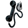
The world's most advanced phones include an icon that looks like a phone handset that you haven't touched in 20 years, unless you've used a pay phone recently. (What's that?)
![]()
Magnifying Glass and Binoculars
At some time in the past the magnifying glass became the "search everywhere" icon, but for some reason binoculars are for searching within a document. This makes no sense as magnifying glasses are for searching things that are near and binoculars imply breadth of search and distance. These two commands should have had their icons reversed!
![]()
![]()

Envelopes
Soon the envelope itself will go away and the next generation will wonder what this rectangle means and what it has to do with email. We'll still put other arrows and icons on top of these icons to mean reply, forward, delete, and other things. "Daddy, what's a 'stamp'?"


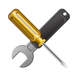
Wrenches and Gears - Setup/Settings
Want to indicate Settings or Setup to a twenty something? Show them a tool they've never used in their lives.

Microphones
If you don't know who Johnny Carson is, how could you know that this is a old-style microphone?

![]()
Photography
No one under 30 has seen a Polaroid in years but we keep using them for icons. Instagram sold for $1B with an icon whose subtlety was lost on its target audience. "Shake it like a Polaroid picture."
![]()
![]()
Televisions
Does your TV have "rabbit ears?"

Carbon Copies and Blueprints
I'll "cc" you on that email. Last time I made a carbon copy I was using a mimeograph to do it.

![]()
What other icons do we use while the original inspiration fades into obscurity?
Note: If one of these icons is yours let me know and I'll link to your site. I found all these and haven't been able to attribute all of them.
About Scott
Scott Hanselman is a former professor, former Chief Architect in finance, now speaker, consultant, father, diabetic, and Microsoft employee. He is a failed stand-up comic, a cornrower, and a book author.
About Newsletter
Ruben
PS: So much trouble using my blogger account for openID... I wonder if the custom domain redirect breaks it or what.
Euroda and other mail apps use the rounded-tin-on-a-stick icon. The rest of the world was probably wondering what that was as I've only ever seen it in North America...
[)amien
As for an icon that is fading, I'd say the CD icon used for most music actions is getting dated.
The icon that confuses me the most is the "Ease of Access Center" in Windows. I've never figured out what the blue circle is supposed to represent.
But the floppy disk - spot on
https://twitter.com/#!/jflanagan/status/185543623226568705
The white circle, together with the positioning of the arrows, mimicks a wheelchair. A classic accessibility symbol in blue and white.
So what do we replace these with? Will every icon moving forward be an iPhone looking rectangle?
Or maybe everything will simply be binary icons:
011010101
 010100011
100000101
010110000
000101011
Everybody is talking about 'shipping' their products these days .. Github's mantra: "Ship it bitches!"
Comes from days-of-yore industrial revolution times where loading your product onto ships to export to customers meant done, dusted, out the door.
I used my rotary phone just yesterday, thank you very much. I used it to make a phone call with Google Voice.
I guess it's a coincidence, because otherwise it would mean this is built upon the collective work of Reddit without proper credit.
A good choice for "setup"? Perhaps not, but certainly still relevant.
Other than that it's going to be interesting to see what iconography looks like in another twenty years if it even exists in its current form. I'm having a hard time imagining replacements to many of the rapidly degrading metaphors.
Those icons formed a "visual language" that is used to communicate with the user. I dont think there is a need to replace them, because unlike when they were introduced we don't need the metaphor anymore. Why? Because that metaphor was used to match a command with a task that was familiar to the user before. But in 2012, the familarity is with other software that use those icon. Now, young user associate directly those shape with some functionnality of the software, not with the original object. They have become symbol of their own right, like democracy became a word and kratos and demos were forgotten.
In a few decade, history teachers will display to young student some of those old physical artefact to show them the object of the ancient time that inspired the symbol in their software. Just like when my history teacher told us the origin of the word democracy when we talked about the ancient greek.
So, in my opinion at least, those icons still make sense Scott. I am myself 23 and only touch a floppy when I was under 7. But in my mind, their is a direct mapping between its shape and "save my work". It would really confuse me if some software used something else.
So your car's current radio lets you push more than one button at a time? What happens when you do? Do you get to listen to multiple stations at once?
In the computer world they might all look the same!
I say we've become used to these. They're part of the culture irrespective.
http://www.dimensionsguide.com/wp-content/uploads/2009/11/Audio-Cassette.jpg
Plus, until I read this I never got the carbon copy part of the icon, so thanks.
Also, You added that people under 30 haven't seen these 'in years.' I think you mean one or the other but not really both. Also, I think it's worth noting that, in most cases, the prime case (the first one) of something (e.g. steam train) is often the most iconic.
To be honest, I think this is a list of things you hope are obsolete. I'm for that. Lets do that together, ok?
2. "Show them a tool they've never used in their lives" - only if you have pampered apartment-raised kids.
3. Yes, my TV has "ears", it's how I receive HDTV signals.
4. Those microphones and cameras aren't out of style - you can find many similar looking ones for sale right now.
Books are not obsolete. Maybe to you dont read them anymore and instead read your fancy ipad. :)
Calendars. yes i have an exchange calendar at work. I have a personal google calendar as well. But i still have a family calendar on the wall. Our kids also have their own magnet calendars they update each month. Schools also send monthly calendars home with events. Spiral bound is still a popular form to hold the pages together.
Manilla folders. people and companies still file legal documents in guess what else but a manilla folder.
Mail.... most people still receive mail... even personal stuff... not just junk mail. Party invitations, thank you notes, birthday cards, etc... my kids love to receive birthday cards, and they dont care at all about email. His classmates seem to be the same in that regard. I am sure that will change as they grow, but they do know about mail.
Settings.. 'show them a tool they've never used'. Seriously. You show a screwdriver and wrench. Those are like the first universal tools everyone uses. You cant do everything with a computer! A screwdriver and wrench are the first tools anyone should own.
Microphones. If you watch any radio show through a window as a tourist or if you watch any of them that are on TV you'll still see that kind of microphone. People recognize that as being a high quality microphone.
Tv. They still sell televisions with rabbit ears. It is just that many people pay for satellite or cable and dont use them. And if you are on a budget or just have less time for tv, youll realize there are plenty of stations in HD over the air. You need to extend your antenae to receive the channels clearly.
Carbon copies. My bank still offers carbon copy checkbooks. If you still have a checkbook youll find they are quite helpful. Also when you get a blood test at quest diagnostics they still use carbon copies. There are other examples as well. Most people dont use them daily, but they recognize what they are.
Blueprints still are blue. I went to school for architecture. Blue prints are the retro cool way to present some drawings. When i did an addition on my home the drawings were made with autocad, and the copies for everyone were made with a blueprint machine.
Iconograhy does not need symbols to look like real things anyway. All they need is to be consistent with the past. Ever see the davinci code? Every symbol has a history, and most people dont know why the symbols look as they do. But there is typically a history and reason why each symbol looks as it does. If you change a symbol thing long and hard about what the symbol should be. And most importantly conduct usability studies on the new symbols.
My favorite is the phone. A friend of mine has a 3 year old who recently got a toy phone. The child can actively use an ipad or smartphone, but didn't know what to do with the telephone toy, not even how to hold the receiver. Amazing!
http://10rem.net/blog/2008/11/18/when-will-the-floppy-disk-die-as-a-save-icon
So there! I even beat that SO post. :)
Oh and, "blah blah MORON." Yes. Definitely going to start using that in email, or maybe in conference calls. It's witty. It's succinct. Perfect.
http://rockablepress.com/books/rockstar-icon-designer
I'm not surprised that icons hang onto the conventions from 10 years ago.
I've saved many butts in college by knowing how to find the Word Document in the Temp folder after a power cut or crash.
Sorry, I guess I shouldn't have come to your blog right after getting mad at the Visual Studio blog.
Are you condemning the use of metaphors (icons) because they are no longer visible to modern society? If so, that's EXACTLY why they are relevant. :)
The metaphors are effective *only* because they represent images of a world that was conquered by revolution.
Why else would you see a capitalist yuppie wearing a Che t-shirt???
Regards
AK
The rules of soccer, easily the most popular sport on the planet, put signal flags in the hands of the two assistant referees, who use them actively during the game, as well as at the four corners of the pitch.
Don't get ahead of yourself. The world at large isn't as digitized yet as you (and the signal flag respondent) seem to think it is. Alternatively, sarcasm and hyperbole both lose their impact without a more sensible context against which they contrast (You're saying that most twenty-somethings have never used a screwdriver or a wrench and don't know what gears do? You can't possibly be that stupid.)
Icons don’t need to make sense. They need to be iconic.
Their meanings should also be discoverable. I expect a tooltip to appear very quickly with a word or phrase describing the action. This is a problem on touch screen devices where this isn’t possible. I’m often confused about what a button does when an app developer doesn’t use one of the universally recognised icons for a perhaps uncommon action. I have to press the button and perform the action just to learn what it does. In this case they might as well have just used text. Even if you’re displaying English to non-English speakers, it’s no worse than an undecipherable icon.
You get the idea. Humans change slowly, and as technology moves faster and faster UI will be more about keeping humans in their comfort zone, for enjoyment and profit. Keyboard layout is a good example. Historically the qwerty set is only there to prevent jams, there are proven faster sets, such as dvorak, but qwerty has benefited from the network effect, and so will stay with us, as it maximizes enjoyment and profit.
It wouldn't really have made any difference if the first UI designers had used small animal icons to represent actions, that would have stuck with us. Imagine, click on the skunk to save, the otter to open...
The Pages Icon shows a fountain pen and ink pot. Who uses a proper compass these days. I would say clapperboard but that is still used.
Folders are still used as well. Again, by children, to carry back and forth their homework.
I liked your comments with the rest of the icons. The floppy disk is the biggest culprit. However, we don't have any short hand for saving to a hard drive or to the cloud. A cloud icon may lead to people think that they are about to connect to the cloud.
"That's not old, I just used my radio/compass/phone set/monocle/CDs/VHS the other day!
:P
- Bookmarks? Sorry, but we aren't there yet. I know you love your Kindle, but a lot of people still read novels and use bookmarks. We still a few good years for this one.
- Definitely agree with the magnifying glass and binoculars
- A bit condescending :( on the wrenches and gears. Have you seen how many folks have an interest in car racing or even robotics (ex. Lego mindstorm)
- Microphones? Have you seen the Yeti? I don't know, with all the podcasts and articles on podcasting.
- I do have to admit that at times I struggle to remember what the second C is for in CC and BCC; and I'm old enough have made carbon copies on a type writer.
I don't think icons need to be something we've seen before, it's just something our minds can associate with an action or destination. The problem would be if an app or site is constantly changing what an icon does.
Earlier today I looked at two proposed alternatives to the floppy disk, including LibreOffice's replacement of it with a green arrow pointing at a grey rectangle. Needless to say it isn't being well received by users.
I don't know if we will ever get rid of the floppy disk.
If you tried to update those icons to something that really relates to kids today, you'd only have one icon. An icon of a laptop.
You can buy brand new mics that look just like it right now.
http://www.adorama.com/FJIM7SWH.html?gclid=CJaB1qWJ9q8CFUu4tgodtz6mSw
polaroid is still kicking :)
"The poets made all the words, and therefore language is the archives of history, and, if we must say it, a sort of tomb of the muses. For, though the origin of most of our words is forgotten, each word was at a stroke of genius, and obtained currency, because for the moment it symbolizes the world to the first speaker and to the hearer. The etymologist finds the deadest word to have been once a brilliant picture. Language is fossil poetry. As the limestone of the continent consists of infinite masses of the shells of animalcules, so language is made up of images, or tropes, which now, in their secondary use, have long ceased to remind us of their poetic origin."
The transport controls in audio apps are another software example. The buttons for play, record, stop, fast-forward etc. nearly always adopt the original symbols and organisation from tape machines and video recorders (green triangle for play, red circle for record etc.). These not only mimic the transport controls from an old tape machine but in some cases even copy the required interactions to start recording. You have to first press the record button to "arm" a track for recording and then the play button to actually initiate recording, in just the same way as you would on a multi-track tape machine and I'm guessing hardly anyone outside the pro-audio world has ever used one of those before.
I suppose the more modern equivalent would be a USB stick, but switching to that would be misguided as cloud storage and pervasive internet connections become more and more the norm.
The disc as a metaphor for "save to disc" still works fairly well, as no matter where you're saving to, the file will almost certainly end up on some matter of magnetic disc, and the shape of a floppy disc is much more iconic and quickly recognizable (especially at small sizes) than an actual magnetic disc, which would just look like a circle.
some of what s bineg pointed out has actually become an issue of lexicon rather then icon, take bookmark for instance, the icon is perfect and always will be, it's the word that does not match in my opinion. And if the word does match then so does the icon which harkens back. How in the world does a star represent bookmark? And what 20 yr old has never use a screw driver, what world does this author live in that machines and gears don't still operate the things around us, even the inner works of a computer still uses fans and tiny gears? Being a person who is confronted by this conundrum on an almost daily basis, I think the article lost what could have been a great goal, to re-imagine the semiotics, rather then offer a cynical critique with no insight. I beg the author to find a better icon for phone that captures a screen without numbers that can do so much more then a phone and is a moving target at the very least.
From what I understand (and I'm no language expert) the modern Chinese characters originally were representational and evolved into the modern abstractions. Perhaps the representations will do the same: the save icon may evolve from a disk to just a rectangle with an arrow or some other simplification. As long as the share meaning is there, there is nothing "strong" with this. (And switching to a USB key would be worse, because I doubt they will be anything but a blip in storage before being replaced by another form factor).
. ↑
└ ┘ as Open
. ↓
└ ┘ as Save
And what does paste have to do with anything? You're not gluing content down, you're inserting it somewhere.
It was a little funny as I started to read, but then I realized that if you want to follow that line of reasoning - "updating" icons for concepts like telephones, microphones, folders, etc. which represent the essence of the technology - when they broke onto the scene and had their day in the form captured in these icons, then where do you go from there? Is there something more "telephone"-like than a telephone? What are the folders, really? A bunch of microcircuitry that no one would be able to tell apart from the mess of microcircuitry that performs the task of moving one line of text from one place to another in a document? I mean really, it's all virtual, right? If the goal is to have an easily recognizable icon which has a clear meaning, mission accomplished. The more computerized everything gets, the less truly recognizable the parts that comprise our reality are going to become. Microcircuits are boring to look at, so despite the fundamental role they play in so many aspects of our lives, we're going to have to admit that visually at least, they'll never outdo the "obsolete" technologies they are bound to replace.
As an example, for the no paper iOS app UI, I created over 50 icons, http://www.behance.net/gallery/no-paper-iPhone-app/2643271 but trying to create icons that users instantly recognised through testing was tricky and often I had to fall back on legacy real world items... plus an added irony that may make you smile, is that there was an option to view by icon, but there isn't a recognised standard icon for icon!
And here's two further examples where there are no standard icons, blogs and websites, sure there are the wordpress circle and W, the blogger icon used for blogs, or the windows explorer icon used for websites, but these are all company trademarks. Due to this I created a blog icon a couple of years ago, so far it's been downloaded over 100,000 times and I see it popping up all over the place. At the end of the year I needed an icon for websites, so I made one for that too, which I've included in the blog icon .zip download, and that's slowly spreading too
http://www.theblogicon.com
http://blog.brendanmitchell.com/2011/12/05/the-web-icon/
let me know what you think
brendan
There was a surprising number of complaints that I had used check boxes instead of radio buttons.
"How will they know they can only select one?"
"Because when you click an item it is the only one selected."
"They need to be radio buttons."
"Okay."
So I made my div have a border radius. Now we have check circles and only one can be selected at a time.
Fixed it for you.
― Wikipedia:ideogram
This is how Chinese started.
My smartphone is a black rectangle.
My tablet is a black rectangle.
My speakers are black rectangles.
My monitor is a big black rectangle.
My printer is a black and silver rectangle.
My hard drives are big black rectangles.
My laptop is a silver and black rectangle.
All of these things, only 10 years ago (those that existed) would have looked completely different from one another, and consequently their icons at the time would have had their own visual distinction making them easy to tell apart.
You: "Click the speaker icon"
Me: "Which one is that?"
You: "The black rectangle"
Me: "Which one? I see 10 black rectangles"
I'm not convinced that making icons look like their contemporary real-life counter-parts is a good thing. You would have to reinvent them as technology progresses (allows for slimmer and more creative form factors) and that means users would have to re-learn the meaning of the icons constantly.
On top of that, you can't assume just because an icon is an accurate representation of its real life counterpart, that people will necessarily know what that is.
That being said, there are plenty of icons in existence that fail to relay their meaning when taken out of context. The voicemail one you noted is a perfect example - whithout the text below it I also would have thought it was film container.
My rule of thumb is that if the user can not understand the icon sans text to describe it, then the icon has failed.
Besides, Retro can be cool.
Signed,
A feisty old broad with a 10 year old computer and a 66 year old mind set.
Luddites Unite!
Steam trains also, those are seen on TV and in movies a lot (Thomas the Tank Engine for one) plus they are more likely to be instantly recognized as a train (rather than some sort of road vehicle)
This kind of retro-enthusiasm is very selective though. Recently I had a friend chastise another friend on why he would have an interest in vintage computers. Later that day, when visiting said friend's abode, I discovered an Atari 2600 configured with a SynthCart that allowed him to manipulate it as a retro-new-wave electronic instrument.
However, well done in making an issue where there is obviously none.
This is how we innovate (?!)
Second of all — so what do you suggest we change those "old" icons to? I could not find at least ONE suggestion...
Third of all — WHY should we change them, what is wrong with young people having a clue about the past?
Let me know what you think.
Greets @pimeijer
What makes a good symbol is its unambiguity and ease of recognition, not how well it mimics some physical object, or how often people see or use that object.
And seriously, who in the industrialized world has never seen a studio microphone or a wrench...?
However, I remember him pointing out one important aspect: It's almost impossible to create an icon that clearly explains what's behind it. You will always have some ambiguity. What you should focus on is creating icons that are easy to remember and clearly distinguishable.
It's a classic problem of language mixing the device with the content. E-books should be called e-stories, the book is the physical thing which in our mind becomes synonymous to the message it conveys.
I'm 27, and of the all tech referenced in the article, I think the 8-track is the only one I didn't get to see or use.
I have definitely used 110 film (for my tiny spy camera), polaroid cameras (heck, I still have one), and I just bought a floppy disk drive and disks last week to load some Server 2003 RAID drivers.
Although the icons used today aren't very "with the times," I don't think updating the icons to more recent images will help.
I think the problem is app designers have defaulted to using ONLY icons, and no text on buttons. This does not work, as inevitably, some apps will use different icons and will start to cause confusion. Likewise, some apps don't allow you to unselect an action, so pushing the wrong button can be app-fatal.
We want text!
I don't see anywhere that Hanselman ranted that we were all morons for using this imagery... just wondering about the world out loud. If your blood is boiling over that.... wow... you must be impossible to work with or talk to.
I'll readily admit it's not the best download icon ever. But it made sense in the context it was originally designed for.
As for the point of the article: Meanings and symbols get detached from one another and rearranged all the time. Precious few people realize that the ampersand character ("&") was originally an abbreviated form of the Latin word "et" meaning "and". Yet that doesn't stop them from using it just fine. So what does it matter if nobody gets that "radio buttons" mimic an obsolete physical device for tuning a car radio? That lack of knowledge won't make the radio buttons less usable.
Besides, changing the standard iconic vocabulary would be hard. Swapping in a cloud icon for a floppy disk would require re-educating all the users who know from long experience that you save your stuff by clicking the floppy disk. That's not impossible; but why bother?
Conventions do need to be broken sometimes, but only when you have a really good reason -- like introducing entirely new functionality, or when an existing convention has stopped working entirely. Worrying that new generations won't understand the original metaphors behind an icon doesn't strike me as a good reason.
The street sign for a school in the UK when I was a kid was a blazing old-style torch (conical thing with flames on top). This was blindingly obvious to the classically-educated civil servants who started street signs in the 1920s, as it was the Lamp of Learning :-)
Should we change it to a cloud or a USB drive? So 5 years from now we change it again to whatever-storage-device we're using that time?
In 20 years we'd have a whole mess of different icons for the same stuff, much harder to figure out than having a single one (even if it represents an outdated object).
And obviously this goes to the other icons, not just the 'Save' one, lol.
I come from a Portuguese-speaking country, where a flag is just an object, not a verb. You can't "flag" something.
So, the flag never made much sense.
A "pin" is a better metaphor, IMO.
That's a really good point!
I see some people trying to replace the floppy with clouds, or things like that... well, that makes even less sense.
Except that 99% of users haven't ever seen a hard drive.
I, for one, prefer the floppy -- it may be outdated, but at least it has a well known meaning.
You still 'hang up' a telephone, but have you ever used the type of telephone with a 'switchhook' on which you would literally hang the handset to end the call?
You still 'dial' a telephone number, but when (if ever) did you last use a telephone with a dial?
If you're American, you put things in the 'trunk' of your car, but have you ever driven one of the cars where the rear storage space is a steamer trunk?
Your car probably does have a dashboard, but is it still there to prevent mud from your horse's hooves being dashed against you?
I fully expect most of these 'obsolete' icons to remain, as fossilized technology preserved in conventions of visual language, as these examples have been fossilized in spoken and written language.
Regarding to mimeograph and carbon copy. The last one I created a carbon copied letter, was the last time I touched a typewriter. As already mentioned, it was done through carbon transfer from one sheet of paper to another.
It is like the signature markings used in business letters that have been carried forward into email parlance.
Like:
Fcc (file carbon copy, or take a the copy generated from carbon transfer, put it in a manila folder and store it in a cabinet).
Cc (Carbon Copy, distribute copies to those in the list, which meant to be informed about, and not to act on the letter).
Enc. (in other words attachments).
It is not only graphical representations that have been carried over since old times, these commands or instructions also originate from older technology that may not make sense in the digital age.
Back to mimeographs, considering the cost of laser toners and their replacements, mimeographs beats hands down later printers in terms of printed pages per cost. Too bad that it stinks when it's printing.
On Save - I rather have a cabinet with an arrow for save rather than a cloud. Saving on a cloud makes no more sense than thinking that it means dancing for rain.
Comments are closed.
