Visual Studio Programmer Themes Gallery
UPDATE: http://studiostyles.info/ for a great growing community of Visual Studio Styles and Themes. You can create, import and export themes in your browser!
 More and more I find myself "skinning and themeing" my Visual Studio development environment in order to stay frosty. It's surprising how changing your theme (fonts, colors, etc.) can re-energize me when I'm having trouble with some problem or motivation.
Here's a gallery of some nice Visual Studio Themes to refresh your look.
Remember to always back up your settings so you can get back to the way things were and have no fear when you're changing your settings. Note also that some of these settings files you'll find out in the wild may (mistakenly) have Keyboard Bindings included. You'll want to selectively import just the fonts and colors that you want and avoid importing over your own custom keyboard settings.
I switched to a darker scheme a while back, as have many others. I also spent a while looking for the perfect font as have others. When you stumble on a 2005 theme that you want ot use in 2008, Tomas has an XSLT to make the transition smoother.
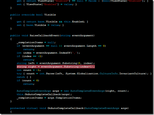
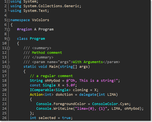
Oren Ellenbogen's Dark Scheme
A lot of the darker schemes like Oren's don't use a True Black, but an "off black." His theme is very low contrast and uses muted, relaxing colors.
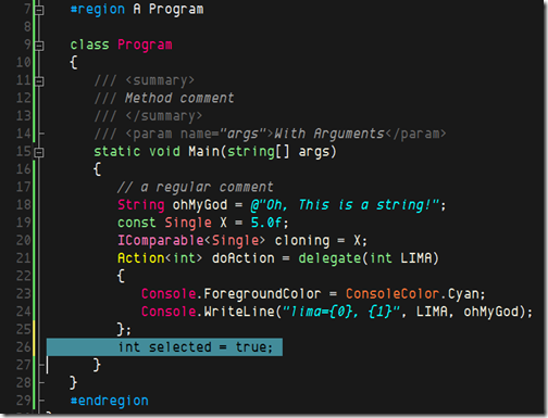
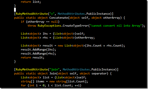
Mike "Blowmage" Moore's Ruby Blue
This is a low-contrast calm schema, but operators and numbers have a little "pop" to them.
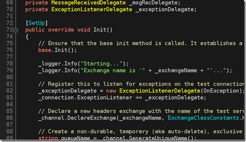
Vibrant Borland by Mawi
This one bring backs good memories of writing Borland C++ with OWL and Turbovision, with a little Norton Commander thrown in for fun.
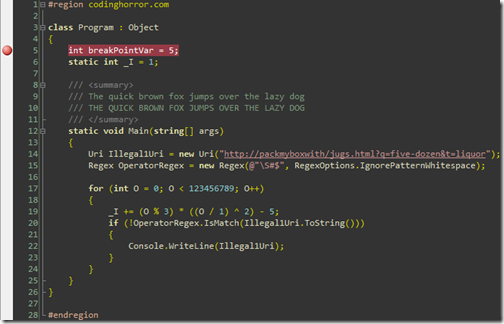
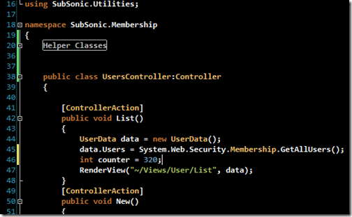
CodingHorror
One of the few light-colored themes, Jeff's also uses a custom font to make 0 and O stand out. Note that the white background is more of a paper-colored off-white.
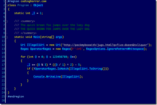
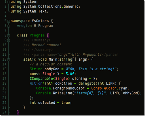
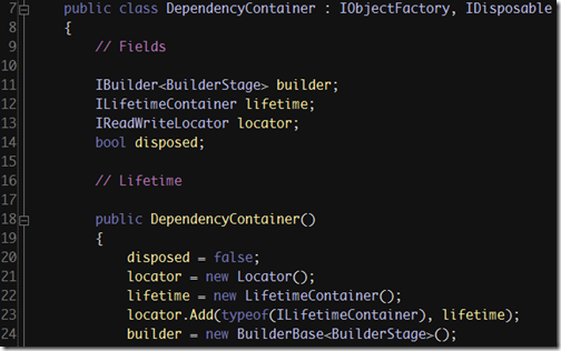
Dave Reed's Jedi Scheme
Dave's schema uses a complete black, and a neon blue. A little intense, but much higher contrast.
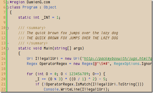
Damien Guard's Humane
This earthy theme includes little details like smart fonts and italics.
Tomas Restrepo's Themes
Tomas has done a huge amount of work in this space. You can get seven of his themes here. He's even got a tool to port color schemes from Visual Studio to SQL Management Studio.
Desert Nights
This theme uses the greatest range of colors outside of the Vibrant Ink them, and approaches, but doesn't reach, a number of primary colors.
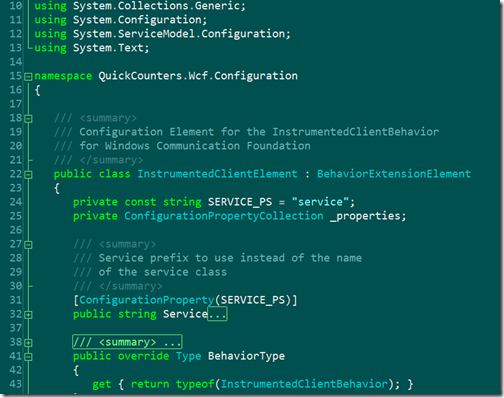
Garden of Eden
Green, Kermit-green, sea-green, they are all here in this blue-green theme.
Ragnarok
Initially similar to many dark themes, this one uses complementary colors to provide contrast between identifiers and keywords, string literals and comments.
Nightingale
A more cheerful dark theme that includes italics for string literals and brighter neons for keywords.
Moria Alternate
This uses Deja Vu Sans Mono as it's font and uses a lot more neutrals and grays outside of the keyword space.
Brad Wilson Dark Visual Studio
A muted, low-contrast theme with blues and purples. Even the yellow is relaxed.
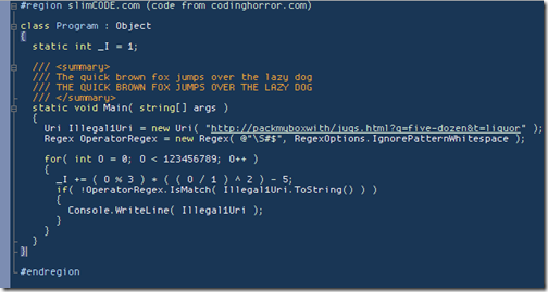
Martin Plante (slimCODE)
Martin likes small text, no ClearType to take advantage of crisp LCD screens. Rather than committing to blue or black he goes for a navy-gray-blue background.
John Lam's Vibrant Ink Port
John's trying for a straight port of Textmate's famous Vibrant Ink. This is a sharp, bright, neo-classic theme. Note his use of Monaco.
Rob Conery - Textmate
This is Rob's take on Vibrant Ink, added Consolas as the font, some bolding, and lowers the contrast a smidge.
Post links your themes in the comments!
Related Posts
- Changing your colors in Visual Studio.NET - Black versus White
- In search of the perfect monospaced programmers font - Inconsolata
- Five Things You (Seriously) Didn't Know About Me
About Scott
Scott Hanselman is a former professor, former Chief Architect in finance, now speaker, consultant, father, diabetic, and Microsoft employee. He is a failed stand-up comic, a cornrower, and a book author.
About Newsletter
My earlier settings which I use to use http://www.ragingit.com/temp/vs2005.png.
I did go through a pragmata font stage, but back to consolas.
Even in Object Pascal and Delphi I never could get used to the dark themes.
I'm currently using the CodingHorror scheme, but there is too much red text for my taste.
I'll have to try a few of Tomas Restrepo's themes even though they have a dark background. He has really used the full range of colors which I like. I will also check out his tool to port themes to SQL Mgmt Studio.
Thanks!
I like this post. I didn't relize VS could be themed. I"m getting frostier! Also I'd like to request another podcast, I feel greedy for asking but we're used to the weekly release. After seeing the themes I"m definitly trying the Coding Horror theme 1st.
Thx 4 the info,
Catto
ReSharper brings VB coloring up to par, but ReSharper isn't always an option. (Like at work where it seems to choke on our 3500 file web-site project.)
It's a variation of the white on black that I've been working on for a little while...
I've posted my personal take on the dark background Visual Studio and SQL Management Studio themes, with 11pt Consolas font.
http://blogema.wordpress.com/2008/02/04/visual-studio-dark-settings/
bye
I am still using FAR Manager as a file manager, even if it is discontinued. I even thought of trying to port the source to C#. So I'll give a try to the the Borland Turbo Pascal/Norton Commander scheme for a bit :)
http://vlko.zilina.net/dwn/blog/white-black.png
and theme link
http://vlko.zilina.net/dwn/blog/white-black.vssettings
theme is based on delphi twilight theme
http://www.darksideofvisualstudio.net
i want to try them all out!
the borland one sure takes me back, maybe i don't wanna try it so much.
Although not a dark theme, the one Jeff Atwood posted seems to work well with the CodeRush visualization features.
Of course, all of the colors can be changed in Studio and CodeRush so that they would work well in a dark themed environment, I just don't have a day to spend on it. :)
Normally I prefer the dark backgrounds with light font but I found a lot of them went to intense with the 'light' fonts and they were too bright.
I'd also like to throw out a big thanks to the guys that did these cause god only knows I am to 'busy' (read lazy) to this on my own.
http://idehotornot.ning.com/index.php/index/show?id=2045554
I chose a muted light background and soft pastel colors. I have been using it for years and so far I found it the most confortable. The dark backgrounds tend to feel too harsh for my eyes. Even when I worked at Borland I could never get used to the dark background and never used it.
You would not prefer to read a book in fixed fonts, would you?
// Ryan
http://www.caublestoneink.com/blog/?p=4
Actually...i would. I prefer fixed fonts and find them infinitely more readable. Even so, code isn't a book. No matter what the "Coding as Art" people would have you believe. Code which isn't organized and, frankly, symmetrical is harder to read. Symmetric code is really only achieved with a fixed font.
Thanks.
Since the cursor blinks between white and black anyway, you already have this. Only on a black background it appears to be a blinking white line instead of a blinking black line. But it already swaps between the two colors.
then when at work, the more "dark" you are (you're in VS), the stronger and richer the empire is becoming....the more "ligh" you are, rebellion is taking parts in you ;) e.g. when you're alt-tabing to see all the not-so-important windows (youtube? ;) which tend's to be "white" in general (use black css for testing ;)
more to the topic, it's funny how much useless (graphically too rich, almost with dot with one color and colon with another) themes ppl are making, I know it's fun but there should be at least a bit of science in it...it is not a circus is it?
for me Rob Conery's theme is the winner, if Lord Vader will visit me one day I'll try it...
Comments are closed.
