WPF and Text Blurriness, now with complete Clarity
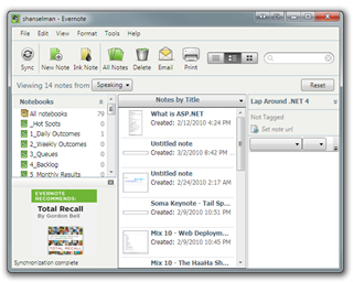
 The #1 complaint I hear about WPF (Windows Presentation Foundation) is that many fonts end up looking "blurry." It's a darned shame because really great applications like Evernote get criticized because of this one issue*.
The blurriness happens on .NET 3.5 and below because WPF's graphics system is "device independent" so rendering happens independent of resolution. It makes apps DPI-aware for free and scales them nicely. Unfortunately MOST people are running on 96dpi screens and that's where you'd expect clarity. You can get around this 90% of the time today using SnapsToDevicePixels when appropriate, but it wasn't automatic and it's subtle.
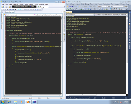
The good news is that with .NET 4 this is totally fixed. You can see with with the .NET 4 RC (Release Candidate) and VS2010, which uses WPF for much of its own rendering. Additionally, a check-in in a recent milestone makes things even clearer with light text on a dark background.
From the WPF Text Blog:
"With this fixed, WPF is not technically pixel perfect with GDI text rendering, but the difference is indiscernible to the naked eye."
So how indiscernible?
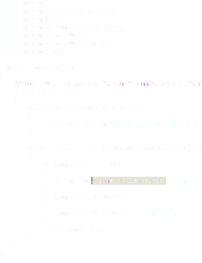
UPDATE: A little confusion about this in the comments. Folks feel very strongly about this stuff, understandably. Just like color blindness, some people are sensitive to this stuff and others "can't see it." One person in the blogs didn't like go for "indiscernible" and showed a screenshot. Here's the deal. If you are running VS2010 RC, you don't have this fix. This will be in the RTM. Here's a 100% screenshot, followed by the zoomed in version. The takeaway is this. If you didn't like the rendering before, you will now. This is/was some subtle stuff, but it's indiscernible in the RTM, so be happy! I took the screenshot from a daily build, not the actual RTM, which hasn't happened yet.
![]()
Blown up:

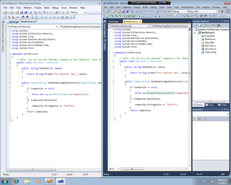
Click on these side-by-side images from the WPF Text Blog to enlarge and compare. VS2008 with GDI rendering is on the left and VS2010 (a post RC-build) with this fix is on the right. Of course, the release of .NET 4 will have this fix.
In the comments on the WPF Text Blog, Rick Brewster, the author of Paint.NET suggests that we can really analyze these images using an XOR in Paint.NET.
I've done just that here, taking the dark text on a white background and XORing it. Then, for visibility, I've inverted the result. This shows just the differences in pixels between the two rendering paths. Can't see much? That's the point.

To quote from the WPF Blog comments: "If you can’t tell a difference between the screenshots of VS2008 and VS2010, then you should not be able to tell the difference between GDI and another WPF app."
Also, note that this applies to all WPF apps on .NET 4. It's a general fix that's not VS2010 specific. Enjoy. I'll be happy when this is out and everyone's using it, including my favorite WPF app, Evernote.
* I don't know anyone at Evernote, I'm just a fan and I read the comments on their blog. I speak only for me on this issue.
About Scott
Scott Hanselman is a former professor, former Chief Architect in finance, now speaker, consultant, father, diabetic, and Microsoft employee. He is a failed stand-up comic, a cornrower, and a book author.
About Newsletter
http://www.telegraph.co.uk/sport/othersports/cycling/7404062/Lance-Armstrong-almost-banned-from-racing-in-South-Africa.html
Will the fix that was "checked into a recent milestone" be a part of the VS2010/.NET 4 release in April?
Thanks,
Eric Bergman-Terrell
VS2010 does look clearer, not by much but I don't have to strain my eyes telling them to focus correctly all the time.
Google Icon Guy - You don't have the fix, you're running the RC. This was checked in last week. However, what font are you using? Send me your font and theme and I'll talk to the team.
My VS2010 font and color settings were imported directly from my VS2008 .vssettings file, so the colors should be identical. However, the glyphs appear heavier in VS2010, which likely accounts for the perceived difference in color.
I've uploaded my font and VS color settings for you. The settings are exported directly out of VS2008 just in case something went screwy with the VS2010 import:
http://72.167.90.173/FontsAndColors.zip
Anyhoo, the RTM rendering in the updated comparison looks *much* better, so I'm happy :).
Mike
Evernote, huh?? How does it compare with OneNote (my benchmark for such apps).
on a clean Win 7 install with cleartype untuned I had no problem at all with 2010 RC rendering (unlike Beta 2 which was awful), but then i tuned cleartype for an exernal monitor and it went bad. i had to re-tune to the defaults when tuning cleartype - as follows:
.
Cleartype tuning 1st Screen – 1st Option out of 2
2nd Screen – 2nd Option out of 6
3rd Screen – 1st Option out of 3
4th Screen – 2nd Option out of 6
will cleartype tuning affect RTM rendering too?
Comments are closed.


On RC light background looks good but dark background is still bad, not blurry, but text is not well shaped.