Windows 8 productivity: Who moved my cheese? Oh, there it is.
 Disclaimer: I don't work for the Windows Team. I installed Windows 8 on my home desktop (this giant multi-monitor epic beast) with my personal MSDN account and wrote this on my own time. This blog is mine and the opinions inside are also mine. I also installed it on my MacBook Pro.
I finally pulled the trigger and upgraded a few machines to Windows 8. I have three main machines, my formerly "Ultimate Developer PC 2.0" whose video card gets slower by the year, my almost-retina-but-just-two-months-late Mac Book Pro, and my Lenovo W520.
I am a web guy SO much more than a desktop guy so if you look in my Taskbar on any of my machines you'll see mostly web browsers, text editors and shells. I live off my taskbar and I'm ALL about HotKeys. If I can avoid touching my mouse at all I will. I spoke to Brad Wilson on this week's podcast about his experience with Windows 8 as well.
Who moved my cheese?
People don't like it when you move their cheese. They are just trying to get through the maze, they have it all under control and then, poof, someone moved their cheese. Now it's a huge hassle to find it again. Change a hotkey or the case of the menus and all heck breaks loose.
The installation process was straightforward and everything still worked when it was done, so that was a relief. I upgraded from Windows 7 Ultimate to Windows 8 Pro. There's fewer SKUs in Windows 8 now, basically just Windows 8, Windows 8 Pro (for super users) and Windows RT (for Tablets).
However, once it's installed, it's initially confusing but I have been using it every day all day since it was released and have got myself productive again. Here's what I ran into and how I realized that there's less reason to freak out than I originally thought.
The Windows 8 Login/Lock Screen
There's a bunch of folks who have said that you have to "swipe up" or "slide away" from the Login or Lock screen to log in. Some websites have even suggested you disable the lock screen. That is stupid and wrong *cough* NBCNews *cough* and you shouldn't turn off the lock screen. Just press any key. Or just start typing. Or click the mouse. Or ANYTHING. You don't have to "swipe up" to log in just click or press anything.
Shut down or Sleep a Windows 8 Machine
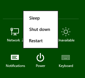 It's initially confusing as to how you shut down your machine. For laptops - at least my Lenovo and MacBook - you really never need to shut it down. I just close the lid.
If I really want to force a shut down, log out, or force sleep I just press Ctrl-Alt-Delete and press the Power button in the lower right corner. To lock the machine, just Windows Key+L.
You can also hit Win+I and press power. There's actually several ways to shut it down. You can even ALT-F4 from the Desktop if you like.
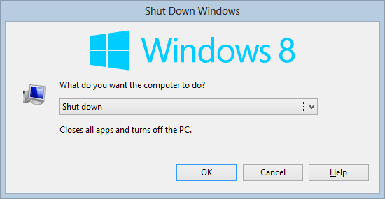
Here's another crazy idea for shutting down your PC or Laptop - Press the Power Button.
Run Power User or Administrative Tools - WinKey+X is EVERYTHING
For the first week the most frustrating thing about Windows 8 was getting to anything that was power-user-like. I was literally pissed at my computer because I was so used to clicking the Start Menu, then right clicking on My Computer in order to do things like Device Manager, etc. For things like the Event Viewer or Admin Command Prompts I was pressing Start, then typing "Event" and hitting enter. It was fine but it wasn't as fast as it should be.
Then I discovered the Number 1 most powerful Windows 8 shortcut for the Power User. It's Windows Key+X.
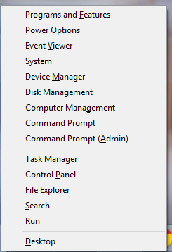
This hotkey used to be the "Mobility Center" and was really only ever used when I wanted to put my machine into Presentation Mode. Now it's a Power User's dream.
Note that everything is pre-underlined. Want an Admin Command prompt? Win+X, A. Event Viewer? Win+X, V. You get the idea.
You can also get to the Win+X menu by moving the mouse to the lower left-corner and right-clicking!
Windows Key Hotkeys are your life
All the usual stuff works and you should know this already. If you don't, picking up a few of these will save you seconds many times a day and that adds up. Force yourself not to use the mouse.
- Win+E - Explorer
- Win+R - Run
- Win+Break - System Info
- Win+D - Desktop (I use this constantly if I get trapped outside the Desktop world)
- Win+Plus or Win+Minus (no shift) - Magnifier/Zoom In and Out
- Win+F - Find Files
- Win+Print Screen – Put a PNG in the Pictures folder
- Alt-Tab - Switch between Apps
- Win-Tab - Switch between Full Screen Apps
Explorer Win-Keys for pinned apps
I'm consistently shocked at how many Windows "experts" don't use the Windows Key + "a number" hotkeys. Just press Windows+1 to launch the first thing in your taskbar, all the way up to Windows+0 for the 10th item.
![]()
There are a few new ones as well worth learning...
New Windows 8 "Win-Key" Hotkeys to move faster
You've likely already figured out that to launch something from the keyboard you press Windows, type part of the name of the app, then press Enter. If you press Ctrl-Shift-Enter it will run that same app as Admin.
Turns out that the keyboard works for most everything, even menus you wouldn't suspect it does. When you get a menu up you can always use the keyboard or hotkeys to move around it.
If you learn just three hotkeys, learn:
- Win+W - Search Control Panel and Settings stuff
- Win+F - Search Files
- Esc - Yes, escape. No joke. If you hit the Windows Key, you can hit Escape to go back.
Once you have those, add these:
- Win+C - Charms (right side menu) then arrows to move and enter to launch.
- Win+K - Devices
- Win+I - Settings in any app plus brightness, network and other useful system features
- Win+Arrows - Snap desktop apps to the sides
- Win+(period) - Alternate sides to "snap" Metro Apps. Add shift to reverse it.
- Win-X - Admin Stuff. I'm mentioning it twice because it's THAT useful.
- Win+PageUp or Win+PageDn - Move full screen apps to other monitors. Super useful for News apps and Readers. The Start Screen can be moved as well.
Better File Operation (File Copy/Move) Dialogs
The file copy dialogs are reason enough to upgrade. No joke, especially when you expand them for details. You get sparklines, throughput, time remaining that makes sense, as well as stop and pause.
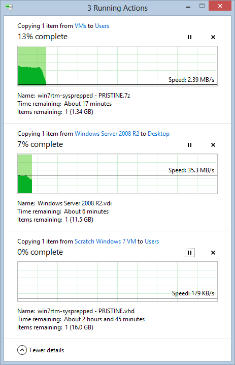
Awesome Task Manager
The Task Manager is epic. I keep it open a LOT. Back in the day I used to have a monitor dedicated to it. The whole point of the Task Manager is to answer those "what the hell is going on" questions. In Windows 7 and before all you could basically do was sort by CPU descending and complain. Now I can see the difference between Apps, Background Stuff, Services, etc.
Right now, for example, the disk is doing something. Here's the Task Man...
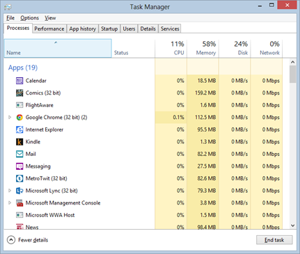
I'll sort by Disk, and I see it's Indexing a bunch of new files I copied.
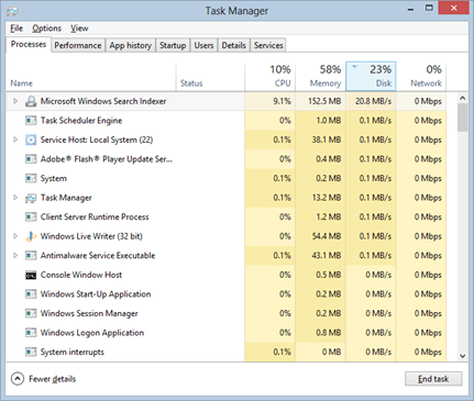
I can see what apps are slowing down my startup, and disable them:
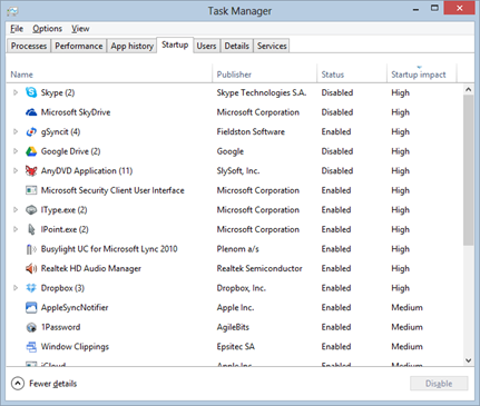
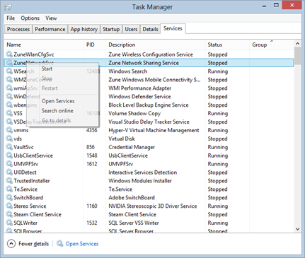
I can finally see services and stop them:
Install Hyper-V
For the developer or power user this one feature is reason enough to upgrade to Windows 8. For the longest time I had a laptop that ran only Windows Server 2008 because I wanted to have a really good Virtual Machine solution with a HyperVisor. On my desktop I used Virtual Box. Now Windows 8 Pro (a client OS!) has Hyper-V which is huge.
Press WinKey+W, type "Add Feature" and select Hyper-V.
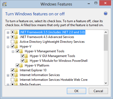
If you want, you can check your Windows 7 machine now and see if your system is 64-bit and supports SLAT and the newer CPU features you'll need. Download CoreInfo and from an Admin Command Prompt run "coreinfo -v." You want to see a star where it says "Supports SLAT." Either way, you'll know as Hyper-V won't let you install if you don't meet the requirements.
C:\WINDOWS\system32>coreinfo -v

Coreinfo v3.05 - Dump information on system CPU and memory topology
Copyright (C) 2008-2012 Mark Russinovich
Sysinternals - www.sysinternals.com

Intel(R) Core(TM) i7 CPU       X 980  @ 3.33GHz
Intel64 Family 6 Model 44 Stepping 2, GenuineIntel
HYPERVISOR      -       Hypervisor is present
VMX             *       Supports Intel hardware-assisted virtualization
EPT             *       Supports Intel extended page tables (SLAT)
Having a great Virtual Machine solution on the client has been great for me as I do a lot of screencasts and install a lot of beta stuff. I've got Ubuntu (which installs and works immediately because of the Hyper-V drivers are in Linux out of the box) running along side a few Windows 7 VMs, a Windows Server 2008 and a Windows XP VM.
Other nice features have been the ability to mount a VHD or ISO out of the box.
Show More Tiles
I have a 30" monitor in the middle of two 24" monitors. When I first looked at the Windows 8 Start Screen I thought "this is not using all my pixels." Then I found out that you can tell the Start Screen to use show more Tiles on high resolution (large) monitors.
Press Win+I (or go to Settings) and click Tiles:
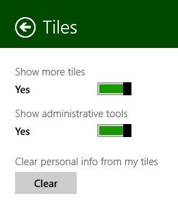
Now I got those pixels working for me and the Start Menu felt nicer on a giant monitor.
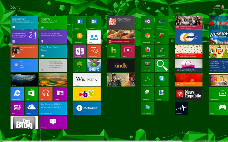
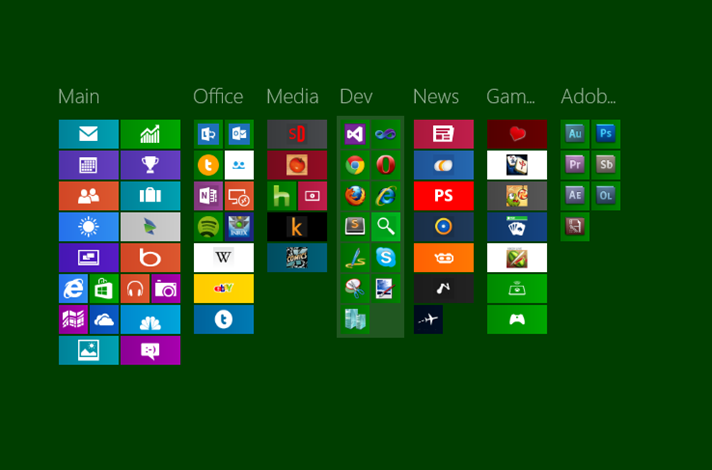
Also, take a moment and "Ctrl+Scroll" (zoom out) from the Start Screen. From here you can right click on groups of icons and name them. I've cropped and zoomed in here...I can basically have sections, zoom out to see headings then click to zoom in. I can also drag these groups around which makes large moves easier.
Multi-Monitor Taskbars
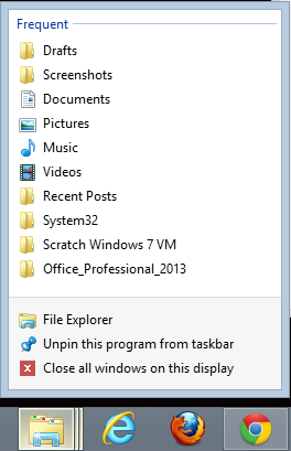
I've been a multi-monitor guy for years and blogged about taskbar utilities that deal with Windows 7's lack of a good multiple monitor solution. Sadly for Ultramon, I haven't needed his excellent utility as it's handled the way I like it in Windows 8.
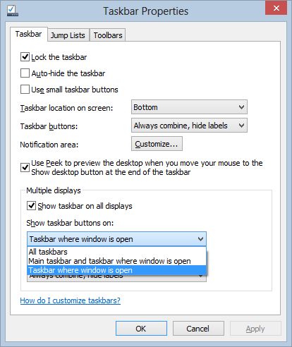
See there where it says "Close all windows on this display?" Windows 8 it full of little improvements like that to irritations from previous OS versions.
The Explorer Ribbon
On my large monitor, I like the Ribbon. Best part is - again, I'm a keyboard person - if I hit Alt, it lights up with the letters I need for hotkeys. Here's before...
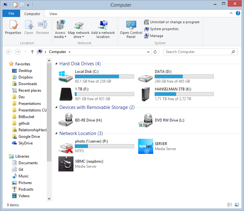
And after...

Don't like it? Hide it and move on. Look mom, no gnashing of teeth.
Conclusion
Maybe I'm too relaxed but after a few days and some hotkeys I've found Windows 8 to be Windows 7+1. Works fine, no crashes, lots of improvements. I spend most of my desktop time in Windows apps, all of which work. I keep News apps or Video apps in full screen on other monitors and I do move the Start Screen around but generally the whole thing has been a non-issue.
Sponsored Ad: DevExpress Webinar: ROI for 3rd party tools. Is it more cost effective to build or purchase developer tools? In this webinar Jeffrey Hammond, Forrester Research, will walk you through an ROI calculation model and help you consider how you might evaluate your future tools investments. Register Today!
About Scott
Scott Hanselman is a former professor, former Chief Architect in finance, now speaker, consultant, father, diabetic, and Microsoft employee. He is a failed stand-up comic, a cornrower, and a book author.
About Newsletter
I haven't had such a strong "who moved my cheese" feeling with a piece of software, ever.
Overall I don't agree the Start screen (or the Charms bar) are non-issues. It would have been so much better if we could completely disable them. They look so touch friendly, and here I am looking at that eye candy on my non-touch laptop... it's like a punishment. "Look at all these goodies, you don't get to play with any of them."
What is also really silly, is when in one session as a power user, you encounter icons in the Windows 95 style, Windows XP style, Windows Vista/7 Aero style, and Windows 8 Metro style. That lack of polish is really indicative of Microsoft, they don't really seem to care about that stuff since forever.
And don't get me started on not being able to login to my brand new machine without an internet connection. Yes, I know the options, but it's very easy to setup a new install without ANY option to log in if the Windows Live service is unavailable.
(It feels that way, because mouse and keyboard, while working fine in Metro, feel like second-class interaction devices.)
And yes, I'm still calling it Metro, like the German supermarket (or whatever it is), and so should all of you...
Overall, I'm looking forward to service pack 1!
I can see the use of the live tiles on a slate but on my desktop it is just a very large Start menu with even more scrolling than the classic menu, which I haven't used since Vista added the typing in the Start menu.
I still use "hit the WinKey and start typing" to start a program.
"Win+PageUp or Win+PageDn - Move full screen apps to other monitors. Super useful for News apps and Readers. The Start Screen can be moved as well."
The Start screen actually moves with single page app as well, probably the single most annoying thing in win8 for me. Meaning that I can't have single page apps running on different screens and that moving them from one screen to another drags the start view with them.
then saw that i cant change windows border size without changing registry
what the hell is this ? srsly guys ? now i cant even change the window border on MY os ?
no matter how awesome it is, i am out
Great article. I think there is a small mistake. To add Hyper-V you say to choose 'Add Features to Windows', but I think you instead want the 'Turn Windows features on or off'. The Add Features is to upgrade to Pro or whatever.
Mark
I just can't get my head around why they won't offer us the simple option of having a Start button. Just leave it off by default, but offer us the damn option. I don't even care if it doesn't give me an actual Start menu, just give a freaking button I can click to pull up the start screen so I don't need to dick around with hovering over INVISIBLE targets.
- Display is 16-bit only (and no RemoteFX).
- No host-guest drag&drop (you will need to use network shared folders to transfer files).
- No USB pass-through (no USB sticks or local printers will be seen by the guests).
If you want to be able to use vmware/virtualbox/etc you will have to create a boot entry to disable the hypervisor, as Microsoft's own Virtual PC Guy explains.
And regarding Windows 8 general use, I must say the biggest problem for me is the beta state (or downright lack) of certain drivers but that should be sorted out soon enough.
Thanks for your blog, Scott! Massively valuable and great fun!
The point of my comment was really about Hyper-V and Type 2 hypervisors not getting on very well (which I understand completely and wouldn't expect otherwise) and giving a workaround which I imagine most here already know of anyway but hey, I'm anti-DRY!
Complete Windows 8 Desktop Keyboard Shortcuts here
Regards,
Viron.
I also really like how much smoother RTM is for multi monitors than the beta.
The other shortcut I use all the time (and this works since 7) is windows key, type something to search
- On which of my 3 monitors does the start screen come up when I press the Windows button? I know, there must be some kind of rule behind this, but even after intensive investigation and working with it for days, I couldn't figure it out. It feels like random.
- Why can't I just pin icons to the new taskbars on my other two monitors? Life would be so much better...
- In the old days, I pressed the Windows button and started typing whatever I needed, then just hitting enter, i.e. "Folder opt" -> Enter. Now, that doesn't work anymore because for some reason the search categorizes the results and "Folder options" are under "Settings", which means that I have to use the arrow buttons to switch down to Settings first.
One more things: If you want a _good_ hypervisor, then uninstall Hyper-V and use VMware Workstation instead. It comes with native drag'n'drop and and excellent snaptshot feature that allows you to take snapshops and roll-back while it's running! I use it a lot for software testing and you should too. It's not cheap, but it's worth every cent.
If you have to shutdown win8, e.g. even to install Windows updates, you have to choose restart.
source: http://www.reddit.com/r/sysadmin/comments/ysty8/windows_8_shut_down_is_a_lie/
Every other blog tries it explain how shortcuts can help you achieve what you already do while navigating the maze that is metro. At the same time they point a finger at change and how people resist it.
Is it absolutely impossible and insane to consider that certain change might just a teeny bit have gone in the other direction? :)
I mean think about it. Everyone on this blog, I would consider are power users. Even we're sharing shortcut keys and new "discoveries". The world is moving to a NUI kinda place, where interfaces and interactions feel natural. When power users have to share tips for things that came about easily before, I doubt it's very natural. The burden on remembering how to interact with an OS is a huge one to put on users, IMHO.
Don't get me wrong, I don't mean to hate. Some of the features are amazing. Hyper-V on clients- awesome, fast boot - awesome, task manager changes - good to have.
For people who really miss the Start menu, you can always get it back with a third party app.
Also, in a RDP session, you can press Alt + Home to invoke the Start menu.
My software development is mostly bespoke apps for my IT consulting clients. I can't tell you how much I dread the support calls when they encounter Windows 8.
-- Jack
But the new metro lipstick thickly painted over the windows 7 desktop is a huge mistake. It should be optional in a transitional OS like this release clearly is.
My guess is that this will turn out to be another Vista. IT departments simply will not agree to upgrade their users to this...the training and support costs will far exceed the value they get from a nicer task manager.
Arthur Wait
Win+W : Search Control Panel and Settings stuff
Win+F : Search Files
Win+C : Charms
Win+K : Devices
Win+I : Metro Settings Charm
Win+Arrows : Snap desktop apps to the sides
Win+(period) : Alternate sides to "snap" Metro Apps.
Win-X : Administrative Tools
Win+PageUp/Dn : Move full screen apps to other monitors
>RDP actually doesn't give you 32-bit colour or 3D acceleration (at least not on my box) but yes, it does give you most other stuff.
For 32bit colour you need to configure the terminal services settings on that machine to allow 32bit colour over RDP. On Server 2008 (R2) this is admin tools | Remote Desktop Services | ... Host Configuration| Properties on the connection: in Client Settings tab. Also ensure your RDP settings for the connection on the client are set to support 32bit colour.
(RDP rather assumes you want to avoid excess network bandwidth -- irrelevant of course when on the same physical machine.)
I wouldn't hesitate to put Win8 on a tablet (where I play games, have a touch screen, etc.). But I don't want in on my desktop where I do actual work. I suspect that most businesses will simply pass this release over, preferring to stick with Windows 7.
Giving users the option of using the old start menu model would have been wise, IMO.
That being said, Windows 8 contains lots of other nice features which you have mentioned here Scott. Win+X for example (although they could've added that feature to win7 too I guess).
The interface for the Network tray icon is the dumbest change they've made I think.
PS. If you use the Google Talk application it's impossible to get links to open in Chrome (haven't tested other browsers). Whatever settings you make they always open in IE. DS.
Thanks for your power user review. I have a few 'hard' questions which I hope you can answer:
- remember 'fences'? How do you replace that ?
- What would be the reason to upgrade from W7? Which functionality do I gain (a better task manager or copy dialog is not that interesting)?
Sincerely Edward
You beautiful, beautiful man.
When it comes to W8, why should we, desktop users, have to adapt rather than the OS adapt to us? Why should we have to move the mouse over a much larger distance simply because the UI was designed for touch? Why should my "flow" be interrupted by a start menu that takes up the entire screen while I still needed to see that website in the back? Why do I now need to make four clicks rather than one or two? Why should I have to deal with two different ways of switching between apps? Why do I even need to worry about having two different kinds of apps? And so on...
There are websites out there that worry about having a button 4px larger or smaller, or a few pixels higher because it improves conversion. These developers obsess about making the experience as fluid as possible for their users. In comparison, W8 for desktop users is like a shop owner who insults you, makes you wait twice as long in line, and puts the chewing gum in the back of the store.
While I appreciate your attempt to make the situation more bearable, those who go out of their way to justify this UI/UX abuse, I believe, have a serious case of Stockholm syndrome.
With a new UI comes a lot of new rules. Many apps out there today will make the Metro Start screen hard to use. Therefor, Microsoft should have allowed a hybrid model with a classical program launcher in Desktop mode.
Somewhere, someone made a decision to force Metro on us. That decision was wrong. The OS pretty solid otherwise, but it feels very fragmented and unpolished.
Also, when I say Metro, I mean the UI, not the German supermarket. Just saying in case you were confused...
It had all the new functionality they were crying for, but unfortunately, the existing customers just wanted the new functions with the old user interface (which simply wasn't possible).
NEW customers loved it and the folks selling it were happy, but the upgrades were never really realized.
I think the MS guys know that Win7 corporate users will stay put for a while. It happened with the ribbon control. But they need new customers and if they don't do something they're finished. They can't use the same old interface on their new touch devices and the move away from cycle-hogging, battery-draining, shiny buttons is brilliant. They are innovating and not everyone is going to like it. Those of us with sensory overload are in love with the clean UI and better typography, desktop version included. I didn't like the ribbon when it was introduced and now I love it. I deployed a WPF app with it and guess what - no end user training required.
In the last year, for my personal use, I purchased Windows Storage Server 2008, a Windows Phone 7 and am using VS2012. My experience with these products has been excellent in contrast to previous MS efforts.
They're not perfect, but they're back with some quality and if that means learning a new button or two - then whatever.
(Just to be clear, I am not an MS fanboy: in my household, we have a Kindle, a Kindle Fire, two iPads, three iPhones and three Androids. I don't have a tablet and I intend to buy a Surface Pro when it comes out.)
Scott - They should just wrap this post around each copy of Win8 they sell. Thanks for all the tips and the blog. Awesome.
When it comes to W8, why should we, desktop users, have to adapt rather than the OS adapt to us? Why should we have to move the mouse over a much larger distance simply because the UI was designed for touch? Why should my "flow" be interrupted by a start menu that takes up the entire screen while I still needed to see that website in the back? Why do I now need to make four clicks rather than one or two? Why should I have to deal with two different ways of switching between apps? Why do I even need to worry about having two different kinds of apps? And so on...
When I read questions like this, I get the impression that the person isn't interested in improving their computer skills. Doesn't matter how smart that person may be .... they just think that the plateau they arrived at is as far as they will ever need to go in life.
Let's go through these:
1) "Why should we adapt to the OS rather than the OS adapt to us?" -- the question makes no sense because you adapted to the OS in the past. You did! There was no such thing as a "start menu" before 1995 and it only had one column up until 2001. People struggled like hell to understand the Start menu when it was introduced.... many thought it was a big step backwards to be forced to navigate through pop-up menus instead of the Windows 1 - 3.1 way of just opening up the program group on the desktop. A lot of people were already equipped with years of Mac experience which was closer to the old Windows way of opening your app from inside a window.
But people adapted... right? Despite some reservations, dyed-in-the-wool graybeard Mac OS 8/9 users struggled to adjust to the dock, but did it eventually... right? Pretty much nobody on the Mac seriously questions the "one icon per application" philosophy anymore, because it makes plenty of sense. So much so that Windows 7 adopted something similar, which we all adjusted to.... right?
2) "Why should we have to move the mouse larger distances?" .... you don't have to. Hanselman has repeatedly said that if you use your mouse to do everything, you're a bit...... well...... stupid. And he's right. If you're mousing your way into the Start menu for something often enough that it's annoying you, it should be on your taskbar instead so it is consistently available to you in the same place on your screen, with exactly one click. If you insist on keeping it in the start menu, you can move any Start menu tile around to anywhere you like.
That's an example of the OS adapting to you, by the way.
3) "Why should my flow be interrupted by a full-screen Start menu?" ...... how often do you need to go into the Start menu while browsing a web site, anyways? What's in there that's so important but CANNOT be placed on your taskbar? Be honest with yourself here -- you probably can't name anything.
4) "Why do I need to make four clicks rather than one or two?" ..... because you haven't learned how to do it in one or two yet. There's no other reason.
5) "Why do I have to deal with two different ways of switching between apps?" .... don't you mean three kinds of apps? The UI for switching between Facebook and hanselman.com is different from the UI for switching between Outlook and Visual Studio, right? (Well, unless you're using IE, which is the only browser I'm aware of that tries to treat web applications like applications.... but most of us switched away from IE a long time ago so we don't get those benefits). If you're concerned about the disconnect between classic desktop apps and the new Metro-style apps, here's an idea: Don't use metro-style apps. Problem solved!
6) To answer your final question about why Metro-style apps are needed in the first place, yes, it does have a lot to do with tablet-style user interfaces because Microsoft thinks that is the direction computing is going. The problem Microsoft had here is that the traditional Windows API programming model is so old and disorganized that it wasn't going to be possible to build out a whole new style of applications using what is effectively a 30-year-old platform. They had to start somewhere, and Windows 8 is it.
TL;DR: The way you know how to operate a computer is not the one true way. Flex your adaptability muscles a bit, and invest your best energy in learning instead of bitching, 'cause the latter won't really get you anywhere.
That said, HyperV just might be enough to convince me to upgrade my desktop (I've already upgraded my laptop). I currently use VMWare Workstation 8 to run Server 2008 (R1, not R2) as a "shared VM" to host TeamCity. VMWare won't let me install 64bit OS so I can't install R2 or Server 2012. Here's my coreinfo report:
Intel(R) Core(TM)2 Quad CPU Q8200 @ 2.33GHz
Intel64 Family 6 Model 23 Stepping 7, GenuineIntel
HYPERVISOR - Hypervisor is present
VMX - Supports Intel hardware-assisted virtualization
EPT - Supports Intel extended page tables (SLAT)
I should be able to install HyperV, would I be able to run a 64bit OS? If so, that might be worth putting it on my desktop as soon as Acronis True Image supports Win8.
I do have to say though the UI of Windows 8 Desktop is UGLY, UGLY, UGLY. There's hardly any contrast between Windows so it's not immediately obvious at a glance which window has focus. The missing lack of depth also makes it all feel very old school - more like Windows 95 than anything. This I can live with, but feels like 2 steps backwards - I have a powerful machine, Windows should help make it take advantage of the horsepower at least as an option.
Biggest complaint I have though is the inability to run as a true Administrator. You can't use UAC to make this happen anymore - it requires a policy change. And then if you do enable a true admin account, you can't run Win RT apps (which isn't a big loss - the built-in stuff is horrendous). I debug a lot of unmanaged code and I need to run as admin crossing several process boundaries and that's impossible without running as true admin. Not a common use case, but I wish there was an easy way to do this than the policy setting (which is buried 8 levels down).
Overall I'm of mixed mind. Functionally there are many small improvements that are cool and the added snappiness and faster boot, shutdown, startup sleep times are also very nice. Hardware just works without any fanfare. All good stuff.
But aesthetically I can only shake my head and think this is not the way we want to go forward with a platform. I'm sure next update will come back with full bore overemphasized graphics. There never seems to be any middle ground when it comes to Windows with Microsoft...
When you design something your goal is to make a UI that is intuitive and natural. You build on top of existing paradigms from the real world or from the abstract world of software.
In the software world it is harder to design a proper interface because a lot of our senses are not involved. We can't really touch a virtual button, but the idea of a button comes from the real world where you can actually touch it. If you've never seen a button in real life you won't know what to do with one in the virtual world.
Of course you can learn, but the bar is higher than that. You have to aim for your interface to be as learn-free as possible. This is the foundation of modern UI. You should NOT make people think. If you do, it's at your peril, as your competitor will sweep up your business in no-time. (Of course MS doesn't have to worry about this, for now...)
In some cases you have to change things around. However, the long term ROI has to justify it. From a desktop user's point of view I don't see any ROI in W8. For the average user I see a negative return, even in the long run. Just because you're smart, can adapt quickly, and can tune out the annoyance over time, doesn't mean that the majority of people can or are willing to try.
This is one of the main reasons Linux never really caught on the desktop. "Just bring up the command line and type in this command. What's the matter you're too stupid to do this?" For the average user telling them to use a keyboard shortcut is pretty much the same thing. A few select will learn while the majority won't bother or will mumble in frustration.
To address your points:
1) When working on the desktop, in the start screen, and I right click on item the menu is at the bottom and then I have to move the mouse all the way to the bottom rather than a right click menu where the menu follows the mouse. From a mouse point of view this makes no sense. It makes perfect sense from a touch UI point of view. Another one: Quick, when in Metro, how do you close an app? Is that really easier than clicking an X? Now try that in a multi-monitor configuration...
2)Yes you do (see above for examples). I doubt that Scott called somebody stupid for using the mouse, but in any case, we're talking about regular folks here.
3) Ah, every time I want to search for something? What's important there? How about all my documents...
4) There are steps in W8 that require more clicks and more mouse movement than in W7.
5) Your "don't use Metro apps" solution clearly shows the problem.
6) It's not like there's no other way MS could have handled this. They just chose a way that is not optimal.
You don't have to click & drag...not at all. You can just click, or press a key or anything really, and it will reveal the sign-in screen.
I'm sorry, but the assertion that one is stupid if they use their mouse is just...well, stupid.
Guess what - we have the mouse for a reason and the paradigm for its use within Windows has been established for quite some time now. Perhaps the little start video should really lead with:
"Oh, by the way, any notion you had of right clicking, lasso selecting or other common actions you'd expect to have on a similarly presented UI in a Windows operating system - yeah, throw those out the Window (see what I did there?) because we changed it around and guess what - we're not going to tell you how it changed! Oh, and we're also going to constantly remind you of Win7 with the 'desktop' portion of the OS and make you long for how simple it was before. Good luck, have fun!"
As someone mentioned above, there are most definitely actions you do have to drag your mouse completely across the screen if you want to perform an action. There are no shortcut keys around such actions.
I'll also harp on the lack of lasso select - seriously, you're going to make me !@#)(!@# right click on every damn icon to select them, then remove them? Even if the removal itself is in bulk, guess what - this fancy lasso select people have been using for...I dunno, forever - is the way we deal with such a problem. This becomes quite apparent once you install say Visual Studio and SQL Server onto a Win8 box because you have to clear a painfully stupid amount of icons from your start menu. If you're going to be a keyboard bigot about it, where's my CTRL-A for the start screen?
I was definitely in a similar boat with being royally pissed with my PC after installing Win8. Thankfully Scott pointed out the Win-X combo but the point is that it had to be pointed out - it's not intuitive. Moreover the whole type-to-find approach regresses in Win8. Want to join a domain or see what you're on in Win7? Just type. Want to in Win8? You need to explicitly know to go to the control panel to do that, THEN you can type it there. That's poor UX. Most of Win8 is. This persistent theme of UX ineptitude with the Win8 wave is nothing short of dumbfounding.
This business of trying to create a unified UI for a tablet and a desktop, while admirable, is just...well, stupid. Without any contextual switching to tailor the experience to the device the overall experience of W8 falls pretty much flat on its face.
There are -zero- compelling features, outside of *potentially* Hyper-V, for corporations to adopt this. End of story. Try selling a fancy file copy and task manager dialog to a CIO. Watch him laugh your ass right out of the building. You know when one of the big questions is if you have downgrade rights in a technically agressive organization, you're on the totally wrong side of the conversation.
Let's not call Win8 Win7+1. Let's call it WinME or Bob 2.0. My OS shouldn't be fighting against me. This isn't about moving cheese, this is about just exceptionally poor UX. Period. Admirable goal - pretty much a failure.
Installing CoreInfo, as suggested, does not show any error, but results ONLY in four entries in the Windows/PreFetch folder, like:
C:\Windows\Prefetch\COREINFO.EXE-47D74EF1.pf
Typing "coreinfo -v" in a admin-privileged command-window results in a message the program cannot be found.
Does 'CoreInfo' require something else to be installed ?
thanks, Bill
That's fine, but the problem is that probably greater than 90% of the market is for people who are not tech-heads, or power-uses, and who don't want to be: they want to be productive, and they want the UI to assist them to be productive, and get out of their way as much as possible.
I agree totally with J. Johnson's remark above: "I don't get it - the whole point of Windows was discoverability and _affordances. Having to stumble across blog posts with the Double-Top-Secret keystrokes to do common tasks just doesn't feel like progress to me."
Yes, the Interface formerly known an "Metro" will provide a "dumbed-down" interface suitable for small form-factor devices: if your eyes can visually withstand the jammed together tiles.
But, the users for content creation and productivity ... who will use a keyboard and mouse, on a large(r) screen(s) ... don't want, or need, a dumbed-down UI half-integrated with an upgrade of Win 7, in a "schizophrenic" manner.
The sight of your glaring-color collage of rectangles on your thirty inch monitor, both before, and after, you order by categories: is perhaps the best visual argument I've ever seen for never using Metro/Modern on a large screen.
I'm just praying that, within one month after the official upgrade, some kindly third-party will offer a tool to completely suppress Metro/Modern: I'd pay more for that than for the upgrade to Win 8.
Bill Woodruff
To quote Louis C.K. "Everything is amazing and nobody is happy (youtube)". He continues "We live in an amazing time, with amazing technology which is wasted on the crappiest generation of spoiled, non-contributing zeros." (I paraphrase)
The Windows UI Metaphor has remained relatively unchanged for the past...17 years?...since...Windows 95? And now everyone is saying that Microsoft is moving too fast...too much change, too quickly. Seriously? Shut up people.
The stupid people responses are the best...I can't invest the time to re-train on this really hard new UI so I'm going to:
1) Get a Mac! (yeah, because then you can avoid all the retraining...LOL)
2) Switch to Linux (look, I love Linux, but get real. If this UI is too hard for you to master, you are screwed)
3) I'll stay on (7, Vista, XP, 98...whatever). Good idea. Half of you are still on XP...an 11 year old operation system. Staying 11 years behind technology has helped you adapt so well, so why not stay there.
So, Windows 8 may actually widen the Digital Divide. You gonna hide in the past on the other side of the divide? Go ahead.
Windows 8 was designed for the next 1 Billion Users, not the last 1 Billion Users.
I'm moving forward!!!! #WIN8 #FTW
What? There's still the good old command prompt, and PowerShell, and PowerShell is part of 8 by default now...
So what do you mean there is not a good command line?
"You've likely already figured out that to launch something from the keyboard you press Windows, type part of the name of the app, then press Enter. If you press Ctrl-Enter it will run that same app as Admin."
Don't you mean Ctrl-Shift-Enter?
Which Windows 8 do you speak of: the "Modern" tile-based UI, or the Win 8 desktop ? Do you really believe there is a "synergy" between the two: I got news for you: speaking as a programmer: as yet, there's not even a way for a Win 8 Desktop app to inter-operate at high-speed with a Metro/Modern app, imho, a fatal flaw on Intel hardware. And, that's not even considering the "brave new world" of WinRT on ARM which constitutes a huge "rupture" with legacy MS technologies.
There is a lineage of UI design that was well-worked out by the early 60's at Xerox Parc:
Heisted by Apple, heisted by Microsoft, and, almost universally adopted, that includes: a "where you are" cursor, "insertion cursors," some form of icon or tiles on a "virtual desktop," mouse input, drag-and-drop (yes, very limited in the early days) and direct-action via on/in user-interfaces.
Later elaborations include File-Explorer tree-views, great evolution in the area of drag-drop functionality, non-mouse control (trackpads, touch, gestural, voice, even eye-control: the last three of those being, of course as yet mass-market unsuccessful).
The idea that Metro/Modern is something "new under the sun," and not just another flavor of this "classic lineage," is completely mistaken, if anything it draws from earlier versions of Windows.
Your list of "stupid people" statements rant puzzles me: I cannot find one statement on the responses to this blog that gives a clear example of any of item in your list.
Tech-heads and power-users represent perhaps .001 per-cent of the next billion users; however, the next billion users may be dominated by people who will buy touch-driven, smaller-form-factor, and portable devices (tablets, slates, smart-phones, netbooks, phblets, etc.), and most of those will be content consumers, not content creators.
Fortunately for MS, they will continue, I believe, to have a healthy and expanding revenue base from corporate clients, content producers, and server-side OS's.
By saying "content consumers," I intend no "put-down:" nothing wrong with folks having a device to primarily use the net, read their e-mail and compose e-mail, go shopping, use the net to get information related to where they are physically (GPS), take pictures and adjust them for contrast/brightness, sharpness, post their content on their FaceBook Wall, or in whatever social networks they use, etc.
It's fine with me that you "love" Win 8, but your extrapolations from your "passion" to the rest of the world, and the future users of technology, strike me as illogical.
As of yet, there is not even review by any third-party who has had the opportunity to really sit down and test the keyboard on Win Surface, and test what it's like to use touch-driven MS Office: it's premature, imho, to be "in love" ... yet :)
So, what am I enthused about: the excellence in Ms's tech tools, particulary VS 2012, the inherent beauty and power of C#, and the potential in the future for high-precision no-touch gestural control in development now at companies like leapmotion.com.
If only "voice recognition, and control" could ever reach a point of usability !
yrs, Bill
Perhaps the problem with these keyboard shortcuts is that they are not discoverable. The user is required to RTFM, which suggests there's a problem with the usability of the software and not the user.
Create a directory in drive C: called Coreinfo
Place "coreinfo.exe" in drive C:\Coreinfo
Run commandprompt as admin.
Navigate to C:\Coreinfo>coreinfo -v
press enter, and you'll get the results you want.
It might take some getting used to if you are stuck in the mindset of manipulating strings, but you may come to prefer object oriented scripting/CLI over the old fashioned method.
Windows was so successful because it was customizable - all they had to do was to let the code in place so that the user could customize the UI as he prefers - enable back the start menu, disable the new "Metro" start screen, enable or disable the Aero theme or go back to using Ctrl-Alt-Del before logging-in. In this way the power user could customize the OS to it's liking, while most users will learn "the new way".
But instead someone at Microsoft has decided that no, the users have to be forced to use the new UI and be denied to customize it.
Sure from a business perspective MS won't be affected by this bad move - they will continue to sell millions of copies and make profits, but will leave a sour taste to many clients.
> 2) "Why should we have to move the mouse larger distances?" .... you don't have to. Hanselman has repeatedly said that if you use your mouse to do everything, you're a bit...... well...... stupid. And he's right.
I'm a keyboard user, and I find Windows 8 clumsier than 7. Compare eg. shutting down in 7 (Win, right arrow, Enter) to 8 (Ctrl+Alt+Del, Shift+Tab, Shift+Tab, Enter, up arrow, up arrow, Enter), or searching the control panel (in 7: Win, type, results available immediately; in 8: Win, type, Tab, down arrow, Enter). This is supposed to be an improvement?
> 3) "Why should my flow be interrupted by a full-screen Start menu?" ...... how often do you need to go into the Start menu while browsing a web site, anyways?
I honestly had no idea I was even doing it, until I found out how it breaks my flow in 8. Win, type something, (Ctrl+Shift+)Enter - can't do that anymore since it really kicks me out of the zone. Aargh.
> 4) "Why do I need to make four clicks rather than one or two?" ..... because you haven't learned how to do it in one or two yet. There's no other reason.
Teach me how to shut down with two clicks (or 3 keypresses) like in Windows 7 (and no, using the power button on my computer is out of the question - my tower is tucked in a corner of the room behind the door, and I can't easily reach it; I power the machine on by hitting spacebar).
I'm trying to like Windows 8 (especially since I can finally keep desktop composition enabled while using my high contrast colour scheme), but some of the decisions they made really make me go "What the *** were they thinking?!"
Next time they're going to press the user to using the Dvorak keyboard - it *is* much better than the qwerty most of us are used to.
Radisav
@Warren: You trolling deliberately, or by accident? Clever trolls are witty and the wildly emotive responses are always amusing. Nobody needs a stupid troll.
Not that I normally read/respond to any comment more than a couple of lines, or have a clue what using Windows 8 is like - too many of your points involve adding something to the task bar. I don't see why anyone should need to do that. If I can't find my way around *any* new software in under 5 minutes, I uninstall it and never attempt using it again. If anyone complains about my software being unintuitive, I rewrite it.
Just one thing, the hotkey for the system info is actually WIN+PAUSE not break (the break key is usually the same, but for me they're different... in fact for me it's WIN+FN+PGUP/PAUSE :)
Cheers,
James
Open Mail app, press Win+Q and start typing.
etc...
Also the shortcut to change the current language change from alt-shift to WIN+Space. This is kind of annoying also.
Having said that, I think windows 8 will shine in Microsoft Surface. OS expects touch, hardware supports touch and to be frank it'll be a marriage made in heaven.
It is. But does it have to be?
For example, would it improve usability to have a mode where the user is told of shortcuts if they perform an action that has one? Maybe, maybe not, but I think a better solution exists than expecting users to learn myriad keystroke combinations.
I don't own an iPad, but is RTM required to use that operation system?
I don't want Microsoft to fail at this, but I'm more than a bit worried that they're going to.
After years of trying to make a desktop UI work on touch devices and failing, now they're trying to make a touch UI work on a desktop. MS is determined to make a one-size-fits-all user experience. Why?? Aren't they big enough to build and maintain two?
Win8 was built to compete with Apple's iPad. But MS hasn't learned Apple's lesson. OS X and iOS are different stacks for different devices. They provide discoverability and affordance on both because they know that the discoverability and affordance model for a touchscreen is completely different from a mouse. In the past year I've watched my 3-year-old figure out an iPhone and a laptop PC with very little instruction, and not once did I see her try to use a paradigm on one device that was designed for the other.
This is not to say that the new shared kernel is on the wrong track. I love the idea of having a tablet that I can use on a couch, then plug a keyboard and mouse into it and get some real work done, all on the same machine. But it needs to work differently when a mouse is plugged into it than it does when I'm controlling it with a touchscreen. Similarly, it should work differently on a 20" monitor (or pair thereof) than it does on a 10" monitor.
So bottom line, Microsoft has something here, but they need to work harder to get the experience right. Windows 7 did that for Vista, and I hope the next rev does that for 8. Check that – Microsoft doesn't have three more years to compete with iPad on this – they need to nail this in a service pack.
-Chris
2. I use a Kinesis Essential keyboard[1]. Again, no Win key available. Suggestions?
[1] http://kinesis-ergo.com/images/kb_adv-wht720x442.jpg
Instead of doing WIN+PGUP & WIN+PGDW I'd rather use shift key and cursors. Because I already use WIN+LEFT for snapping to left, WIN+SHIFT+LEFT moves window to left screen. Much easier to remember and to use.
Regards, Dennis
That was my favorite feature of Windows 95 and it's still there in Windows 8. You can even pin them to the new start screen where you can have a whole screenful of them instead of being limited to a single strip like WinXP-7 or having to cascade them out like Win95-2000. This is perfect since I don't like cluttering my desktop with shortcuts, but I have a lot of them. The start screen scales better than the start menu.
So personally, I was never a big fan of the start menu and I'm not that sad to see it gone. As long as I can make my own shortcuts and pin them somewhere I can get to quickly.
At first I was concerned that I could no longer search for files from Start, then I learned that Win+F does that. Fine by me, since I never search for programs and files at the same time. Remembering to hit Win+I instead of Win to search for Control Panel utilities will be a bit harder to adjust to, since I think of them like programs.
And I'm not going to miss Aero either.
I aggry with all that you wrote!I'm using W8 since last year i think. it's awsom and i like it!
BUT i faced one bug and i dont know where to write about it. My metro apps not working at all. even windows store!
Can you help me to find where can I post my bug report?
I'm a keyboard user, and I find Windows 8 clumsier than 7. Compare eg. shutting down in 7 (Win, right arrow, Enter) to 8 (Ctrl+Alt+Del, Shift+Tab, Shift+Tab, Enter, up arrow, up arrow, Enter), or searching the control panel (in 7: Win, type, results available immediately; in 8: Win, type, Tab, down arrow, Enter). This is supposed to be an improvement?
Most users don't even bother to shutdown anymore, or if they do, won't have much trouble using the mouse or the power button to do so.
If you really want an easier way to do it with the keyboard, make yourself a shortcut to both shutdown and restart in the Win-X menu. You can easily Google for guides on that. Or make a shortcut for shutdown and place it in your taskbar so you can WIN-# for the position of where you put it, etc.
As for control panel, use the WIN-W shortcut. It will save you all that tabbing. If you want to search the desktop control panel, then put a shortcut to control panel on your Start screen. Once launched, the cursor is automatically placed in the search box.
The problem with the power button is that it's not so close, and no confirmation dialog appear when it's pressed.
Now, vs Win 7:
Keyboard accelerators: already exist in Win 7, nothing new there, plus they are optional in Win 7
Task Manager: you can enable additional columns including Disk IO and many more in Win 7. Just takes a power user to do that, props to MS for bringing it to the average user.
More tiles on the desktop? is the same as having many shortcuts in Win 7, nothing new.
More details on file transfer? Nice addition but not essential except from very special cases.
Over all, not enough reasons to go through the trouble of upgrading to a new OS that mainly involves an unproductive learning curve, but that's just me... here are my personal thoughts on the new OS for anyone interested.
You wouldn't even have to celebrate the option...You could have tucked the dirty little option away somewhere in the same fashion as XP got tucked away in the boot menu when Vista came out ala "older (or was it other?) operating system" not that I wasn't glad to move away from xp, but it was the pariahical fashion in which it was done that sucked.
The Metro screen serves little to no purpose for me as a developer, (at least until I write some apps), at the moment it's like a subliminal Andy Warhol graphic that keeps flashing in and out of my life as I try to get something done.
The performance enhancements are really solid, but you could have avoided all this backlash (that will come - it might not be bad enough to induce another Mojave - but it will come...) by just providing an option for all the devs.....*sigh*
@James - the host runs in the hypervisor as it does in server 2008 r2.
p.s. If you're not using sysinternals procexp as a task manager replacement then you know Mark will strike you down, all the way from the Azure building...
I've relegated "newer operating system" to a vhd along with VS2012 so I can choose when to endure it for the time being at least.
Oh while i'm on VS2012 - can you load the largest project you've got and then scroll up and down the solution explorer a bit? I can't see the wood for the trees, the icons and colour scheme are dire - it's making life a bit painful to be honest, I know someone will come out with an add in that replaces it, but the native view is just bad bad bad.
But all I get are the "Keep Personal Files Only" and "Nothing" options. I don't see the options to keep apps and settings.
I can get along just fine in Win 8, but I'm afraid the average user is going to throw their hands up in frustration when they think they can do something but realize after they get into it that they have to go to the "other version." Haven't yet installed the RTM version, so hopefully some things are better.
Did you find any shortcut to pop up the Networking charm? My current solution is [ Win+I End Up Up Return ], but it would be really nice if a faster combo existed.
On all of my Windows 8 machines, this command will hibernate the box, not sleep it. Does anyone know the correct command to sleep (without disabling hibernate on the box)?
And to all those "just close the lid or press the button" folks the laptop is docked and out of the way.
http://wrightdev.wordpress.com/2012/06/05/wpf-ratebar/
Win+Q = My new launcher.
Yesterday I was setting up a new VM with Win2k12 and VS2012 for development and I discovered that the default GUI on login is reversed in Win2k12 vis Win8. Unless you install "Desktop Experience", Windows Server (non-core) logs in directly to the Desktop. Furthermore, unlike with Windows Server 2008 R2, the Desktop Experience isn't needed to run a full experience Theme but you do need Dekstop experience to select and configure a theme. You can install Desktop Experience, configure a theme and then uninstall Desktop Experience and your theme settings will be retained.
"Desktop Experience" in Win2k12 seems to be largely about the theme manager GUI, Flash and Metro being the default environment at login.
C:\ProgramData\Microsoft\Windows\Start Menu\Programs
At least this looks like the place most shortcuts get placed when you install applications. I like to copy the ones that I use frequently to my own toolbars on the task bar, and sometimes I like to go here because I know where to find something that I don't use very often.
Maybe as I get more accustomed to the new ways of doing things, I won't need this, but for now it is useful.
That said, A few of these pointers/hot keys really do help bridge that gap so thanks for sharing those, it's much appreciated.
I love the Metro interface on my WP7 phone. I'm not there yet on the Desktop with a mouse and a keyboard but I'm going to give it a few more weeks to get used to it before passing judgement.
I do like the idea of keyboard shortcuts in Win8 as I've been trying to lose my mouse for years. The display's main "tiled" screen will take a little bit of getting used to, but that's just me playing the role of "Hem & Haw" and not liking my cheese moved around. I will adapt eventually, but not before I complain first about having to do it :)
What scares me more than anything with this OS is that it is such a difference from any previous Microsoft OS and they are not doing much of anything to help their own customers learn it.
As you noted in your first paragraph, this information is from your own use, your own troubleshooting, and your own wrestling with this OS. You saw the problems that every user is going to face, regardless of their tech level and felt the need to put this information out there to help others!
Why is the manufacturer doing so little? They want to make this huge change and just expect their customers who are going to spend their hard earned money AND have to learn it on their own.
Think of Windows Phone 7+ that practically uses the same modern UI but doesn't care about legacy. Does that UI work? Hell yeah! I'm an Android user myself but I personally think that best mobile UI is actually this modern UI. On touch devices that is of course...
Now when you get to a desktop and start using Windows 8 this mixture of legacy and modern UI becomes a highly distracting feature. Windows RT would be a good candidate where Microsoft should simply ditch desktop but without it users wouldn't have too many apps at their disposal. And so desktop stays there too afaik.
This mixture between desktop and modern UI shows us two things:
1. that humans are hard at adopting to radical change and try to fight it as much as possible and
2. more importantly and I hope you'll agree with me regardless how much of an evangelist for Windows 8 you are, I think that usability of each part in Windows 8 is fine but usability of the mix is simply appalling. And when I say usability of the desktop I'm not directly referring to Windows 8 desktop at its current state but rather Windows 7 because they're similar, but on the newer version particular parts have been stripped out to make the mixture seemingly work. And these stripped out features make it a worse usability UI.
One bigger question is Windows Server 2012 and modern UI
As I hear modern UI will become part of Server as well and this my friend is a total nonsense. Why? Servers are rarely physically accessed and having something like modern UI start screen on a server where applications that aren't in front are actually paused, doesn't make any sense at all. Unless modern UI is only used to start desktop applications. A kind of Start menu replacement or even better think of it as a programs group in Windows 3.1. In that case this is not a modern UI anymore but just a desktop app launcher. Apart from that any modern UI app is stupid to have on a server machine.
All that being said, Windows 8 lasted a total of 3 hours on my machine. It boggles my mind that this actually got released for the desktop, and I have a hard time believing MS won't dramatically adjust the way it currently works (or pump out win9 in record speed)
1) I do not want to constantly be moving my mouse from one end of my 37" monitors to the other. Designing an interface for the mouse that expects that is madness.
2) When I scroll the mouse wheel up and down, I expect the thing I am scrolling to move up and down. Horizontal scrolling is one of the worst interactions you can introduce for mice (even though it works great for touch). Since the majority of people buying windows 8 will actually have mice and not track pads, It seems kind of redicules to design everything around a concept that will result in an irritating experience to them. I got used to apple natural scrolling in about 30 mins, while I could get used to this, I don't think I could ever like it
3) Even if I get comfortable with modern apps, I don't think there is anything that could be more jarring then rapidly switching between the modern ui and the desktop. And that is something that will never go away, since there isn't even a vague attempt to integrate the two concepts. Not only that, this is a problem that will never leave us, since modern is completely inappropriate for many, many things.
I wanted to like windows 8. I think the aesthetic is beautiful, and love to try radical, new things. Windows 8 convinced me surface is a really great thing, but holy crap it sucks for a desktop OS.
Microsoft acknowledges that different computing environments have different UI needs, look at Windows Server 2008 vs Windows 7. Why they felt that the PC and tablet need the same interface is beyond me. But my biggest problem is that the missing tie ins for touch or mouse clicks within the program, such as getting to the charm settings I have to go to a specific corner and bring up a menu, instead of simply a gear icon at least, much less a settings button or area.
Mattman
browsers and I must say this blog loads a lot faster then most.
Can you recommend a good internet hosting provider at a fair price?
Thank you, I appreciate it!
At least Netflix still works in the Desktop browsers no matter what.
System Configuration Problem

There is a problem playing video on this system. This may be caused by any of the following:

1. Netflix is not supported in virtual machines.
2. New graphics drivers may be required. Please use Windows Update or your graphics card manufacturer's web site to obtain a graphics driver that is certified for Windows 8.

Specifically, the following graphics drivers are known to cause this problem:

- Microsoft Basic Display Adapter
- Apple Boot Camp graphics drivers

If you need assistance with this problem, please call 866-579-7113

Error code: W8156-C0262500
I found someone else on another blog (that I cannot remember at the moment) that had the same problem and discovered that uninstalling Hyper-V fixed the problem. I have tried uninstalling it and Netflix starts to work again. Re-installing Hyper-V causes Netflix to show this error.
I'll probably end up pinning some of those utilities to the start panel and be done with it that way.
I had to learn the new way but it did not take long and I am not a techhead.
I just rearranged the tiles on start menu so that when windows start the programs I use daily are at the very front and the more important ones are pinned top the task bar. No moving the mouse over a long distance everyday.
Once in the desktop using is not difficult. Again, as an ordinary user who never messes with commandprompts and registry, I am not missing playing round with the OS innards.
Metro interface is horrible but MS never had any taste. But I am on the desktop all day so it doesnot matter very much.
I am going to upgrade while the price is cheap.
Help Please!
Netflix, Facebook, Pandora, all of these are running inside of your web browser. Most of these require you install a plug in of some sort putting more and more weight onto the browser itself. Lets say you were listening to a song on Pandora and browsing through Facebook and Twitter. You have dozens of tabs open and suddenly your browser crashes. Well, recently browsers have gotten auto recovery. But that doesn't extend to the web apps. You don't start listening to where you left off. Sure, a Pandora app could still crash, but at least it's not taking everything along with it.
I don't think Windows 8 is perfect. I wish we had dual screen metro apps. I wish the taskbar colour was independent of the window border.
Remember, we aren't like most people. Most people just use their computers as $600 dollar browser launchers.
I have never done that before. Never ever have I gone back to a previous version of windows after upgrading. (Disclamer: I never installed Win ME in the first place. Went directly from Win 98SE to Win 2k.)
Thing is, that even with Windows Vista that had issues, none of them where deal breakers taht did not have a decent work around.
In the end it was not the new (on the desktop useless and unfitting) Metro GUI that did it. No, I could deal with that. Hate it? Sure! But it was not a deal breaker. The bugs were though. Remote desktop crashed on me all the time (Max. 3 minutes when connection to Win 7 or Win 2k8 R2 servers.). Do a few copy jobs and browse around files at the same time? Explorer crash. Open the mail app to soon and you cant access all your mail accounts. Etc..
I can deal with having to learn new ways of doing stuff, if I get something in return. In this case though Metro Apps on the desktop offers no productivity gain on the desktop (at best, at worst it reduces productivity). But when stability went down it got to the point where I just ahd to draw the line.
I hope that MS realise that touch device interfaces and mouse driven interfaces are just to different to mix in a meaningfull way, and give us a Win 8 or 9 for the desktop. Do it along with a SP1 for Win8 and i'll give it another go. Fortunately I got Windows 7, which will do nicely for the next few years if not.
If they had users in mind, it would have taken no more than a single install/cpanel preference for touch/non-touch that set the default initial interface and enabled the Start menu and Metro apps running in re-sizable windows for the desktop users.
I'm not sure what you mean by "Remote Desktop," but I do log in to a Windows 7 Enterprise PC 5000 miles away on a daily basis through Remote Web Workplace (Windows Small Business Server 2008) - no issues at all, and just a tad faster than when accessing from a Windows 7 Ultimate PC.
I've been copying, moving, and rearranging files since the upgrade (32-bit to 64-bit so no in-place upgrade), all while extracting .zip files and listening to .mp3s stored on the same drive, with no issues. Explorer has not crashed once through all this.
Mail app? Don't use Metro apps. Use a webmail service (like GMail), or if you must use POP3 (or similar) mail, get an old (and therefore cheap) version of MS Outlook. Hell, you could probably get away with Thunderbird.
-George
Thanks again for the great post!
C. Davis
One big Win 8 annoyance is how stingy MS is with administrator rights. I use XYplorer as file manager and frequently either have to restart it to run as admin or unhook it temporarily as default manager to use Win Explorer, which remains stuck in the 1980s. Even then, sometimes Admin rights blocked for no good reason. In fact, I just had a case where they were blocked from full Admin user.
I've been using win8 for almost 2 months now, and thought I'd sussed the tricks out as far as I could, without actually having to re-learn how to use a desktop or re-learn how to do things entirely.
I managed to get everything sorted. And then I read this.
It's like I was going over the OS brand new once more. Simplicity in your tips. I knew most of them, but some just .. how did I miss!! lol. Groovy stuff.
I think the actual mechanical tweaks in win8 outweight the cosmetic appearance disfavor the general xp/7 crew have against it. I was one. I tried it to get over it. I did. As it is, I could go back to win7. But I'd miss the actual upgrades in 8. And sure it's still got issues. It's still microsoft after all. lmao.
It would be cool if the Start Screen just rendered itself in the renaming 2/3's of the screen leaving my pinned app running (which could just as easily be a music app). I also didn't realize how often I type something into the indexing finder from another Window (which, when the Start Screen takes over 100% of the real estate it means that I can't see that other window to type from it). There are a lot of these nuances that I never thought about in the past until they became an issue.
My current solution is on the immediate issue is, use a desktop browser that doesn't carry this limitation.
Great post as always. Thanks again. Richard
It's rather like driving a car really. Imagine if Microsoft made cars... And decided that the gas and brake pedals should be moved around....
-Metro (full screen startup menu) should be optional
-Scrolling from left to right and back in the startmenu is a pain in the....wrist. Typing, is, required. "Everything at once", well, not quite!
-The users will be lost, in Win7 they point at what they want and click it. Now in Win8 you are supposed to type what you want (DOS anyone?). Yes you can find it by clicking but an average user will spend hours trying to find the same items by clicking.
-No start button bottom left ? More user confusion. We were just getting used to "press start to (stop) shut down" after 20 years of a start-button in the bottom left.
An interface like this is nice for a public computer in a library somewhere, but not for people who actually need to work. Why social media access by default ? Why multimedia ? Why that annoying movie intro at the creation of every user? Why a required mail address to base your whole windows profile on ? Most of these "features" are utterly useless on a PC which is supposed to be used for work.
Please tell me we can copy-paste these Metro-menu profiles so we don't have to deactivate all these useless features every time we install a new computer ? ? ?
Intel(R) Xeon(R) CPU E5440 @ 2.83GHz
Intel64 Family 6 Model 23 Stepping 6, GenuineIntel
HYPERVISOR - Hypervisor is present
VMX * Supports Intel hardware-assisted virtualization
EPT - Supports Intel extended page tables (SLAT)
But Windows features does not let me enable the Hyper-V Platform, with the hint:
Hyper-V cannot be installed: the processor does not have Second Level Address Translation (SLAT) capabilities.
Apparently the processor supports it, but the BIOS does not, could that be the reason?
Seriously, this is a great overview of Win8. You have done a phenomenal piece. It's just all the improvements to be found are of borderline utility, and pretty much eye candy. "live tiles" and combined "social media" go with my "hunting accordian" and "inflatable dartboard."
So. What's the buzz on windows 9? Will it save the day, or is Microsoft the new Novell?
Every normal user we have set up with windows 8 loves it. And all the complaints we get are about software issues with 3rd parties. No problems on the OS level.
Be thankful Vista and later requires ACPI to boot, because it is what guarantees this support.
That's a fact along with Surface sales below expectations.
The Sinofsky plan to use the desktop to help Microsoft get into the tablet market has failed.
Millions of people are avoiding Windows 8 because of negative reviews and those losses will never be made up from tablet sales.
The critics were right about Windows 8 and Metro from day 1. You can go back to the Sinofsky blog and read all the comments from people like myself that predicted this would happen.
Oh and Hansel I will let your defense of Windows 8 slide since I think you are one of the better execs at MS.
——
While the Visual Studio 2010 visual appearance is unique, it does follow the Microsoft Windows UX guidelines. Microsoft does not use one standard visual appearance for all its products for multiple reasons, including:
* Not every product has the same users and therefore the same UI is not appropriate everywhere
* Microsoft has such a wide range of products, it would be impossible to do one visual appearance that is a “one size fits all.” For example, it would be virtually impossible to use a single UI design for Zune, XBox, Visual Studio and Bing.
* Different visual appearance of different products helps differentiate/brand them.
* Having a single UI appearance would not give individual products flexibility to evolve as needed in response to trends, customer and business needs.
Thank you, Suzanne Hansen, Program Manager, Visual Studio Platform Shell Team
[...]
——-
Suzanne explains here why Visual Studio 2010 has a different look and feel than Windows. And the explanations make perfect sense! (unlike the stuff they tout out with Windows 8) But isn’t this the complete opposite from the current Windows 8 design philosophy? And yet, this was Microsoft’s credo just two-three years ago! How is it possible to trust in Microsoft’s Windows 8 vision, when they were able to flip their own philosophy completely on its head within such a short timespan?
Windows 8 is clearly a “one size fits all” rush-job that was driven in a dictatorial fashion by its main-overseer at Microsoft, Steven Sinofsky (the man “left” the company shortly after the Win8 debute. Signs and wonders). Countless of people have raised their voices on the official Windows 8 blog when the OS was in development, yet the dev team and Sinofsky have demonstratively ignored the highly technical issues that were brought up and only answered the simplistic ones. it went something like this:
—
Sinofsky’s Blog
user 1: Hi there! I like Windows 8.
user 2: You said Aero shouldn’t be in Windows 8 because it harms battery life, but that doesn’t make sense because Aero can be turned off when the computer is on battery. It actually wasn’t long ago that Microsoft was defending Aero as having minimal impact on battery life. Are you now going to claim that Microsoft was wrong? In fact I have multiple links showing specific benchmarks that Aero only uses 1-4% when on and…..
user 3: Will Windows 8 have a Twitter app?
Sinofsky: That’s a great question that I’d be happy to answer. Yes Windows 8 will have a Twitter app.
(week later user 2 comment is gone)
—
(Quoted from the blog “Techbroil“)
I was reading the W8 blog regularly, it was EXACTLY like this.
But let’s concentrate on the product itself – Windows 8 has a new programming interface, called WinRT, and a new GUI, formerly called Metro. What’s the problem with WinRT and Metro? Here’s the list:
1. The desktop has multiple windows, Metro has not.
2. Desktop programs can be resized, Metro apps cannot.
3. The desktop has drag and drop between applications, Metro has not. Instead of just selecting the items you want to export and actually move them into the other program, you need to handle with “charms” which comes across far more unintuitive than just dragging and dropping.
4. The desktop has nearly unlimited multi-tasking abilities, Metro has not.
5. Metro apps are far more limited in scope, by design, than desktop programs.
6. Desktop programs have depth and 3D, Metro apps on the other hand seem to be approved by the Flat Earth Society.
7. Desktop programs are usually more colorful and vibrant, the Metro design principle consists of CGA style mono-color.
8. You can open up other programs in the desktop, through the start menu, without disrupting workflow. On the other hand the start screen is something like the “item menu” in games where you dress up your character with weapons etc. Everyone knows that it is quite distracting switching between item menu and game world in games, and Microsoft brought this concept onto its flag ship product! Hooray.
9. Desktop programs can be easily distributed, Metro desktops are locked-in into the store.
If an alien would just land on our planet and see Windows 7 and Windows 8 (and its programs) for the first time, without no prior knowledge, he would think Windows 7 is the successor, not 8. And that’s just the problem of the WinRT part. The fact is that Win8 has multiple control panels and update mechanisms and is a duality monster. Win8 apologists in all seriousness propose arcane keyboard shortcuts as solution for some of the glaring problems, where previous versions worked just fine without using them. Also the Metro start screen offers absolutely no indication that it is searchable, yet it is. It’s full of little news items and ad-like graphics. It resembles something like cnn.com, only that CNN HAS a search box! Would you “just start typing” at cnn.com, if the site had no visible search box?
So, fine. Use ONLY the desktop then! But here’s the catch, and the reason for all this negativity – Microsoft put away the start button. If you click on the hidden start button, you’re back to the Metro interface. It’s a jarring experience. They want you to force going Metro, yet the whole Metro and WinRT experience is so limited and smart phoney, it’s just insane to use it on a screen bigger than a tablet. No one, and I mean NO ONE was able to tell me what the heck the benefit of the start screen is for desktop and laptop users or why the Metro apps are this castrated (the mail app can’t handle the most common mail protocol IN THE WORLD!), yet MS forces you to use them (the default image/video/music viewers/players are awkward Metro apps in W8.. even in desktop mode! They look as if they consist of one single code line). The explanations only come to “newer mobile devices have something like that, so.. eh.. and you will get used to it!”.. And that’s pretty much it. That’s not a compelling argument to warrant such a hassle.
Oh, and did you know that for multiple users Windows 8 is just arsed? The “All Programs” system is bonkered in Windows 8. Let me explain: If installers (of Win32 programs) put links into the C:\ProgramData\Microsoft\Windows\Start Menu\Programs folder, they ARE NOT GLOBAL. Not really that is. The link appears in the start screen for the user who installed the program, but all other users don’t see it. It’s only visible for them if they right-click and chose the “All Apps” screen (yes, IT’S HIDDEN ON DEFAULT!)
Windows Vista and 7 didn’t highlight newly installed programs in the start menu for other users as well, but the “All Programs” submenu-button wasn’t hidden, so it wasn’t such an issue like with W8.
Oh, and let’s also not forget that W8 Metro “apps” need to be installed per user, undeleted per user and updated per user. Just try it out: Install the updates of all the default apps through the appstore, create another account on the computer and log-in to the app-store. What do you see? You need to install the updates for that user as well! Trying to manage this for multiple users is hell! At the moment, the only reasonable tactic if you have multiple users and you want to use them apps is to let them use ONE account only and lock that one down with scripts etc. BACK TO DOS, BABY
And it’s not only about the metro-menu and all the headache that brings, it’s the whole approach. For example the darn “apps” themselves: How hard could it have been to include a “Pro mode” (with scary “You’re on your own now!” warnings if needed) or something like that which would allow sideloading? They could still have their store and still make the enthusiasts and “Pros” happy. It would have been easy to make the Metro-Notro-Win8stylestoreapps-whatever more appealing to the laptop and desktop users. How about more features availble the bigger the screen is? “Windows has detected you have a 24 inch screen, multi-tasking and windowing of Metro apps is enabled now”. Stuff like that wouldn’t be too hard, freeware like Bluestacks does it! But no, Microsoft has chosen the most limiting and existing-customers-repulsing way possible. That is why there are complaints and bad feeling all around. That’s where the “walled garden” and “dictatorial” accusations come from. MS was a quite comfortable choice between the strict Apple- and the free-for-all linux world, pretty much the golden middle, now they are doing their darndest to change themselves into a totally redundant MicroApple and this generates ill felings. The many game developers were annoyed for good reasons IMHO. And let’s not start on the limitations of the metro apps.. Oh sure, they aren’t forcing metro down on you, except they do:
Now let’s forget the start screen, just open up an audio file on the desktop.. BAM – You’re on a full screen monstrosity, with “parental advisory” graphics from obscene rap album covers and stuff like that. With no obvious way to get out of it. PROGRESS. They wanted to simplify Windows 8. That’s why instead of clicking on an easy to spot bright red X, (that’s faaar to power user for the common idiot to understand) you need to “grab” the application by its invisible head and drag it down the drain so that it can disappear. And if you managed to close it, you’re back on the metro screen instead of the desktop (where you started). Just fabulous! So just playing a darn audio file means switching through completely different GUI environments and playing a mini-adventure. Same is happening when you open up pictures and movie files. Yes, that’s what I call a great user experience right there. Then there’s the DVD codec issue and WMP not playing them even if you have the codecs installed, mail apps that can’t handle common protocols.. No one is going to change their provider just because subpar OS update decided it wants to out-hipster the whole world.
Sure, you can hack-around to link WMP back to the files etc. but shouldn’t an “upgrade” make stuff.. you know, better?! How’s stuff like that a good default experience? In the first beta versions, the welcome screen could not be clicked away. You had to drag it away with the mouse! Totally insane. That’s one of the very few things they have fixed, but the fact that something like that made it into an alpha version, yet alone beta, makes it clear what kind of carelessness the “design” of Win8 truly was/is. I am pretty sure the main reason the server got metro too is to prevent “power users” running Server 2012 as a desktop replacement.
All that is just NOT comparable to the previous versions. Never before were there such regressions in usability of Windows and “feel” of the company.
Then there’s the whole subplot about their handling of developers and the whole Silverlight affair to promote the W8 craplets – killing SL just when it was going strong as LOB tool. The amount of badwil they have created with this OS among their (former) allies, devs and supporters is just staggering.
Steve Ballmer compared Windows 8 multiple times to Windows 95, yet the comparison doesn’t hold water in the slightest.
Windows 8 is the anti-95.
Win32 programs didn’t gave you the feeling that something is amiss compared to Win 3.1 applications. (with Metro you have this feeling constantly). Even the first generation Win95 programs at launch felt more capable than their 3.1 precursors (Corel Draw 6, Office 95). Notro provides the complete opposite feeling.
Windows 95 came with uncrippled winfile.exe and progman.exe (the win 3.1 GUI), and you were able to boot directly into it without even seeing 95′s explorer.exe at all (“shell=progman.exe” in system.ini). (works in win 98 too) There was even an official option at the Windows 95 setup for that if you upgraded from Win3.1.
You also were able to directly boot into DOS with ease (just set bootgui=0 in msdos.sys, that also worked in Win 98).
Windows 95 is the anti-thesis to Windows 8. The philosphies were completely different. The team had enough courage to provide all these options because it truly seemed as if they were proud and confident about the system to stand on its own. Windows 8 on the other hand comes across as coward’s darling – “the users are too stupid to appreciate our beautiful hippster GUI, let’s cripple the desktop as much as we can to force them to this”. Windows 95 didn’t need any crippling, users chosed explorer.exe because it was better, and they had the ability to use the old GUI without compromise If they wished to do so.
Windows 95 is confidence. Windows 8 is cowardice.
You listed some other great shortcuts, like Win+I to open the Settings Charm and reveal the power button, just stick with those.
Ginny
So, I am very happy that I found this page/video. I've learnt a ton of things in a short amount of time. Thank you, this information really makes a difference, and the video is professionally clear and to the point. All in all, excellent!! Have a nice day!
I still use xcopy, robocopy from the prompt, talk about power usage.
The other points about improvements in task manager and hotkeys are welcomed. But with an exception I do not quite get the author's admiration for the win+# number 0...items in the taskbar . He confesses to be a power user , keyboard lover and owner of large monitor , with long taskbar I presume and rich in items because more is more. So in case I have 15, 20 or 30 dear programs pinned at that edge, tiny as we power users don't use fingers across the screen or arrows, but fingers across keyboard, he assumes I would fall in love with the ability to launch them say win+13(13 counts still,doesn't it?) to launch say VLC. Way to train your brain. Win+R remains the cornerstone in power usage you should pray MS does not remove it in the future. And there is Launchy thyt program does for the desktop what start screen does for the metro. Then we are back discussing start screen which I bet it's down right better to launch that VLC.
Will you be doing an 8.1 update?
Thank you!
Comments are closed.

Also, if you hadn't see it yet, I made this to help people afraid of cheese moving on Windows 8. Be sure to note the caption under the picture.