Your Colorful Visual Studio 2012 with the Color Theme Editor (VS2010 colors, too)
The stock Visual Studio 2012 gray color scheme is growing on me. Sue me. When you're writing code you usually focus on the code so I'm more concerned with the colors of the code than the chrome.
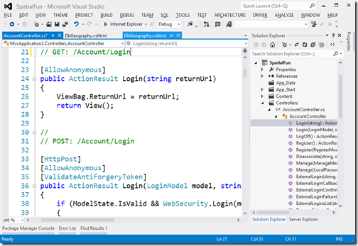
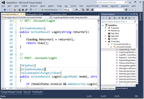
Here's my default, which is the VS2012 defaults with larger fonts.
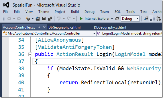
Here is Visual Studio 2012 again, except this time I've used Matthew Johnson's Visual Studio 2012 Color Theme Editor and applied the Blue theme:
Here it is again with the ALL CAPS registry setting turned off:
HKEY_CURRENT_USER\Software\Microsoft\VisualStudio\11.0\General\SuppressUppercaseConversion
REG_DWORD value: 1
Now you're pretty much back to the VS2010 look and feel. I've zoomed in here to make it clear.

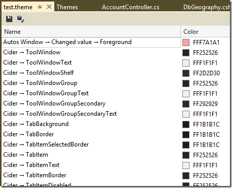
Go nuts! You can make and share custom themes yourself! With this add-in you can customize a lot more than the default installation allows:

Have fun! Go get Matthew Johnson's Visual Studio 2012 Color Theme Editor now.
UPDATE: I personally would not go this far, but you can also patch the icons if you feel strongly about it. http://vsip.codeplex.com
About Scott
Scott Hanselman is a former professor, former Chief Architect in finance, now speaker, consultant, father, diabetic, and Microsoft employee. He is a failed stand-up comic, a cornrower, and a book author.
About Newsletter
Thanks!
It is a though a great news even if rounded corners are still missing as all those rectangle areas are less fine visually.
I also hope that sets of icons ( beit the old ones or new ones but that wold be meaningfull) will be able to substitute the current set that is absolutely confusing as they all look like each other and are quite meaningless.
Sorry thus to be only half positive but this add-on only solves half of the mess caused by the new ugly ( should I say Modern ???) design.
Incidentally... turning off all caps? Why not hide them altogether?
Why not remove all vowels from all Menu items, since one can effectively recogize words from consonants alone (worked in many Semitic family languages) ? :)
Fl Dt Vw Dbg Tm SQL Tls Tst Nlyz Wndw Hlp
best, Bill
I don't suppose there's a secret registry key for disabling the god-awful main menu spacing between items? While it makes the ALL CAPS style a bit less cluttered, it hurts the soul as much as bad kerning in Title Case menu mode.
(I tried making this comment as positive as possible according to the hanselminutes advice, this is as good as it gets :D)
When there are two opposing polars to visual function, make it a setting and let people change it the way they like.
BTW, the free "VSCommands for VS 2012" add-on has a setting for this plus other useful settings.
I would bet money that the graphic design teams at MS did not review this before it shipped, and that a group of programmers said "hey let's try to get this to look more Metro-ish".
Programmers should not design UIs.
I don't see anyone hating change here. People hate it when the products they HAVE to use for 8 hours a day are unuseable and make their eyes hurt.
I really don't understand what's gotten into Microsoft's head lately.
Would like to change the window background color of the top part of the window from white to something else. Because the ComboBox in that location is now completely hidden, as it is also white.
This is the default behavior of the "Blue" theme.
Why are Microsoft persisting with leaving them on by default, despite the universal opposition? It's just making Microsoft look like it's run by total idiots!
Scott - what position would you need to have within the dev division, where you could have the most influence over direction? You've always got a balanced and practical view of things, a great attention for detail, and you're universally respected by your readers. You've got my vote already :-)
C'mon scott, how could you let that Evil UI Genius do this to our Visual Studio?
Spent 6K and i'll use VS2010 as long as i can, and hopefully by that time, Microsoft will stop panicking over Apple and Google and start innovating again rather than devolving when it comes to UI. Who knows, hell might just freeze over and i'll get my wish.
This time they claim monochrom icon make user focus on coding.
Inside MS, there is no different opinion or voice for such childish and naive thoughts. You can imagine the company culture. Every one want to kiss the boss ass to hold the position.
The registry hack for Web Express: HKEY_CURRENT_USER\Software\Microsoft\VWDExpress\11.0\General
Now if you can fix the find dialog... I dunno man, I'll, like, have your babies or something!!
There is one tweak that I would really appreciate and that is to make all the editor font styles BOLD in one go. Rather than individually set each one.
Mark
To expand and bring as much closure as is currently possible (not 100%, but it's close):
- change the color theme to blue or something you're fairly happy with, run the icon patcher at http://vsip.codeplex.com to get solution explorer back to a usable stateinstall the NiceVS extension from the Visual Studio Gallery
Only Microsoft can give us that last mile. Any thoughts on making your customers happy, MS?
i'd like to use the "Blue with Dark Editor" (which doesnt exist yet)...
I literally have to hover mouse on the toolbar icons to read the tooltip. The icons themselves are way too different than the old ones.
-
AMir.
If the icons are such a determining factor to finding the right file, then it seems to me that you need to organise and name your files better.
I prefer Blue with Dark Editor too. But haven't find a easy to create it :) Anyone can help?
cateyes
Not just on aesthetic grounds either - the icons are a means of data visualisation which should allow me to perceive the detailed structure of my application at a glance ie; I shouldn't have to read the text (sorry, Adrian but I DO organise and name my files fairly well, in my opinion).
Usability of the current schemes/icons are a seriously retrograde step compared to vs2010 - whoever green-lit this should be shown the door...
http://www.hanselman.com/blog/VisualStudioProgrammerThemesGallery.aspx
( http://studiostyl.es/ )
Any way to get the whole appearance looking a bit less flat and 2D? I really can't understand the people at microsoft, wanting the very latest releases to look ugly and flat in comparison to previous ones.
Kind of like watching episodes of Family Guy in reverse order - the animation gets more crap as time goes on.
I'm new to VS 2012 and don't know to add this!
How do I get the old icons back, these new ones are dog crap.
Well really it is just dressing
It would be great if the intellisense worked correctly since that is actually important
Oh lord. A folder looks like a folder EVERYWHERE else (Win Explorer, file dialogs, etc etc) and then is reversed, black, and looks like some kind of rectangle with a key on top of it (well, that's the best I can do anyway) in VS. So we're not just talking undoing years of burned-in targets to look for, but they are still the same EVERYWHERE ELSE which just screws with your mind all the more.
THAT does not help with target acquisition no matter how you've organized anything!
My solution is the icon patcher and using parts of VS (Source Control Explorer esp) as little as possible until the IP works for those too (TFS Power Tools being great for doing TFS stuff from Win Exp for instance).
Comments are closed.


