MSDN Updates - and RFC for you
There's a bunch of stuff going on over at MSDN. They're making some cool changes and aren't afraid to break a few eggs to make an omelet. I used to think that MSDN was this static, non-moving thing, but I've been meeting with a bunch of folks on the various sub-teams and I'm seeing a resurgence of agility. (MSDN, agile?! Madness! No, seriously.) Soma blogged recently about some of the changes.
Here's some of the stuff that's been going on lately at MSDN, as well as a Request for Comments (RFC) from me.
Alternate MSDN Views
I blogged while back about alternate views for MSDN, including a Low-Bandwith (loband) view. MSDN includes the Home Page (of course), the MSDN Library, Downloads, Community and Forums. The library experience (LEX) team has updated the loband view as well as the new dev10ide view. They're aiming for sub-1-second load times, small page weight and they are reading all the feedback.
MSDN Forums in ASP.NET MVC
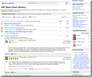 The MSDN Forums have been updated and are now written in ASP.NET MVC. This, along with other changes has made the forums markup much smaller and the site much snappier. This forum upgrade went out to all MSDN/TechNet forums, including the Windows 7 Forums and Windows Client Development Forums.
The Forums are also more answer-focused now, kind of like StackOverflow. You can see how many questions remain unanswered, mark questions answered, and browse by tag. There's also filters like "hascode" to show only Q&A with code, or you can show only "helpful" answers, or just proposed, but not accepted answers.
The Forum Reading view has been updated with AJAXy goodness, so you can expand threads without leaving the page.
Other tweaks to MSDN include, the MSDN Community Center that includes not just blogs, but also tweets, delicious links, Technorati results and Diggs.
What would a new MSDN look like?
Chris Sells told me once:
"If you're not getting in trouble at least twice a year, you're not doing your job."
This statement really changed the way I thought about my job. It's good to push the envelope.
I was in an MSDN redesign meeting and they were brainstorming on some potential designs. I said, hey, let's go crazy here and try some way-out-there-MSDN designs. A bunch of emails have been thrown around and since they never explicitly said "don't blog this," I figured, why not ask you guys, then take the feedback/comments you give directly to them.
This is just brainstorming, to be sure, VERY early on for a potential redesign. I picked a few comps that the designer was working on that were in the same vein, but different in purpose.
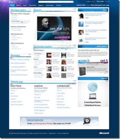
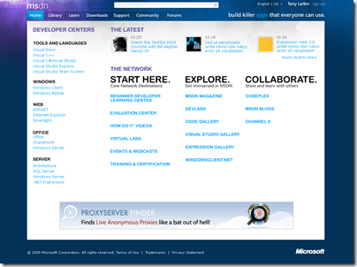
First, here's a concept design for a a would-be MSDN Home Page. There's two goals here, and a visual refresh is just one of them. The other is to change the user experience to make it easier to find things. To make it easy to find things you need, but also have enough active content to have "serendipity" moments when you see something you wouldn't ordinarily.
There's a community visualizer at the middle there. It'd be an active widget and clicking on the left site would get you real-time results with recent activity, most popular items, etc from all over the network.
The Developer Centers are called out on the left-side to get you to the top areas in one-click. I pushed them to get you from the MSDN Home page to mostly anywhere in one click, two tops. For example, downloads has the most likely download links. At the bottom, you can get to other sites within the network.
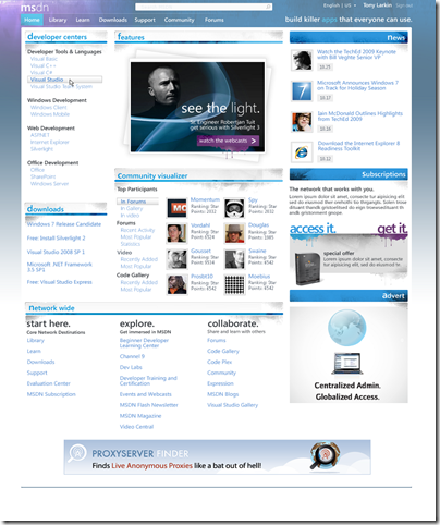
Perhaps a lighter frame?
Darker? Notice the "channel bar" at the top in gray.
Perhaps a compromise?
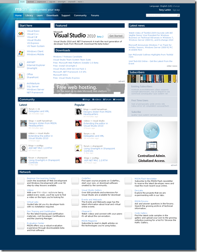
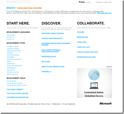
This potential home page is as a result of me saying, do the opposite of what we'd ordinarily do. Is the MSDN Home page too visually busy? Make it simpler. How simple can it get, and if it gets simple, does it still provide value?
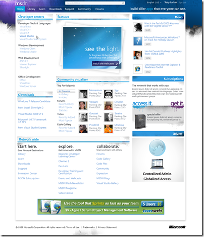
Perhaps without the blue frame? Even simpler?
Please offer your opinions and comments here. MSDN is your site and if you have an opinion, make it heard and I'll pass them out to my bosses. How should the site look? How do you want to use it? What do you think of these designs? What works and what doesn't?
If me leaking designs like this is helpful, tell me here and I'll use them as character references at my Court Martial. All the better if you find it helpful, then I'll have good reason to share even more, even earlier in the process.
About Scott
Scott Hanselman is a former professor, former Chief Architect in finance, now speaker, consultant, father, diabetic, and Microsoft employee. He is a failed stand-up comic, a cornrower, and a book author.
About Newsletter
I don't think the main MSDN pages need too much of an overhaul. They work rather well and get information across pretty clearly. The one thing I think really needs an overhaul is the MSDN library. Navigation in FireFox is still buggy, using the click-scroll. The filter by languages rarely saves, the side frame is completely annoying.
Aside from the design, I am very excited to see a change to the MSDN site design coming in the (hopefully) near future.
Overall, I really like that look. The others don't really do it for me and look more like advertisements. I also think the darker one with the Channel Bar looks the most polished and most professional. The image below the MSDN logo is a nice touch, but not too overbearing.
How about adding something in the search that say “Powered By Bing?” :)
The colours are nice tho.
[)amien
P.S.: Not sold on that "combo" ... nothing wrong with it, but I actually like the dark borders.
And yes--keep leaking. It's people like you that keep Microsoft fresh.
http://www.hanselman.com/blog/content/binary/WindowsLiveWriter/MSDNFeedback_93A3/MSDN_NORD_HOME_thumb.png
On the current home page I really like the blogs, downloads, and the subscription box. I would prefer the MSDN home page to accomediate more content, not less. Actually what I've always wished for was a MSDN homepage that was customizable like MSN, yahoo, etc. I could add widgets for the Forums, blogs, twitter, downloads, etc. It would also be nice to somehow rank how relavent a technology is and what my prefered language is etc. So for instance I could say I'd like to see more or less silverlight stuff and even have the ability to filter it out all together.
All I'm asking for is a MSDN homepage that can read my mind and do whatever I want, is that too much to ask? LoL. Anyways, my main point is please keep in mind that some of us rely on this site every day and what is important to me is finding answers and learning about better ways to do things.
Thanks for all the hard work the MSDN team does! I know you won't let us down.
P.S. (Visually I like the dar with chanel bar feel the best)
The C# Developer Center's Community Tab should aggregate Stack Overflow's hottest questions with C# tags.
I would love to choose your potential home page, because i believe it will be fast to open and in the same time will organized! also why not to make the others to be like Themes! everyone can pickup his own favourite one :-)
Thanks,
Mohammed
Any chance someone could package up the MVC forums code as a starter kit or out on Codeplex? From what I can see, it looks waaayy better than anything else available on the .NET platform.
My problem with every one of these layouts is that they require me to read a substantial amount of words on the page that don't pertain at all to what I am looking for or what I care about, and that's precious time that is wasted. I don't want to have to scan the page to find useful tidbits among many things I'm not interested in at all. I'd much prefer to give you some profile information about me (I'm already signed in with my Windows Live ID anyway) and let you do the heavy lifting, providing me with content that is the most relevant to me and what I do based on how well it matches my profile and not consuming screen real estate with stuff I don't care about. That's why I usually use google search, twitter, RSS feeds, and other Web 2.0 media today: they help me waste less time and get results faster. Why aren't we learning from those experiences and finding ways to boost productivity through websites as well?
Writing this just reminded me to check...I don't even have a home page in IE that I use anymore because it's gotten to the point where I don't even have one page that I read in a browser on a regular basis because I don't have time to casually browse for what I need to find.
Maybe you're not redesigning these pages for someone like me and you're more interested in the casual browser. But just in case you were, I thought I should tell you that while they look nice and while there may be one or two I find more visually appealing, none of them are going to suit my needs if they aren't smart enough to learn from me and only show me what is most relevant to my job. Learn from the usefulness of stack overflow. Tag content internally with appropriate tags so that they can be matched with users based on their profile (which should allow users to get as granular as they want to), allow users to mark items as relevant or not (or thumbs up or down) and influence the content on their own customized site as well as the customized site of other similar users within an allowed degree of variance from their own profile. Improvements like that will be much more likely to get my attention.
Thanks for sharing and listening,
Kirk out.
One of the biggest challenges we face with MSDN is accommidating folks who are visiting the site for the first time. Today, as a first-time user of MSDN, I'm confused. "What is this? Where do I go?"
We need to simplify, simplify, simplify.
http://www.hanselman.com/blog/content/binary/WindowsLiveWriter/MSDNFeedback_93A3/MSDN_LOCH_HOME_2.png
Anyway, I vote for a skin-selector dropdown!
for example:
1) don't reload the whole page when selecting nodes in the tree view
2) when navigating, don't close nodes in the tree that I previously had open.
3) more relevant links, eg. put a link to 'regex language elements' on _every_ regex-related page
4) scrolling is broken on iPhone - the two-finger div scrolling is a pain.
I love the rethinking of MSDN, by the way. Keep up with the good work, Scott.
Serendipity moments? Easier to find things? How about a new color? A silly gimmick 'visualizer'? when are you people going to realize that people simply want help in using your tools to do their jobs better? we don't want purple, visualizers or news, we want help, stop wasting resources on stupid stuff like this.
Two goals: a visual refresh (why bother on this?) and make things easier to find? I have two better stated goals: fix your search engine and make your centers online applications that let me decide what should go there.
Why don't you blog something that says "hey, since we don't know and can't explain the 4 things we want our site to do for people, how about making it purple?"
When using MSDN search gives me zero results, but "site:msdn.microsoft.com" does, that means I'm never going to see this redesigned page since it's only a feel-good exercise for y'all, maybe some performance objective ticked off, and not actually the way people use the site.
It's clean, easy on the eyes and it's keeps the focus on the main content (less distraction).
That first one looks like MSN - "ScottGu and BHarry caught pair programming! Exclusive pics inside!" "Is the new C# GC too trashy? Vote now!" "You won't believe what went down at Mix09" "Dear MSDN, this one time at Code Camp..." Do I need to go on? I want information, not silverlight effects.
As far as aesthetics of the simple page, I prefer light-colored pages, but not plain white. Maybe even something similar to your blog, where it has a slightly darker variation on the border? I don't have a strong opinion on this, though.
Get rid of the information overload.
JW
Simple doesn't mean less powerful, however simple is always the way to go if you can afford it.
Comments are closed.
