Monospaced Programming Fonts with Ligatures
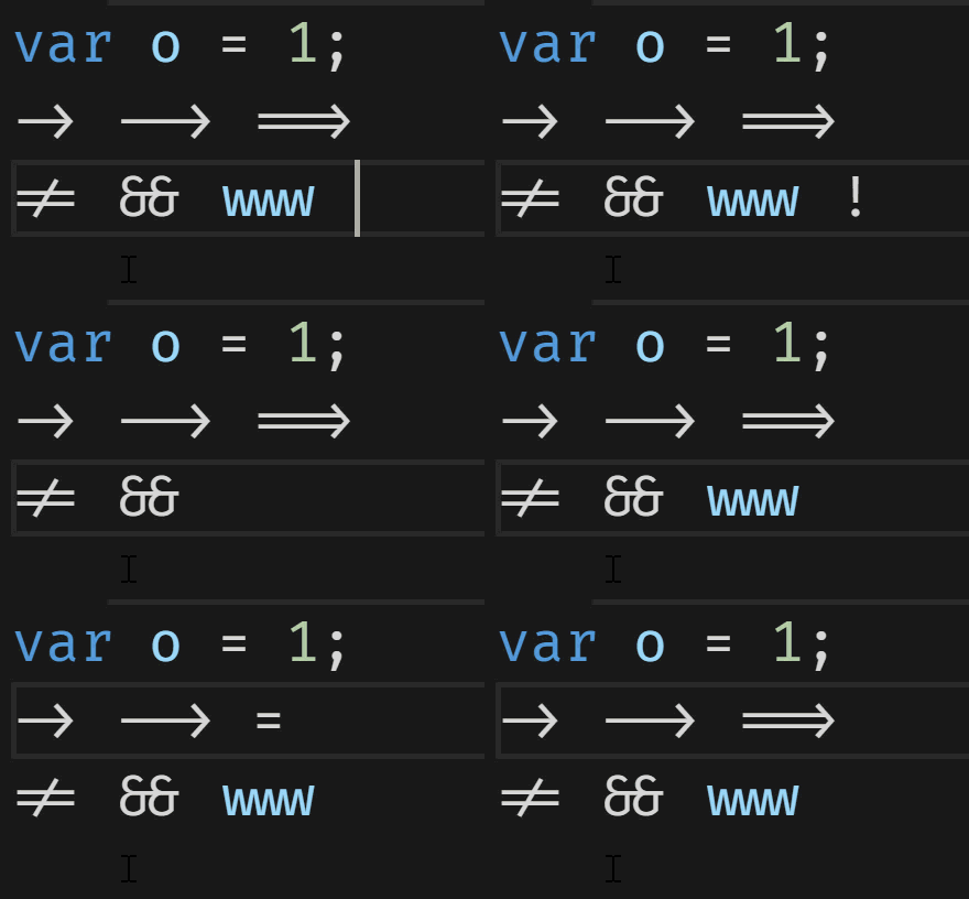 Typographic ligatures are when multiple characters appear to combine into a single character. Simplistically, when you type two or more characters and they magically attach to each other, you're using ligatures that were supported by your OS, your app, and your font.
I did a blog post in 2011 on using OpenType Ligatures and Stylistic Sets to make nice looking wedding invitations. Most English laypeople aren't familiar with ligatures as such and are impressed by them! However, if your language uses ligatures as a fundamental building block, this kind of stuff is old hat. Ligatures are fundamental to Arabic script and when you're typing it up you'll see your characters/font change and ligatures be added as you type. For example here is ل ا with a space between them, but this is لا the same two characters with no space. Ligatures kicked in.
OK, let's talk programming. Picking a programming font is like picking a religion. No matter what you pick someone will say you're wrong. Most people will agree at least that monospaced fonts are ideal for reading code and that both of you who use proportionally spaced fonts are destined for hell, or at the very least, purgatory.
Beyond that, there's some really interesting programming fonts that have ligature support built in. It's important that you - as programmers - understand and remember that ligatures are just a view on the bytes that are your code. If you custom make a font that makes the = equals site a poop emoji, that's between you and your font. The same thing applies to ligatures. Your code is the same.
Three of the most interesting and thoughtful monospaced programming fonts with ligatures are Fira Code, Monoid, and Hasklig. I say "thoughtful" but that's what I really mean - these folks have designed these fonts with programming in mind, considering spacing, feel, density, pleasantness, glance-ability, and a dozen other things that I'm not clever enough to think of.
I'll be doing screenshots (and coding) in the free cross-platform Visual Studio Code. Go to your User Settings (Ctrl-,) or File | Preferences, and add your font name and turn on ligatures if you want to follow along. Example:
// Place your settings in this file to overwrite the default settings
{
    "editor.fontSize": 20,
    "editor.fontLigatures": true,
    "editor.fontFamily": "Fira Code"
}
Most of these fonts have dozens and dozens of ligature combinations and there is no agreement for "make this a single glyph" or "use ligatures for -> but not ==> so you'll need to try them out with YOUR code and make a decision for yourself. My sample code example can't be complete and how it looks and feels to you on your screen is all that matters.
Here's my little sample. Note the differences.
// FIRA CODE
object o;
if (o is int i || (o is string s &&
    int.TryParse(s, out i)) { /* use i */ }
var x = 0xABCDEF;
-> --> ==> != === !== && ||<=<
</><tag> http://www.hanselman.com
<=><!-- HTML Comment -->
i++; #### ***
Fira Code
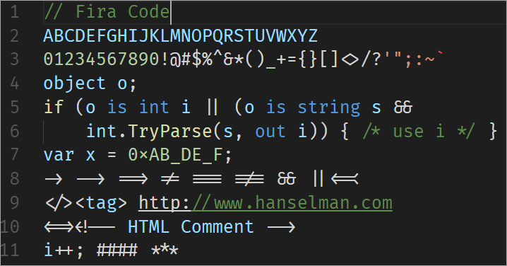
There's so much here. Look at how "www" turned into an interesting glyph. Things like != and ==> turn into arrows. HTML Comments are awesome. Double ampersands join together.
I was especially impressed by the redefined hex "x". See how it's higher up and smaller than var x?
Monoid
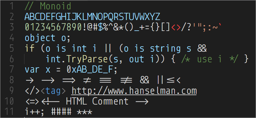
Monoid prides itself on being crisp and readable on retina displays as well as at 9pt on low-res displays. I frankly can't understand how tiny font people can function. It gives me a headache to even consider programming at anything less than 14 to 16pt and I am usually around 20pt. And my vision is fine. ;)
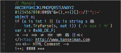
Monoid's goal is to be sleek and precise and the designer has gone out of their way to make sure there's no confusion between any two characters.
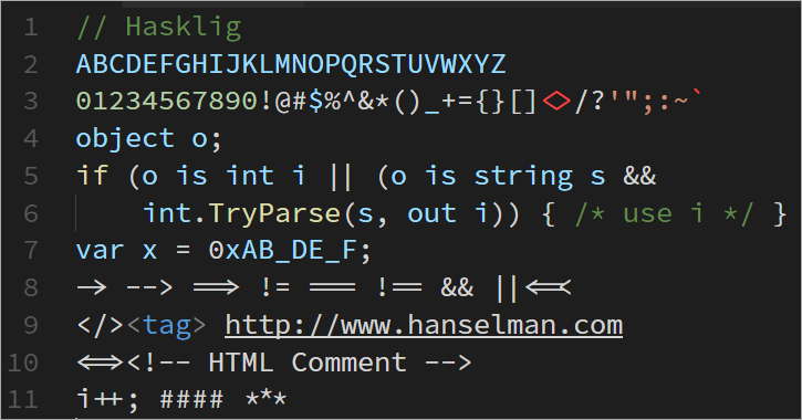
Hasklig
Hasklig takes the Source Code Pro font and adds ligatures. As you can tell by the name, it's great in Haskell, as for a while a number of Haskell people were taking to using single character (tiny) Unicode glyphs like ⇒ for things like =>. Clearly this was a problem best solved by ligatures.
Do any of you use programming fonts with ligatures? I'm impressed with Fira Code, myself, and I'm giving it a try this month.
Sponsor: Thanks to Redgate! A third of teams don’t version control their database. Connect your database to your version control system with SQL Source Control and find out who made changes, what they did, and why. Learn more
About Scott
Scott Hanselman is a former professor, former Chief Architect in finance, now speaker, consultant, father, diabetic, and Microsoft employee. He is a failed stand-up comic, a cornrower, and a book author.
About Newsletter
FiraCode looks pretty damn sweet in VS Code. I wrote about it here:
http://www.mindbodysouldeveloper.com/2016/10/23/why-i-changed-my-visual-studio-code-font-to-fira-code/
I assume that the underscores in the hex value are part of the ligature additions. That definitely seems misleading to me but each to their own.
I went to the Fira Code link in the article (on GitHub) and the docs say it's compatible on VS2015 and 2017 simply by installing the font and selecting it.
I did the following:
- downloaded and extracted
- right-click-install
- switch back to VS2015 windows, tools >> options >> font & colours >> texteditor >> fira code.
The font in my editor changes but when I copy/paste Scotts example there are no ligatures shown. At the time I pasted into a C# class file.
Despite the newly installed Fira code being available in the font list and changing the Visual Studio 2015 font to something different to what I was using (Consolas) it wasn't really doing it right. A restart of Visual Studio sorted it out.
I did try using ligatures briefly a while back. I say "briefly", because I quickly reverted - I found I needed to continually translate mentally from ligature to code and it added a processing overhead that my ageing brain couldn't deal with.
I'll agree that it's pretty, though. ;-)
Main problem for me is that we do a lot of Pull Requests, so I am as likely to see code in a browser as a editor. I think flipping between two fonts like that would probably be a worse experience.
I think MS should provide one of these fonts by default along with Consolas when we install Visual Studio though installing FiraCode and using it is easy.
Would love to see http://input.fontbureau.com/ add ligatures.
See also: https://gist.github.com/renatorib/a0d7af29133c8a775b0740d0b67e32a8
If I could do such a thing, I'd make a version of Consolas that uses ligatures to make small changes (e.g. tighten spacing between = and > in =>), but I'd leave characters visually distinct. I don't care for the merged look. I feel like I have to keep peering at it to figure out whether the lines are == vs ===, => vs ==>, etc.
https://medium.com/@peterpme/operator-mono-fira-code-the-best-of-both-worlds-191be512fd5e
I'm finding that translation difficult in either direction. What's the explanation?
Yours,
ProggyTinyFan ;)
There is nothing more magical than typing in '->' for a lambda function and seeing an APL-style glyph emerge.
I 100% disagree with the otherwise brilliant Matthew Butterick on this. https://tinyletter.com/mbutterick/letters/q-ligatures-in-programming-fonts-a-hell-no
As it appears that Niklaus Wirth is not following your blog as I do, it will be my responsibility to state the case for proportional spacing even though I have not received the Turing award as Niklaus has :)
Like many programmers I had accepted the "fact" that program code should be using monospaced font. That was until I read the book on Modula-2 written by Wirth where he states the case for using proportional spaced fonts.
His main arguments as I remember are as follows:
Books have been published for centuries with proportionally spaced fonts for a very good reason. The text is more readable and about 30% more characters can fit in one line using proportional rather than monospaced font reducing the need to split logical lines into physical lines.
I grew up programming with line printers incapable of printing any proportionally spaced fonts. Lots of systems did not support proportional fonts for a long period maybe leading programmers to think that monospaced fonts where an inseparable part of programming.
In my experience, proportional fonts have worked very well. On occasion, I have come across code formatted in a way that seems to assume monospaced fonts for display but that has not bothered me much.
I don't see any fundamental difference between software code and other texts that requires monospaced font for programming.
https://github.com/tonsky/FiraCode/issues/259
but other than a nicer visual look, it doesn't really improve things.
After that IMO `Hasklig Semibold` looks a lot like all time fav. Consolas.. `Fira Code` seems a wee bit to busy for me.
So --> Restart VS.NET! <--
https://fonts.google.com/specimen/Cousine
FixedSys Excelsior
https://github.com/kika/fixedsys
Comments are closed.
