Summer 2011 Stats - Tailoring your Blog to your Readers' Browsers
I was poking around in my Google Analytics and checking out some browsers stats as I wanted to make sure my new site redesign looked good on the browsers that matter to you all, Dear Reader. As I said in the redesign post (insert egotistical self-quote here. Seriously, who DOEs that?):
This new site design looks great in every awesome browser like Opera, IE9, Chrome, FireFox, and even all the way back to IE7. This site looks like a steaming pile of ass in IE6. As it should.
- Scott Hanselman
Of course, as some internal naysayers are right to say, nayly, these charts are invalid as they are inside the HanselBubble where (they say, these sayers of nay) that we all run Chrome 99 and Beta Builds of Windows 7+1.
Nonsense! I say. It's always interesting to see what the user demographic is. With that, to the charts! First, the big one, Visits by Browser.
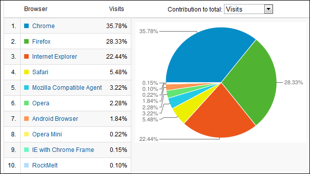
Interesting, almost looks like the Google Logo. You've got the big 3 in there almost with 1/3 each, but Chrome is ahead and IE and Firefox are more like 1/4 each. We made sure this blogs and works OK on the top 90% of the browsers that hit it and it should look OK on the rest.
Now, let's drill in. First, Chrome:
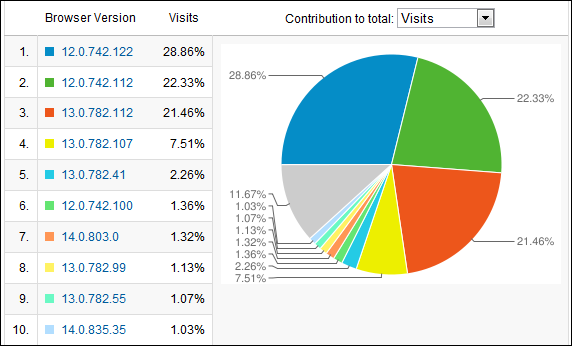
Looks like Chrome's auto-updating strategy sure works. I do worry myself, sometimes, that a security bug will sneak in to one of my thrice-daily Chrome updates, but we'll see. There's a balance between security and stability and new features. I hope they've found it. Everyone is basically on Chrome 12 or 13 it seems. I'm on 15 'cause I'm a canary.
What about Firefox?
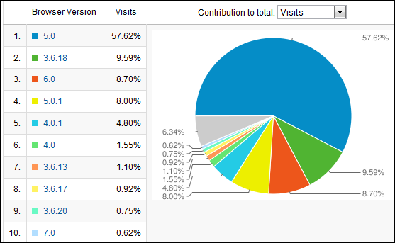
Nearly 60% on 5.0, but 6.0 is doing pretty well given it JUST came out. I'm a little surprised at the Firefox 3.6 numbers. 10% is a little high, IMHO, but there are those that believe that was a great release and have stuck with it.
Next, Internet Explorer:
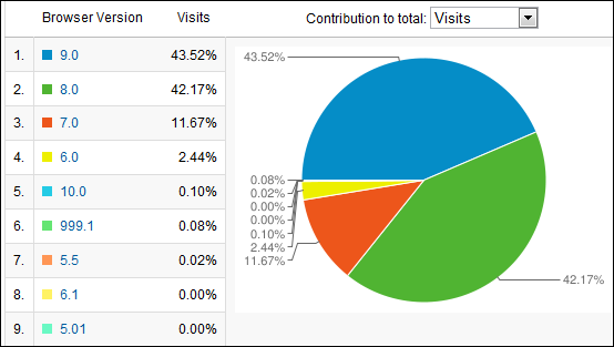
Big numbers for IE9. I assume that's because Windows 7 isn't Windows Vista and folks are really liking it. Also possibly that folks who read this blog do Microsoft tech and have installed IE9 to be on the latest stuff. Kudos to Jeremy for getting this site's markup to work on IE9, IE8 and IE7. I'm afraid not for you guys on IE6. I'm sorry your corporation is oppressing you.
Screen Resolution
Y'all got some LARGE monitors and high-resolution displays! 90+% of my readers are running screens wider than 1024x768.
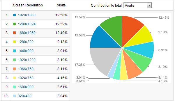
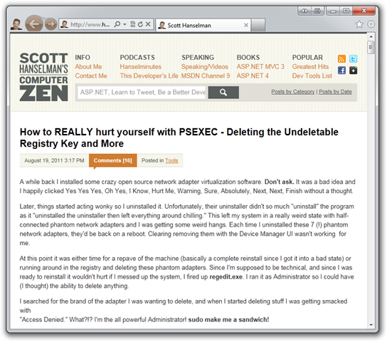
One could argue from these numbers that I could target 1280 as a browser width, but with this new redesign Jeremy and I decided to support not only mobile (decently, although we need to take a deeper look at how to make the fonts more readable) but also really small resolutions on netbooks and stuff. Here's this site resized to about 800x700:
And still this same blog, but now resized to about 1500x1500:
_2836dcb5-d261-4e12-8d1b-8e2d5984dc38.png)
Mobile
On the Mobile side, I had about 15k PV from an Android Browser version which is almost as much as Opera on my site, nearly 2%. This explains all the emails I've gotten about a bad cert issue that only shows up on Android. There's almost 6% Safari, and about half are iOS devices.
86% of the mobile browsers that hit my site have a touch screen. I don't have good percentage numbers but I do have this sorted list of visits by mobile device. I know that about 8% of the browsers that hit my site are mobile.
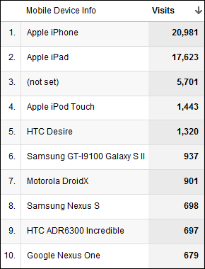
I don't obsess over these stats; I maybe look at them twice a year or when making large decisions. It IS useful for you, Dear Reader, to take a look at your own readership. Perhaps they are Cupcake baking Moms, or Linux Hackers, or Fly-fishing Retirees. What browsers do they run? What resolutions are their screens? How fast are their connections? Does your website or blog know who your audience is and cater to not only their minds but also their browsers?
About Scott
Scott Hanselman is a former professor, former Chief Architect in finance, now speaker, consultant, father, diabetic, and Microsoft employee. He is a failed stand-up comic, a cornrower, and a book author.
About Newsletter
I think you mean Chrome's logo :)
My tip is "make sure it looks good on Google Reader", as that is all I ever use to read blogs (except when posting comments). It works brilliantly on the iPhone (and most mobile devices), making the font just the right size with no zooming, keeps all your blogs/feeds together in one lovely collapsable list and stores it in the cloud so you can keep up to date anywhere on any device.
For those poor sods who don't use google reader Scott, your blog could use a simple list of titles somewhere (perhaps on the right panel) which would save a lot of scrolling when looking for a particular post. I know you have lists by tag and a weird calendar thing in a link. As for me I'm happy with Google Reader, do what you want with your formatting!
Comments are closed.

With over a million pageviews a day, even a 1% share accounts for a lot of eyeballs, and our IE6 share is currently around 7%. That's higher than Firefox and Chrome combined. Our most common resolution? 1024x768.
I am dreaming of the day when IE6 usage on our site drops to a level where I can recommend that we stop supporting it.