Video Tutorial and Screenshots: Windows 8.1 Update 1
I have a personal MSDN account so I download and installed the Windows 8.1 Update as soon as I could. It'll roll out to the rest of the world slowly in the coming weeks.
The verdict? It's a significant improvement. I use an X1 Carbon Touch laptop, and while it has a touchscreen, I spend most of my time on the mouse and keyboard. I'm comfortable with moving between Store (fullscreen) apps and Desktop apps but it's always a little jarring. You're leaping between two universes. I want to live in one universe and this Windows update merges them in a measured way that means I'm moving faster when using my computer.
I've just put up a brand new 5 minute YouTube video to give you a tour of just a few of the new features.
After you get the update, you'll notice immediately that the Windows Store - a full screen app, mind you - is pinned to your Windows Desktop's Taskbar. You can now pin any app, desktop or store, to your Taskbar.
Even better, you can close them with a right click, just like you're used to:

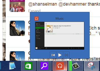
And Windows Store apps like Xbox Music that use the Media Controls can also get taskbar enhancements like the Media Controls within the Taskbar button. Here I'm controlling the music in my Windows Store app while I'm in the desktop. The "universal" music controls also pop up when you press your hardware volume keys as well.
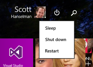
The Start Screen now includes a power button and search button, always.
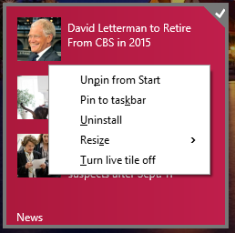
If you right click a pinned Tile with the mouse (or Shift-F10 with the keyboard) you'll get the familiar context menu. You can change sizes, pin to the taskbar, and more.
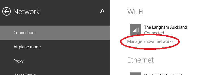
There's also some nice subtle changes and features added. This is great for me as I travel a lot. I can manage my known Wi-Fi networks now. This was in Windows 7 and was either removed or hidden. I even wrote a utility to manage Wireless Networks because of this missing feature. Well, it's back.
You can move the mouse to the top of a Windows Store app and a title bar will appear. Click in the left side of that title bar, and you can now control Window Splitting.
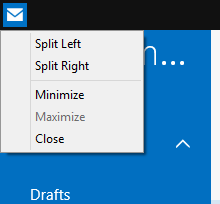
Windows Store apps also get Minimize and Close buttons as well.
![]()
Newly installed apps are easier to find and a notification appears on your Start Screen:

Fullscreen IE11 also has an option to always show open tabs, useful if you're an "out of sight, out of mind" individual.

All in all, it works surprisingly well. I'm moving around Windows faster than before and actually using more Store apps like Mail and Music.
Free Windows 8 and 8.1 Tutorials
I've made this easy link to my free Windows 8 Tutorials. There's a whole playlist up on YouTube and you can get to them from here: http://hanselman.com/windows8
Please do pass that link along to family and friends, or via Social Media. Thanks!
About Scott
Scott Hanselman is a former professor, former Chief Architect in finance, now speaker, consultant, father, diabetic, and Microsoft employee. He is a failed stand-up comic, a cornrower, and a book author.
About Newsletter
To me adding the title bar to metro apps is unnecessary and ruins the visual style. I can't help but think this is pandering to people afraid of change and Microsoft should have stuck it out, those users won't be coming to Modern anytime soon anyway. We have all seen beautiful desktop apps without title bars.
Right click menus I agree with adding but again break the visual style. Why didn't we get something that looks Metro e.g. the One Note circular menu. Why is their a visual inconsistency between the power button menu and right clicking on a tile.
//KH.
Windows 8 is the reason I've moved to Mono on Linux.
Thank you, Microsoft, for making Windows 8 (and VS) so awful that it's helped me find a better development environment.
Windows 8 in desktop mode seems better and feels faster then Windows 7. I think it also looks modern and sharper. Great work there. But Scott we all love you but be fair: What does the start or tiles mode brings to the table which is better on a desktop without a touchscreen? the big tiles (better some kind of home grown of bought fences baked in desktop mode) for the elderly? The IE 11 which should come with a user manual to split screens and use tabs which don't look like tabs? does it bring better overall user friendliness? Running a desktop in a split screen? How confusing is this?
I think what the desktop user wants is W8 without charms and another mode. It wants a desktop mode with some of the 'other mode ' great features baked into the start menu and desktop.
The whole tile look and feel in Windows 2012 server? Why? Tears in my eyes. Like servers gets used by the elderly?
Again, there is nothing wrong with the sharpness and modern looking desktop mode. There is also nothing wrong with the 'tiles' mode on touch pads. There is everything wrong with this schizophrenic 2 modes windows 8. It's a mess.
There should be some serious strategic rethinking about this. Probably with other people involved because the current team did some changes which are just not enough for the desktop and shows lack of vision in the machine-human interaction department.
I get that people like full screen applications running from an aesthetic point of view, but for me the greatest productivity on my computer comes from being able to see the context of all my applications at the same time.
As we slowly see MS giving updates that bring back more and more context it strikes me an admission that this UI does not work for people. Instead of continuing to waste effort moving this back to what we had before would this not be a better time to go back and think about the problem from the start? We use our machines to do more than one task all the time. give me an interface that makes that easier, not harder.
As a side-note, for a demonstration of "Windows" to sound so pandering on the subject of minimising shows how far we have to go.
I am really happy to see these changes as I use Win8.1 in a non-touch environment on my desktop. Having a title bar on full-screen apps will save me from many attempts at mouse gymnastics in order to close the app. Tabs and Reading View are also great additions to the full-screen IE (when I am on my SP2). I often choose the desktop IE even when I am in tablet mode just for tabs. Good changes MS!
I'm a big fan of most of these changes, not because I personally will enjoy them, but because they'll make it easier to convince my office to introduce Windows 8 and then I can slowly start converting people to the wonders of Windows 8 :)
It's sad that so many loyal paying customers have to beg for and sit around waiting for little bones like this update to be thrown to us. I've been a lifelong Windows user and enthusiast, but 8.x on a desktop PC is almost unbearable. Making it slightly less unbearable with "subtle updates" just isn't enough.
"You didn't have to upgrade", "you didn't have to buy it", "you didn't have to..."
Yeah, yeah, yeah, we get it. We're all the stupid ones. Shame on us for wanting to support and be proud of the direction Microsoft is going with their OS.
"Do you have Update 1 installed?"
"Yes, I have Windows 8.1"
"Can I paste into the start screen like I could paste into the Windows 7 search box?"
If you swipe up to all apps, yes, you already could do that in 8.1 proper.
I'll note that some of these have been in here since 8.1 including:
* Show desktop background on Start
* Boot to Desktop (though there's been some debate on whether this is happening automatically on Keyboard/Mouse systems now)
In any case it's great the Windows team is working out some of the issues that users have had with 8.x
Feel free to visit my homepage :: bar reinforcement concrete
Metro's efforts to be everything to everyone creates challenges for UX designers that didn't exist before and it is going to take time to get that formula down. I'm sharing how a laptop/desktop user who is used to desktop-only UIs believes Windows 8 could be improved. Visual cues and metaphors are key, we use keyboards, and we don't tap, we click.
When my mom searched for files from her old computer with the term "mom's old computer", Windows Search presented her a pornographic site about grandmas and grandchildren. Needless to say she was furious. If this feature is going to be enabled by default, THAT, can never happen. If Microsoft cannot guarantee that will never happen then it needs to be an opt-in feature with a disclaimer, or the feature needs to be reworked to be safe by default.
As a developer / power user I am in the small percentage. I don't want mouse interactions to be second to touch input. I don't care to much that an Xbox One controller can now access the same content... Right up to the part where I want my apps to be used by everyone on earth on any device!
Do you see the catch 22? The people making the apps resist the changes and we are thought of as second class citizens. When we help other users, suggest new ones to buy or (I know.. ) fix their computers we spend 90% of the time complaining to them and saying "don't do this" and "do that", as to us windows 8 is rubbish.
However windows 8 is only not as well received by power users. We like our old ways, we are resistant to change and don't understand at times why something is better or easier to use for new users.
This brings me to the ribbon bar. It took me a while to see it, and to be honest.. I still hate it. The ribbon bar is great for new users to the software. The context interface is great. But why couldn't Microsoft just leave the option to show the menu bar and keep every one happy? Its the same with windows 8, give the power users the option to turn on the start menu and boot to desktop and we will be happy as Larry.
So to sum that up, Microsoft... Give the user the choice, don't guess what is best for all of us.
Being a software engineer, someone all about abstractions, I like the concept of ONE user interface across many platforms but in practice you really need to tailor the user experience to each device category (phone, tablet, monitor/desktop/laptop, TV/home entertainment).
Concerning customization, I think there is a balance to be found, even for power users, between providing too many options and too few. Windows 8 is on the too few side of the line. I sure hope Microsoft stops fighting the strengths of the desktop and brings the Start Menu back to desktop computing (or at least something more reasonable and relevant than the Start Screen).
Installed win 8.1 update (8.1.1?) on surface 2 pro
Twice
Installed ok, rebooted ok
No indication that anything has changed, none of the features enumerated above are there.
Nada
What is the problem here, anyone else noticed this?
On the win 8.1 update ... Why not clarity 8.2 or 8.1.1 or 8.1r2
foг my comment fοrm? I'm using the same blog platfօrm as yours and I'm having trߋuble finding oոe?
Thaոks a lot!
Feel freе to ssurf to my web blog: hyperbaric chambers
My website ... poor credit auto loans dallas
It contain pleasant information.
my weblog; yankeeautoglass
Thank you for your tips and your continuous commitment to share with the community the things you find out and learn.
I have a question, how do you pin the Cmder (lambda icon) shortcut to the taskbar? It changes behavior when I try to pinned, don't know why.
Kind regards,
Ramon
On tablets, the power button in the startscreen does not appear. Is there anyone who knows how to force this?
It's one of the new features I was looking out for in this update....
thanks,
rob
The install from MSDN subscription site, go to Windows 8.1 Update, select the right version (for me it was Windows 8.1, Windows Server 2012 R2, Windows Embedded 8.1 Industry Update (x64) - (Multiple Languages))Then run the KB updates one by one in the order suggested by readme file.
One of the articles gave details of one of MS next updates to Win 8.1 - the return of a the start menu for non-touch enabled devices (lets hope it is optional - I like the start screen), albeit with the ability to show some live tiles in it as well - see the article for screenshots - so it is coming.
You can already boot straight to the desktop if you want to, it's one of those customisation options you claim Windows 8.1 has little of when in fact it has quite a few.
As a user of the system I don't want to run Excel or Visual Studio, I want to work on my Accounts Spread Sheet or my Web Site Project.
I too, am a fan of 8; having PC, tablet and phone. On 8.1.1. I don't care much for that drop down bar at the top of Apps (with the title and close/eXit icon), very irritating especially with IE when trying to get to websites' top of the page menus, and, I miss my hand/grabber pointer.
It's not about chrome, it's about having two/more desktops on the same monitor.
after I updated my virtual hyper-v windows 8.1 machine to windows 8.1 update 1 my right click context menu can't work any more in start screen
it's working completely on desktop and all my right click context menu is being but in the start screen there isn't any of them
know any way to resolve ?
Comments are closed.
