Developer != Designer
I wanted a custom cursor for BabySmash! My son was having trouble associating the mouse cursor on the screen and the movement of the mouse. Clearly a shiny new Kids Cursor was in order.
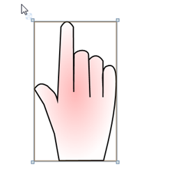
I went into Expression Blend and drew this hand cursor. I drew it with the spliney-liney pully-thing-tool. (That's the official name for it, I'm sure.

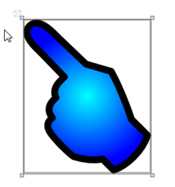
I was feeling pretty good about this cursor. It had a gradient and everything. I put it up, but mentioned to Felix The Designer that maybe he wanted to have a go at making a cursor. Seven minutes later I received this. If you want to understand what real design talent is like, read about Felix's thought process as he redesigned the Mix site.
At this point I declared, in the style of American Comedian Larry Miller:
"The difference between a Designer and Developer, when it comes to design skills, is the difference between shooting a bullet and throwing it." - Scott Hanselman with apologies to Larry Miller
More on the Designer/Developer relationship later, but for now, thanks to Felix and Conchango, BabySmash is looking pretty professional, IMHO.
Developer != Designer. Sigh.
About Scott
Scott Hanselman is a former professor, former Chief Architect in finance, now speaker, consultant, father, diabetic, and Microsoft employee. He is a failed stand-up comic, a cornrower, and a book author.
About Newsletter
Any chance you could get the drawing working across monitors?
So far I'm doing a lot of this myself. I wish I had a team. *cough* *cough*
I couldn't agree more. Just minutes before I read your post I was in a meeting making that exact point. If only I had been armed with your Larry Miller-esque analogy. :)
I actually argue something different: on a big project, I try to find a type of software team member that do both well. Untrained developers tend to make ugly and/or dry UIs. Nonspecializing designers tend to make interfaces with too much gradients and other "bling".
In your example, I think the blue finger is downright annoying. C'mon, does everything a designer touch have to have a friggin gradient?!?
It's not the blue, it's the gradient. On hindsight, sorry for sounding so aggressive, but I guess I have been over-gradiented (sic) lately, discussing a new look for a web app project... :) Don't get me started on how icons and headers are always reflected now...
Gotta say I like the blue one, but that's probably because I'm a lefty. Otherwise, I'm rather impressed by Scott's implementation. Sure would take me a while, and I'm the UI guy at my company. Working on the UI for an application only requires design skills if visual styling is an important factor. If it is, hire a designer or train yourself, as pat mentions. Otherwise, a programmer working on UI should approach the interface much like an Industrial Engineer would approach any problem: Minimize the steps, provide the most intuitive interaction.
@pat:
- To cop from Scott: Design != Graphics. A good web/software designer would know usability issues, common interface/UI patterns, etc, on top of mad Photoshop skillz. This is where having a pure "designer", misunderstood as meaning a graphic designer, on your team just results in bling without substance.
- Given a choice between graphics and content, content should obviously win. However, that is a strawman argument; they are not mutually exclusive choices. And, to be honest, technically-minded developers are those prepare to setup such an argument, then drop the designer. One should strive for good content, good design and some graphic sizzle, esp. in a commercial product, if you want to attract the widest audience.
We all learn around the age of one what a pointing hand looks like. It isn't until several years later that we figure out that Scott's graphic is a hand using a mouse. Not that Scott's doesn't get the point across - especially if your > 6. But Felix's is closer to real life and that helps toddlers (and adults) transfer their "real world" skills/concepts to a digital world much better.
How do we convey the use of the application to its intended audience?
Does a toddler respond better to a hand than an arrow? Is there another shape that works better? Perhaps another metaphor altogether, like BabyTouch?
These are the questions that should be asked about every software project. Someone on the team should own this responsibility. That is what Alan Cooper means when he talks about a designer.
couldnt help but notice that the Hand used by the designer is actually from one of the fonts that you can actually use in babysmash.
Link to image
here is a problem that i found when trying to open the options while using transparence. follow link for screenshot.
link to image
by the way my daughter loved to play this game, my partner though it was a great idea and if you need any help coding anything let me know.
regards
dan
I'd love to work with a good designer on a project once :p (Any volunteers? Contact me! :p)
As always, when developing a site or application, the focus should be on your users: Consider your audience and the purpose of the site, and build accordingly. Are most of your users engineers or artists, teenagers or senior citizens, or any of the other million classifications of people groups? Are you simply sharing information or are you trying to build a brand and sell a product? What impression do you want your users to leave with? Eliciting a "Wow I found that phone number fast" reaction requires a much different approach than getting a "Wow they're hip" or "I really want to buy that cell phone/dress/widget."
As for me, I consider myself a hybrid: I'm a designer at heart, which to me means that I have an "eye" for what visually works and what doesn't. It's not something I learned - it's something that comes naturally to me. I'm married to a programmer with mad skillz and so I've picked up enough programming know-how to be self-sufficient, though it's certainly not something that comes easy for me. I've designed and built enough projects that I have an intuition for what works and what doesn't. I hate building sites designed by people who have never touched html before, because they don't have that intuition about things, and it takes twice as long to hack the code into working.
I use Photoshop to edit my photos, but I don't use it to design my web pages; I'm more of an Illustrator girl myself (using those Bézier curves you were talking about, Scott). I agree that there are way too many gradient-happy designers out there - I work with a few of them.
All in all, I know that I'm mostly a designer: I have a high level of respect for good programmers because I know that their analytical mind is much, much better at solving my coding problems than I will ever be. Likewise, I like working with programmers who acknowledge that I'm good at what I do and they're not: That's a healthy working relationship. In my opinion, either one who says "I don't need the other" is either misinformed or just plain cocky.
That’s my
The blue icon may look nicer, but in terms of usability it's only slightly better than the arrow pointer as it still doesn't have much in common with a real life hand.
Comments are closed.


