Good UX in the Wild: Dropbox's attention to detail on their download page
Sometimes good UX is about being clever. Sometimes it's to make the user happy or smile. However, when the success of your product depends on new, possibly inexperienced users successfully downloading and installing it, good UX is the difference between success and failure.
I love what Dropbox has done here. I've noticed it for years and mentioned it in talks and to friends but I wanted to call it out here because it's so thoughtful.
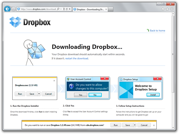
When you go to download Dropbox, here's what you see on Internet Explorer. Note they've used a three step tiny screenshot sequence. Each of them isn't a real screenshot, but rather "evocative" of the thing an IE user would see. For example, the second User Access Control dialog isn't real, but it's close enough that it makes the point while still fitting into width of the page cleanly. Their Welcome to Dropbox Setup screenshot is the same way, distilling the essence of what's coming while keeping the design consistent.
See below how the first screenshot shows what's coming and looks enough like the actual Save As experience that pops up seconds later as to guide the user to the next step.
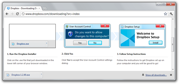
Here's the attention to detail part. Here's what a Chrome user sees when downloading Dropbox. They see a Chrome specific download screenshot.
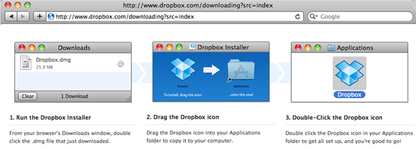
Here's the Dropbox download page when using Safari on a Mac:
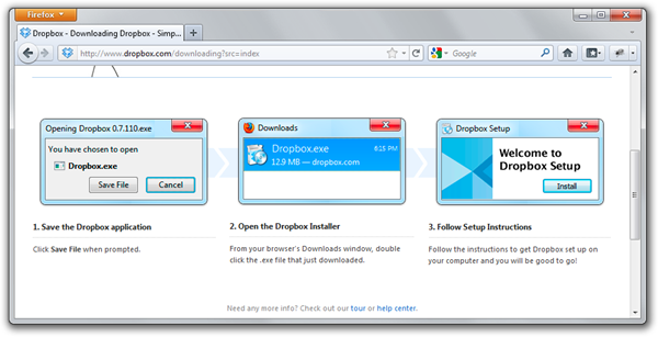
In Firefox for Windows, they see a Firefox Save File dialog along with a different second step. In the second step Dropbox takes a chance and doesn't show the User Access Control screenshot, and is instead more concerned that the user will download the file but not run it. I've had this happen myself with Firefox a few times, where things get downloaded then forgotten.
Techies forget how something as trivial as downloading and running a file can be a huge deal for the average user. What Dropbox has done here is a nice touch over the standard big Download button. To accomplish something like this, not only did they need the initial idea but they needed to the will to do it. They thought it'd be useful and they made it happen. What can we do in our organizations, Dear Reader, to sell our innovated ideas up the management chain and make the happen? What kinds of things stand in our way? What do we tell ourselves? That's too hard, that's too involved, that's too difficult to test, and the list goes on.
We need to continue to push ourselves and our work groups to implement ideas that we know are right. We need to advocate for the Customer and always try to see things from their experience. I don't know anyone at Dropbox but I think it's a fair guess that not only did they have the will to implement this friendly download feature, but they also knew it was the right kind of attention to detail that their customers needed. What a nice, almost subliminal way to kick off your relationship with your users than a subtly customized download page.
Have you done something similar, Dear Reader? Share in the comments.
About Scott
Scott Hanselman is a former professor, former Chief Architect in finance, now speaker, consultant, father, diabetic, and Microsoft employee. He is a failed stand-up comic, a cornrower, and a book author.
About Newsletter
With so many great services out there little polished gems, or nugets if you like, such as these make for a killer experience.
Thanks,
Shez
Would be nice if they gave as much attention to detail to their product, such as, via the desktop UI, when a synch is happening, showing what files are synching, what's in the queue, estimated time to completion, etc.
I'd also like to be able to see a list of recently synched files - or more specifically, more than the last 5. That they actually thought of showing a synch history, but decided showing only the last 5 files is all someone would need, is very depressing.
Imho, dropbox's success says more about their competitor's incompetence than it says about the quality of the dropbox software itself.
I'm browsing on a Samsung Windows 8 preview tablet with 768 vertical pixels, and the ASP.NET banner takes up more than half the visible browser area (in landscape mode).
Good website, poor banner design.
Kudos to DropBox, they've nailed good UX.
...something as trivial as downloading and running a file can be a huge deal for the average user.
The kind of people who are going to be downloading and making use of DropBox are not the kind of people who are going to need hand-holding to download and install it.
Not true. Both of my sisters use Dropbox, and neither one is tech savvy. Regardless, the point is that you cut out a large number of potential customers if you assume that all of your users will be Internet gurus.
Its good to see at least someone in Microsoft thinks and recognizes value of good UI. I make my living using and writing software based on Microsoft software. Typically when I install MS software, the initial dialog shows up with a text area occupying about 20% of the dialog, that has the entire license agreement in it, with a vertical scroll bar so small that you have to try hard to click on it. This while the other ~80% of real estate in the dialog is just Gray pixels! And why or why can I just not re-size the dialog by going to an edge and just dragging it towards any corner.
There are so many screens during installation of SQL server when a horizontal scroll bar shows up and you have to scroll to read because there is no tooltip and you cannot simply resize the dialog/window. This in the days of 21" dual monitors.
My biggest gripe is the tools/options dialog of Visual Studio. Again, not resizable and very ugly. Try to customize a keyboard shortcut. when you start searching for the command, only about 3 commands fit the ListBox that show matching commands and you have to scroll forever to find your command when you type something like 'Edit'.
These sound like minor inconveniences to someone but its so basic that I should even have to think about it let alone rant about it. I understand you might not 'control' these products/areas but if you can 'influence change' for these horrible UI choices, please please do.
The thing is that the release history is available directly from the dropbox site, only the home page (for no apparent reasons) does not link to it.
To me, this aspect is far more important (and an indication of a questionable UX design) than fancy graphical sugar in terms of screenshots that match the used browser.
The guys from Little Big Details collect further stuff like that. Fun and inspiring!
Dom
I guess they have made images for at least 20 languages 4x times (4 browsers IE, Chrome, Firefox, default).
That's impressive.
Comments are closed.


Before:
After:
I have gotten many good testimonials and how much I've improved our internal site(s) but many people love that small addition, it literally took me a few minutes to implement.
The other one I'm proud of is highlighting your builds/deploys on the activity page in green so it's immediately apparent what build you requested. Not to mention how I redid that page completely to use animation, AJAX, sentences ("You requested this x minutes ago and it is building on xxx build server.") and timeago from a table-based page that refreshed (postback) at an interval.