Low Bandwidth View and other Hidden (and Future) Features of MSDN
Ok, so I'm only 8 months late. ;) Last year MSDN quietly implemented a "low bandwidth" view.
Low Bandwidth MSDN
Basically, instead of visiting:
http://msdn.microsoft.com/en-us/library/system.xml.xmlnode.aspx
you could add "(loband)" to the URL, like:
http://msdn.microsoft.com/en-us/library/system.xml.xmlnode(loband).aspx
Instead of the standard MSDN page:
You'd get a nice streamlined version. This is great for not only low-bandwidth situations, but also phones, pdas, screenreaders, etc. More on that in a second.
Jon Galloway noticed this last August and even made a nice bookmarklet to make it easier to get into this view. Fast forward until last week when I noticed that this existed. I started digging around, because not only was it cool, but my spider-sense was telling me there was more underneath the story.
I called Kim, the Development Manager for the project and I asked as many leading questions as I could, in order to find out what they were planning to do with this, how it was done, and if there were any hidden features. Sometimes folks kind of give MSDN a hard time for having fat HTML, lots of scripts, etc, and generally being slow. Turns out there's a whole ongoing project to make MSDN way faster and it's already seen some really significant improvements. I've got some internal slides she smuggled my way that I'm going to share with you here, so don't tell. I figure show first, ask question later, right? This is great stuff.
MSDN Performance
They use a number of tests at MSDN to see how fast the site is running, including Gomez and Keynote. Keynote and other tools not only do testing like YSlow and the like, but they do location testing to make sure the site is fast all over the world. That means testing it on a modem in China and DSL in Australia, etc. For example, you'll see Guangzhou, China appear in the slide deck a lot because it happened to be where MSDN loaded the slowest. The roll-up slides (for bosses) show Seattle, Paris and Beijing. In some places there was missing data.
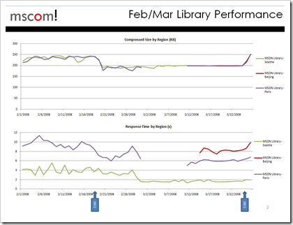
Here's a slide from last Feb before the big performance push started. Notice the page sides is between 200-250k and the response time in China is 10 seconds. Good, I suppose, but not fast.
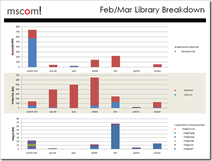
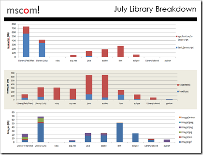
They'd test MSDN on first load, then second (cached) load. They called that PLT1 and PLT2 respectively. The first load of MSDN was like 1.3 megs. Insane. Adobe's site was 800k+, Java's was 800k+, but library sites like Ruby and Eclipses around 200-300k. A meg is not cool. They broke it down by JavaScript, HTML/CSS, Images, etc.
Over the next few months, they started moving CSS and scripts to separate DNS for HTTP Pipelining, reduced the number of redirects, were smarter about JS caching, lazy-loaded the Table of Contents. They started caching scripts at CDNs like Akamai and ChinaCache, reduced or removed ViewState.
Then the idea of flipping the whole thing on its ear happened. Rather than removing this and that, why not remove EVERYTHING, and only add back what was needed. Hence, the loband version was created.
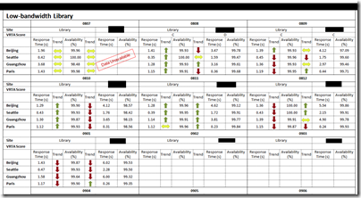
Here's some performance tests between the loband MSDN on an unnamed technologies very-fast library site (you'll have to click the image to see the numbers):
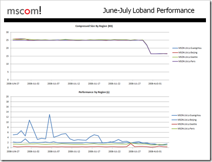
The loband MSDN site can get sub-second times in the states and very close to one-second times outside the states, including Guangzhou, our previously slowest location.
Early versions of loband were 25k, but some changes brought the average down to just over 15k. Caching changes and other optimizations brought the performance by region down to under 2 seconds basically world-wide.
Here's an interesting graph showing the size of JavaScript, HTML and images on MSDN and a bunch of other sites, including http://www.asp.net. In this chart, regular full MSDN in Feb of 2008 is the FAR left bar, and MSDN in July is the second from the left. The loband size is the second from the right.
You can click "persist low bandwidth view" if you want to make it your default. Also, they are paying close attention to the Feedback forum, so click that if you have more ideas. The next version of the loband site will be coming out in the next month and looks like this (sneak-preview):
They've removed the black bars, some markup changes, and the layout stretches horizontally better.
Additional MSDN "Switches"
I figured there can't just be the (loband) "switch" and I mentioned I thought that having to hack the URL was kind of wonky. Turns out that the whole MSDN system isn't a bunch of files on disk, but files in a database with an ASP.NET Virtual Path Provider. Tim Ewald wrote about how they did this WAY back in February of 2005. This was, at the time, kind of a poor-man's ASP.NET Routing:
The normalized path points to a file that does not exist on disk. Rather, the page data is stored in the content cache. The system uses a VirtualPathProvider (VPP) to bridge the gap between the two. In essence, a VPP intercepts all of the ASP.NET plumbing's requests for file streams and gives you a chance to load them from wherever you like. Every ASP.NET app uses a default VPP that simply maps to the file system. An MTPS-based site registers a custom VirtualPathProvider, which sits in front of the default VPP, forming a chain. The custom VPP uses the DocumentInfo and ContentSet objects that the HTTP module's OnPreResolveRequestCache event handler stored in HTTP context to load a topic from the content cache and return it as an .aspx file stream.
All of this is abstracted away, and what I'm calling a "switch" in the URL is what MSDN calls a "device" internally. The URL is just one way to indicate to their routing system that you are a certain device. The other way is via a User-Agent string, as you'd expect.
The content in MSDN is stored as XHTML, but then other controls are injected around it, similar to master pages. The whole page doesn't yet validate. If you think that's important, put it in the comments. If we get hundreds of comments here I'll pass them on to the team as "evidence," heh, heh.
There are in fact many "devices" for various reasons in MSDN. Most are turned on my User-Agent differences or for things like the Printer-Friendly view. However, you can force the device by inserting the device name in to the URL like:
http://msdn.microsoft.com/en-us/library/system.xml.xmlnode(device).aspx
There are also things called iRoots. For example, the word "Library" in the URL above is an iRoot. I could swap in the word "Magazine" and get a site that's skinned for MSDN Magazine.
Here's the devices I've figured out so far:
Low-Bandwidth - (loband)
This is the one we've been talking about. It's a minimal view, focused on one thing, speed.
http://msdn.microsoft.com/en-us/library/system.xml.xmlnode(loband).aspx
PDA - (pda)
The best view for phones or PDAs. Turns off the left side navigation and makes the page 100% width and flexible.
http://msdn.microsoft.com/en-us/library/system.xml.xmlnode(pda).aspx
Robots - (robot)
Optimized for search engines. Lots of meta data, no stylesheets, bare-bones. The Table of Contents is at the bottom of the page.
http://msdn.microsoft.com/en-us/library/system.xml.xmlnode(robot).aspx
Printer-friendly - (printer)
Optimized for printing and includes a call to window.print().
http://msdn.microsoft.com/en-us/library/system.xml.xmlnode(printer).aspx
Now, here's where it gets interesting...
MSDN Inside the (IDE)
When MSDN library content is viewed inside the Visual Studio IDE, a few things are added. First, the ability to Add Content via the MSDN Wiki is promoted to the top, as well as a "send" and "give feedback" feature. This is the view you get when you're inside the "Document Explorer" - the Visual Studio MSDN help browser.
http://msdn.microsoft.com/en-us/library/system.xml.xmlnode(ide).aspx
MSDN for Visual Studio 2010
This is still up in the air, but you can see some ideas with the (dev10ide) switch:
http://msdn.microsoft.com/en-us/library/system.xml.xmlnode(dev10ide).aspx
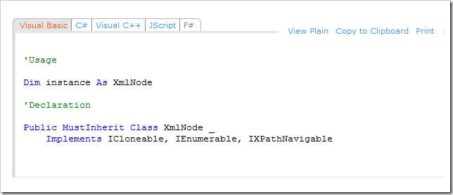
Here's a zoom in to a nice detail. Currently on MSDN online there's a filter dropdown to choose what language you want to see code samples in.
This live prototype has the languages for code samples appearing as tabs (as see above) including the option to "View Plain" or "View Colorized." There's also links to Copy to Clipboard or Print just the sample directly.
Future MSDN Plans
From what I hear from Kim, there's plans in process now for the loband site to become the default site this fall. They'll call it something like lobandlight and it'll have some small additions like a search box, selectable codeblocks, but the focus will be on being fast and clean. If you have opinions either way, leave them in the comments here or in the loband forums and they WILL be read by the MSDN team. Also, right now loband only works on the library, so while you can try these "devices" on other parts of MSDN, it's only currently designed to work with the MSDN Library itself. If you feel strongly that other parts of MSDN need loband lovin', let me know here and I'll pass your comments on directly to my boss.
Thoughts?
About Scott
Scott Hanselman is a former professor, former Chief Architect in finance, now speaker, consultant, father, diabetic, and Microsoft employee. He is a failed stand-up comic, a cornrower, and a book author.
About Newsletter
I like the loband version much better. The slow loading of the msdn page is actually the #1 reason why I avoid msdn if possible.
And yes, XHTML validation of the whole msdn page would be a nice addition, too.
http://msdn.com/library/jk2h42jk3(vs23.7).aspx is not the easiest to read.
What's wrong with MSDN.com/library/system.windows.forms.form
Also IMHO, it would be better if the .NET people did what the win32 people do and instead of having multiple versions of the docs and having to compare them manually, they would just call out the differences. The confusion between VS and Framework is also irritating.
http://userscripts.org/scripts/show/46944
It's very embarassing - having to select c# everytime when looking at msdn, including IDE view.
p.s: i understand, that's probably undoable, but would love to see c# as default (first in case of 2010 view)
MSDN has been getting better over time - probably both due to the work you've outlined in your post and faster browsers. I'm glad to hear about the focus on it at Microsoft and new, faster versions being engineered.
jlo
The treeview on msdn always bugged me.. i hate scrolling around in it and i wish it'd autohide/appear like it does in dexplore (in vs)
another thing i totaly miss at the msdn site is the index feature also available in dexplore :/
One thing i do miss in dexplore though, is the community features (i usually go for the offline version of the docs for speed)
A silverlight client for msdn could bring the best of both worlds, localstore for caching and connectedness for the community stuff :)
this is something anyone could build if there was an xml version of msdn with nothing but the data.. (if such a version exsist pleeeease publish/point me to the api)
hey there apparently IS an api for msdn (and technet)
check this out:
http://www.pluralsight.com/community/blogs/craig/archive/2006/06/12/27273.aspx
and this
http://services.msdn.microsoft.com/ContentServices/ContentService.asmx (includes the wsdl)
The FlashGet* add-in crashes IE7 on my WinXP Pro SP3 PC as soon as I click
the "Switch on low bandwitch view". jccatch.dll and IE7 are only semi-compatible AFAIK.
Regards,
Gerry (Lowry)
* http://www.flashget.com/index_en.htm
Myself, I haven't actively searched MSDN because I felt it was way too heavy with their treeview, etc. The presentation was not easy to look at. I appreciated the new view in loband.
Great job to the MSDN team for getting their heads in the game!
Robots - (robot)
Optimized for search engines. Lots of meta data, no stylesheets, bare-bones. The Table of Contents is at the bottom of the page.
AFAIK, serving a "special" page to search engines -- i.e., a different one than would normally be served to a human user -- is expressly discouraged by every major search engine I can think of.
How is MS getting away with that?
In Romania (Central Europe) I get 700ms..1100ms which is very very good compared to the 1400..2000ms (the full version)
Also, a designer should have a look at some of the details. This is really nitty gritty, but the little icons etc have _never_ lined out right on MSDN. Look at the little lock icon on http://msdn.microsoft.com/en-us/library/system.xml.xmlnode(dev10ide).aspx or the collapse icon on http://msdn.microsoft.com/en-us/library/system.xml.xmlnode(ide).aspx It's minor, but I always wondered how something like that could not be noticed for 4 years (at least), as a webdesigner working on a page, I would immediately go and change the inline img tag for a background-image css rule with some padding...
What i would hope for is a way to persist your preferred language(s), or in the very least being able to select it with one click and not having to uncheck several checkboxes. I can't think of a time when i have needed to view the same example in more than one language.
http://msdn.microsoft.com/en-us/library/ms735119.aspx.
For example, be able to rightclick on the "Windows Communication Foundation" node and create a single pdf of all the pages between the "Windows Communication Foundation" node and the "Windows CardSpace" node so I can read it top to bottom. This experience for me is better than bouncing between the treeview to expand nodes and reading in the right pane. This does not work in many eReaders.
(VS.71) = Microsoft Visual Studio 2003/.NET Framework 1.1
(VS.80) = Microsoft Visual Studio 2005/.NET Framework 2.0
(VS.85) = .NET Framework 3.0
(VS.90) = Microsoft Visual Studio 2008/.NET Framework 3.5
You can combine some devices with commas, for example (VS.80,loband) for the low-bandwidth version of the VS2005/2.0 documentation.
You can do the packaging through PackageThis at http://packagethis.codeplex.com/
Package This is a GUI tool written in C# for creating help files (.chm and .hxs) from the content obtained from the Library via the MSDN Content Service. You select the content you want from the table of contents, build a help file, and use the content offline. You are making personalized ebooks of MSDN or TechNet content. Both help file formats also give full text search and keyword search.
The code illustrates how to use the MSDN Content Service to retrieve documentation from MSDN or TechNet. It also shows how to build .hxs files and .chm files programmatically.
Got one thing to say. All the programming codes are displaying in "Courier" font, instead of "Courier New" font. Thats an annoying font. "Courier New" is more pleasing to read. The other font is really annoying (atleat for me) to keep on reading.
I wonder how come the "courier new" font is changed that "courier" font. Is that another "hidden (annoying) feature"? or else is there any tag there to read the programming codes in more pleasing way.
Thanks.
Comments are closed.
%20-%20Windows%20Internet%20Explorer_thumb.png)
%20-%20Windows%20Internet%20Explorer%20(2)_thumb.png)

%20-%20Windows%20Internet%20Explorer_thumb_1.png)
%20-%20Windows%20Internet%20Explorer%20(3)_thumb.png)

Do you know if there's any plan to add language filtering to lowband? And hopefully the vs10 version is not going to default always to VB on the visible tab...