Making awesome Wedding documents using OpenType Ligatures and Stylistic Sets in Microsoft Word 2010 and Gabriola
 My brother-in-law is getting married in a few weeks and since I'm the default IT guy for the family, I'm making CDs with CD-TEXT for the guests amongst other things. One of those other things is doing the Agenda for the day as well as the Menus that appear on the guests' tables. Anyone can bang out a simple document in word and/or pick a wacky font, but I wanted to try something a little different.
Microsoft Word 2010 includes advanced support for OpenType Fonts, not just TrueType fonts. One of the cool things in OpenType and Word is the support for ligatures. From Wikipedia:
"In writing and typography, a ligature occurs where two or more graphemes are joined as a single glyph."
For example, here's lowercase "fi" and lowercase "fl" first without ligatures, and then with:
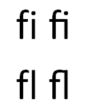
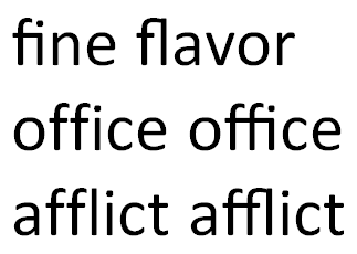
See how the two letters flow together with ligatures? Here's more examples with words like "office," "afflict," and "fine flavor."
Open Ligatures are really visible (and mind-blowing if you've expected fonts to work a certain way for 20 years like me) in complex scripts like Gabriola, one of the many new fonts that comes with Windows 7. The Gabriola font is filled with advanced Open Type features.
The letterforms will change based on the context of the other letters around them. For example, notice how the second m in the word murmur gets out of the way of the r that would otherwise encroach on its space? It's different from the first m.
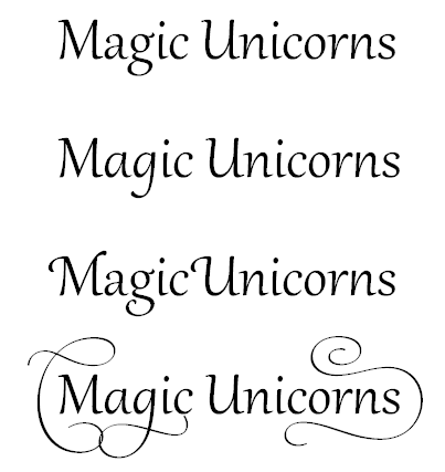
This is just the default behavior, but with Word 2010 you can control it from the Advanced Tab in the Font Menu. For example, I wanted to create a wedding menu so here's the first few lines with the defaults for Gabriola:
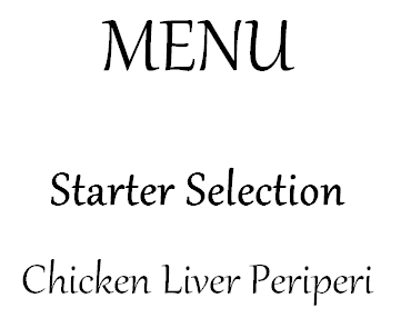
Now, I'll right click on Menu and select Font, then Advanced. There are a number of Stylistic Sets, depending on which font you're using. I liked the look of Set 6.
_3.png)
Next, for the second and third lines I changed to Stylistic Set 5 with Contextual Alternates to give me more options. Compare the two side by side! So much has changed, some subtle, some not. Notice the captial S's, the lowered C, the additions to the L and the tail on the small n and p?

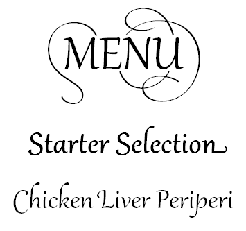
There's a lot of choices that you can make to get the look you want, and of course, this is just the Gabriola font we've see so far!
The font will even change based on where it appears on a line, for example, the word amazon at the start, middle and end (taken from this article by John Hudson, the font designer):

Additionally, this all happens as you type. You have to see it to believe it. I made an animated GIF at the top for you to get the idea. This might seem very weird to English/Latin speakers, but if you have ever typed in Hindi or Arabic you're already used to dynamic ligatures as you type.
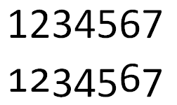
Word 2010 also support different modes for numbering, like Old-Style Number Forms. Notice how the numbers' baselines are different on the second line and their sizes have been adjusted?
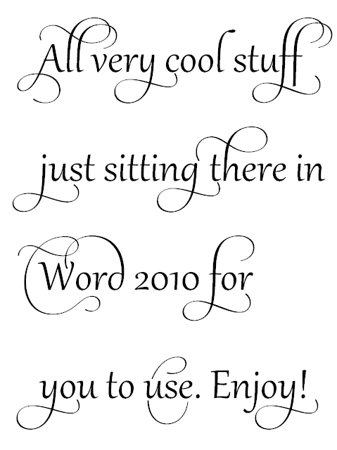
All very cool stuff just sitting there in Word 2010 for you to use. Enjoy!
About Scott
Scott Hanselman is a former professor, former Chief Architect in finance, now speaker, consultant, father, diabetic, and Microsoft employee. He is a failed stand-up comic, a cornrower, and a book author.
About Newsletter
http://dev.w3.org/csswg/css3-fonts/#font-variant-ligatures-prop
https://hacks.mozilla.org/2010/11/firefox-4-font-feature-support/
There goes my weekend...
___
Scott, it looks like in a couple of your examples you have applied a bold setting to Gabriola. Please don't do this: Gabriola is a single weight typeface, which means that if you apply Word's bold function to it what you get is a fake bold which distorts the proper relationship of thick and thin strokes in the design. To differentiate different text elements, I recommend using different sizes or different stylistic sets.
Glad you like the font, and thanks for posting this information about it. It is always interesting to see how my typefaces are used and how word of them spreads. Oh, and congrats to your brother-in-law.
Comments are closed.

