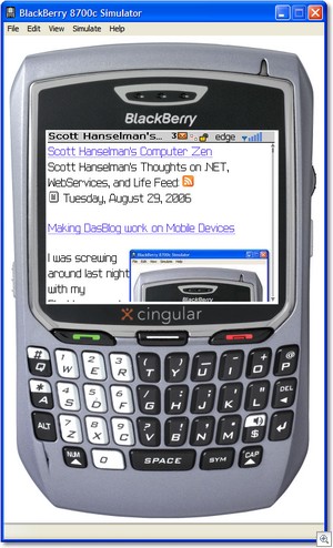
Making DasBlog work on Mobile Devices
 I was screwing around last night with my Blackberry and was frustrated to see how crappy my blog (and most blogs) looked on a small device.
So, here's what I did.
I noticed that you can cast the Request.Browser object in ASP.NET to a System.Web.Mobile.MobileCapabilities. In ASP.NET 1.1, this uses the browsercaps section of your machine.config or web.config. In ASP.NET 2.0, the architecture is much cleaner, using .browser files.
Since DasBlog compiles under ASP.NET 1.1 and typically runs under 1.1, I'll talk about this in the context of ASP.NET 1.1, but the essence is the same.
There's a property called IsMobileDevice on the MobileCapabilities object that most folks consider useless. That's because the default browser caps stuff with ASP.NET 1.1 is poo. Here's a good explanation:
Microsoft pawns the job off on Cyscape.com, which doesn't care about doing the world a service (it's busy selling its competing BrowserHawk product instead). As a result, machine.config is already woefully out-of-date and unaware of newer browsers like Mozilla/Firefox, Netscape 7, Safari, and Konqueror, so it tells Request.Browser that they are "Netscape 5" (though Safari and Konqueror are wholly unrelated rendering engines).
Cyscape hasn't done the job and instead wants to upsell to their (very capable, but often overkill) application.
Instead I Googled around for Browsercaps XML sections...there are many, and they are in various levels of disarray, but this one from last year was pretty darn good. If you're using ASP/PHP the current Patron Saint of BrowserCaps (non-ASP.NET) is Gary Keith. The ASP.NET one from Chris Maunder at CodeProject is also lovely.
DasBlog supports theming, so I added a bare-bones XHTML-ish mobile-friendly theme for small devices - essentially TinyHTML (my term).
I added this code to the SharedBasePage where we decide what theme to use:
//Are we on a Mobile Device? See if we have a mobile theme and use it instead.
System.Web.Mobile.MobileCapabilities mobile = (System.Web.Mobile.MobileCapabilities)Request.Browser;
if(mobile.IsMobileDevice == true)
{
theme = themes["mobile"];
if(theme == null)
{
loggingService.AddEvent(new EventDataItem(EventCodes.Error,
String.Format("If you have a theme called 'mobile' in your themes folder, readers who visit your site via a Mobile Device will automatically get that theme. User-Agent: {0}",Request.UserAgent),
String.Empty));
}
else
{
return theme;
}
}
...continue on...
And boom, shiny, mobile support for this blog. (It is crazy stuff like this at the last minute that keeps 1.9 from being release, but I promise, it's close. For now, remember that unsupported Daily Builds are here: http://blogs.tamtam.nl/paulb/bits/)
About Scott
Scott Hanselman is a former professor, former Chief Architect in finance, now speaker, consultant, father, diabetic, and Microsoft employee. He is a failed stand-up comic, a cornrower, and a book author.
About Newsletter
ex...
<link rel="stylesheet" href="style/default.css" type="text/css" media="handheld" />
I don't have a blackberry so I can't test if it would pickup that style. That way each theme could have a stylesheet specifically for small devices.
http://www.w3.org/TR/REC-CSS2/media.html
aC - That's called the Droste Effect http://en.wikipedia.org/wiki/Droste_effect
If I click a specific post, such as the one about Open in New Window IE7, it looks perfect...
Why not just "if (mobile.IsMobileDevice)"
The former seems redundant and doesn't read as well as the latter. Reading the latter: "if mobile is mobile device".
The former: "if mobile is mobile device equals true"
I know.. being picky.. I digress.. :)
Carl - Ya, the media=handheld stuff just doesn't seem very clever.
This would have been as easy as Page.Theme = "Mobile"
And your LINK elements should be non-closing HTML style, not XHTML style since your DOCTYPE is HTML.
For blogs with rss feeds you can use my mobile rss reader at http://wampad.com/rss/, for your blog it would be http://wampad.com/rss/ScottHanselman. It's designed to take advantage of feedburner feeds to cut down on the need to type urls on the phone, but you can pass it a full url and it will handle it. I've added OPML support but it's new so your milage may vary.
Comments are closed.
