New ASP.NET website launched
A few weeks ago we introduced a beta of a freshly designed http://asp.net website. Today we launched it. Jon, myself, and the team that manages the site took lots of your feedback (lots from the comments of the Beta Blog Post) and did our best to incorporate as much as we could. This is just the start, and we've got lots of plans for the future including responsive design, more text content, localization, more HTML 5, HD Video, closed captioning and lots more.
It is a big site with thousands and thousands of pages. However, a lot of those pages were hard to find. We're continuing to try to get folks what they need in fewer clicks.
There's new content for people getting started, including "choosing a technology" videos, the Big Green Button remains with a new download video as well as quick download links for the stuff you're always searching for.
Each top level page (Web Pages, Web Forms, MVC) has a 5 minute app building video and lots more getting stated content. You asked for more text tutorials and we heard you. In-depth tutorials on deployment, working with the Entity Framework, suggested open source projects to check out for each, books, samples, and more. And, you can always find out about the next version of ASP.NET at http://asp.net/vnext.
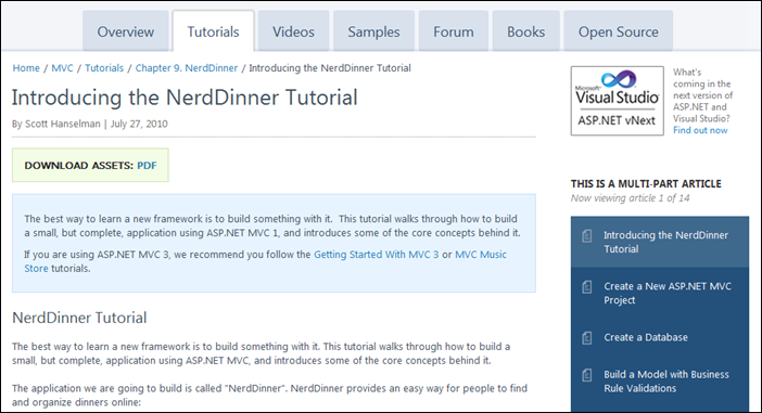
The home page header is smaller, per your feedback, making room for more Daily Community Spotlight content as well as pinned announcements. There's a cleaned up Community page with easy to access RSS feeds, a quick navigator and lots more fresh community content packed onto the page. Tutorials are more organized like a living book now and are easier to follow. Tutorials can now appear as multi-part tutorials with better navigation. Forums got a nice facelift, as did the Wiki, and Weblogs. Each technology also includes a great free video course from Pluralsight. Feedback is always appreciated.
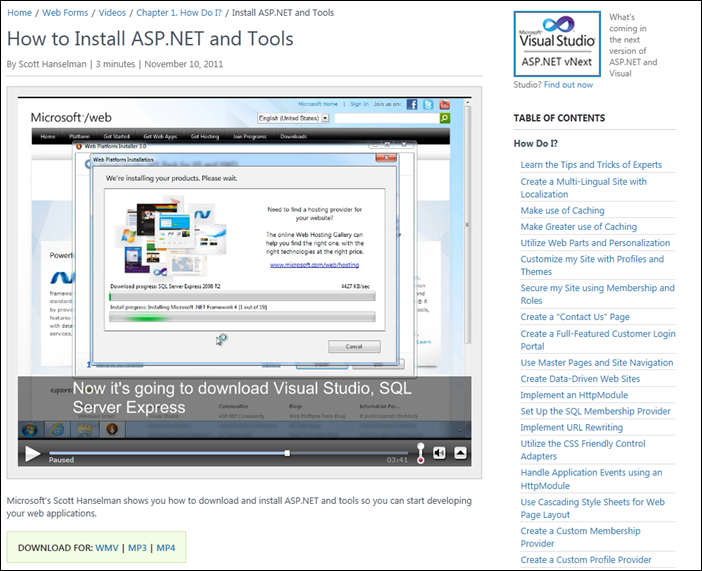
Videos are larger, video downloads are simpler and links with table of contents are everywhere. All those videos you never could find actually do exist.
The site is still powered by the Open Source CMS Umbraco and we're very happy with it. Jon Galloway worked tirelessly on this new site launch along with TerriM, ScottHu, SridharM, Samir and lots of other folks smarter than I. Jon digs into the new layout and "information architecture" over on his blog so check that out for more details on our thinking.
 Also as a part of this process we've gotten the http://facebook.com/aspnet and http://twitter.com/aspnet accounts up and firing on all cylinders. Join us on your favorite social network or subscribe in your favorite reader and we''ll make sure all the fresh Jon Galloway-curated spotlight content is delivered to you as we get it.
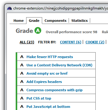
I'm also pretty proud of how we're doing in YSlow. The perf on the site is great. The home page is under 100 lines of HTML5, the markup is clean, and we're aiming for similar results in other parts of the site. Soon we'll make the ASP.NET site's personal CDN cookieless and have straight "A's" on YSlow, which is no small feat.
We realize that the #1 piece of feedback from you all is that you don't like the ads. At this point, that's out of my hands, but I'm working with the team on providing less distracting and more reasonably designed ads. Most of the ads are for hosting or controls, and the vendors that get ads are happy with being on the site. We're also working with the bosses on how to ensure that the site is funded appropriately. You don't have to tell me...I get it. Feel free to vote on the ASP.NET User Voice site.
It's never finished, but it's getting there. We're really happy with the improved performance, better navigation, fresher and more relevant content. We've got more in store, so stay tuned.
Hope you like it.
About Scott
Scott Hanselman is a former professor, former Chief Architect in finance, now speaker, consultant, father, diabetic, and Microsoft employee. He is a failed stand-up comic, a cornrower, and a book author.
About Newsletter
It's nice that you're investing time into the main ASP.NET page, but the fact that the weblogs are running on the VERY old and horrible (even for when it was installed) Community Server 2007 means that the weblogs.asp.net community is not getting the oxygen supply it so desperately needed.
Now I'm convinced moving my weblog off of the weblogs.asp.net hosting was a good idea. It was nice while it lasted. Unfortunately, all good things must come to an end.
Is this old (new) content still available and are links going to be posted?
Is ScottHu the ScottGu v1.1?
Now, figure out some way to cut down on the ads, at least on the front page.
Nick
one thing, When I submit another thread link(say http://forums.asp.net/t/1745880.aspx/...) in asp.net forum answer, it takes wrong relative path.
The new site is a pleasure to browse! Further it's a great example of a content hierarchy done well.
Plus, the HD videos kick ass!
Well done guys! Keep up the good work!
Matt
Nice job on the new web site. Especially, finding contents are so much easier now. On the other hand, I am still seeing no use of tagging system on the asp.net forums. I opened up a thread for this as well:
http://forums.asp.net/t/1733930.aspx/1?What+is+the+point+of+tags+here+
Maybe the problem is me here. Who knows.
It's a shame folks have become so conditioned by the "free" web that they would complain about some relevant and well-placed advertising on a site like the ASP.NET site. It seems people want fast, unlimited hosting, professional site design, and 100% backward compatibility, perfect uptime record, and primium content for free.
Ad serving is an effective way to defray some of the costs associated with all of the above, and people should either pony up some of their own hard-earned cash to access such resources, or simply appreciate the ad-funded model which allows such sites to remain high-quality.
Of course, the key words, from my first paragraph, are "Relevant" and "Well-placed".
I'm referring both to the top navigation bar (Home, Get Started, Downloads, etc.), the sub navigation bar (that displays when Web Pages, Web Forms, or MVC are selected in the top navigation bar), the bread crumb that appears on all pages other than Home, and the side navigation bar (usually titled "Chapters") that appears when many sections are selected (MVC -> Tutorials, for example).
I've been struggling to find a good solution for site navigation controls with MVC. I'm currently using the ASP.NET MVC SiteMap provider, but I suspect I'll need to move to something that offers collapsing and expansion of sections, or separate, multiple level navigation controls (like the new ASP.NET site) as the site grows and I run out of room to display a menu in a legible font size.
Does anyone have any navigation control suggestions for MVC based sites? It would need to support areas, which I make use of, visually indicate which item is currently selected, and support either multiple controls to indicate a hierarchy (main and sub navigation) or expansion/contraction of sections. Not really a tree view control, but only showing the child nodes of a node when that parent node is selected.
on selecting a spefic button the details of that button comes rest of the content of the page is same
(http://www.asp.net/contact-us doesn't work for me)
I found one strange thing in Home page of ASP.net site.
Sometime article not listed on first page for that date. After two days suddenly two article get published with one for currentdate and one for day before that.
I might be wrong but i found this thing since new website launch ( in Beta as well).
BTW.. New site looks nice compare to older one.
With Regards.
Comments are closed.


