Taking Proper Screenshots in Windows for Blogs or Tutorials
What? A blog post on how to take a screenshot? Seriously? Sure, this might seem a silly or superfluous blog post, but I can assure you that I see lousy screenshots on blogs, online tutorials and more (including some of my old posts) at least daily. Perhaps it's my "geek eye" but I (and I assume you, Dear Reader) just know when something is wrong with a screenshot. Just like you are the only one who notices when someone is running a 4:3 image on a 16:9 flat screen at a convention and it looks darned unprofessional, the same is true with screenshots.
"A bad screenshot is equivalent to a misspelled world. It makes both you and the word look unprofessional." - Me, just now.
Sometimes the best way to show you how to do something is to first talk about how not to do something.
Don't save Screenshots as JPEGs
JPEG is lossy. Lossy means "throws stuff away." Always save your screenshots as PNG, which is a lossless (throws nothing away) format.
Don't do uncomfortable, unnecessary or bad resizing
When resizing, only do it if you have to. Always use the highest quality resize algorithm your paint application supports. I use Paint.NET. It's one of the greatest pieces of software out there that should have shipped with Windows. Try to resize things "evenly," like 50% or 25%. If you resize to 73% or or 431 pixels by something, you are throwing data away and your screenshot will look bad.
Try to avoid small resizes, like taking an image and resizing it to 95%. If you are that close, try reframing or resizing the thing you're shooting, rather than doing such a small resize.
Don't customize your environment to the point it's unrecognizable
Think about Framing Your Screenshot as you would a photograph. I don't care about your toolbars. I don't care about your add-ins or your browser bookmarks. Turn EVERYTHING unnecessary off. That means toolbars, toolboxes, windows, add-ins, bookmark bars - anything that would make your screenshot look like your system and not mine. Keep everything stock and standard if you can.
Don't use tiny fonts and fancy colors.
As you can guess by now, these rules apply to screencasts as well. That means 16pt or better, folks. I use Consolas 16pt, minimum. 20 or 24 for Console Windows. Keep the default colors for your IDE. For Command Windows, use either White Text on a Blue Background or Green Text on a Black Background. Both have been proven to be the highest contrast and easiest to see (by me in totally scientific tests.)
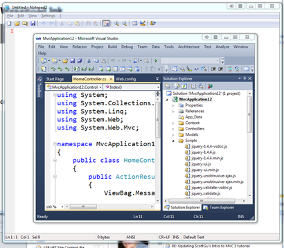
Don't show me what's underneath your transparent Aero Title Bar
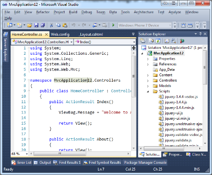
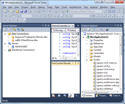
Notice how you can almost see stuff underneath the transparent title bars of these last few screenshots? That's lame. There's two ways to fix it. One, open up notepad with its white background and put it behind the application you are shooting so the white is what you see behind the transparency.
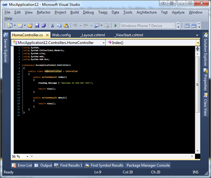
Then, you can crop around it and get a title bar that doesn't look like crap:

Two, use a proper screenshot tool like Window Clippings. More on this later, but it's truly a great tool and worth it if you are taking more than a few screenshots a week. It'll save you time and make you look good. Window Clippings does two things right around transparency. First, it'll programmatically and automatically put a background behind your image while its taking the screenshot, and second, it'll make your transparent regions actually transparent when it makes a PNG.
See this square corner? That's not transparent and looks subtly lame. This was taken with the Window Selection option in the Snipping Tool that came with Windows.
See this one taken with Window Clippings? It's correctly transparent as a PNG and there's even an option to include a nice drop shadow.
Don't use Basic or Classic Theme for Screenshots
Again, I don't know your personal preference, but it doesn't matter. Make your screenshots look like the typical computer, not your computer as you refuse to let Classic Theme go. ¡Viva NT4! Um, no.
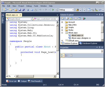
Don't use Raster Fonts or Disable ClearType
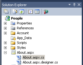
We're going for aesthetics and standardization, here. Consider these two screenshots. The first has ClearType off. Notice the blocky capital A, for example.
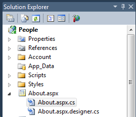
Next, the same shot with ClearType on.
Don't Over-Annotate or use wacky Callout Effects
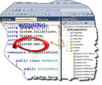
Another great screenshot program is SnagIt from TechSmith. I use their Camtasia product for all my screencasts. As great as SnagIt is, it has the powerful ability to create "callouts" easily. Too easily.
Don't get me wrong, SnagIt is an awesome tool. But just don't point it at your face. Avoid callouts, and when you do, stay classy.
Use ALT text
Try to use ALT text for all your screenshots. There's a blind person (or a hundred) reading your blog. Do them a favor and put in some nice descriptive ALT text on your screenshots. I like to leave them personal messages that you never see. It takes only a second, but it lives in your post forever and helps the visually impaired participate.
Don't forget to squish your PNGs
PNG may be a lossless format but you can often still squeeze 5-30% of the size out of them with tools like PNGOut. This is a must-have tool in your path. I add PNGOut as a post-build step when I make tutorials and you can even hook up Window Clippings to run it for you after a screenshot. It is CPU intensive, but it's worth the effort when publishing your content. Go do it now, get all the PNGs from your blog, run PNGGauntlet on them (it'll take a while) and compare the directories. You'll save tens of megs if you're like me, and your readers will reap the benefits every time they visit your site.
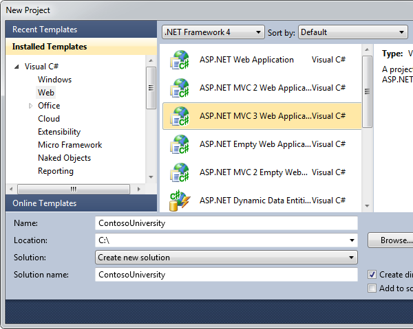
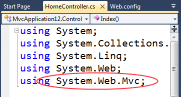
So, rolling all this advice up, here's a good screenshot and a bad one.
Bad Example
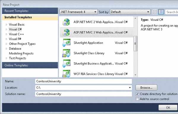
Here's a common example that completely bad. This screenshot is:
- Using the Basic Theme
- It was likely taken on a Virtual Machine that didn't have Aero turned on.
- Not Transparent
- The window corners are curved, but there's a corner pixel.
- Oddly cropped to fit
- The right side is missing, but just a bit. Either chop a lot, or none. Don't chop a little.
- Poorly resized
- Note the trouble resizing the words "Installed Templates"
Notice the aspect ratio is ever-so-slightly wrong.
- Note the trouble resizing the words "Installed Templates"
- JPEG'ed
- Note the lossy artifacts under the selection in the listbox.
- Poorly Staged
- Note the highlight in the listbox is gray? That means the window didn't have focus when the screenshot was taken. It makes it hard to see the point of the screenshot.
Good Example
Or, given our self-imposed width limitation of 600 pixels, perhaps:
I hope this guide helps you, Dear Reader, if you create screenshots as a part of your job.
Please, care about your screenshots as much as you care about your text.
"If a picture is worth a thousand words, a crappy screenshot is a thousand misspelled words." - Me, Just now. Again.
Enjoy!
Related Links
- Window Clippings by Kenny Kerr
- PNGOut by Ken Silverman and PNGOut Tutorial
- PNGGauntlet by Ben Hollis
- Adding PNGOUT to the Explorer Right Click Context Menu
- Run PNGOut on all PNGs with PowerShell
- get-childitem . -include *.png -recurse | foreach ($_) { pngout "$_"}
About Scott
Scott Hanselman is a former professor, former Chief Architect in finance, now speaker, consultant, father, diabetic, and Microsoft employee. He is a failed stand-up comic, a cornrower, and a book author.
About Newsletter
Keep up the great work!
Daniel - Yep, subtle, eh?
Some tips I use for browser shots: (1) close all browser toolbars, leaving perhaps just the address bar, (2) clear the browser history - you don't want to see different colored links, and (3) close all other browser tabs.
I'll also recommend SnagIt - among other things I really like the "timer" mode for delayed screen captures.
Shouldn't that be word? If I am right, then that's amusing that you misspelled a word in a quote about misspelling. If it is deliberate, and I am wrong, then that's also amusing that I was gullable enough to comment.
Remember the snipping tool built into windows (and it saves png by default). just type 'snip' in the taskbar search.
BTW have any of you tried Win+S (you can configure it to copy to clipboard by default).
Merill - Yes, I mention that Notepad trick and demo it in the post above. Also, Win+S is nice, but is OneNote specific.
Tudor - Good info!
I've just reblogged it here http://maxferrari.posterous.com/reblog-taking-proper-screenshots-in-windows-f
For image resizing you can try XnView, it has many image resizing algorithm (bspline, lanczos, hanning....) and I find it faster for cutting/cropping/resizing than a full-fledged graphics editor like Paint.Net.
> "A bad screenshot is equivalent to a misspelled world. It makes both you and the word look unprofessional." - Me, just now.
Perhaps, but nearly all blogs are personal--ie, non-professional--by design.
If I'm writing a help manual I tend to use a white background like your notepad trick but for blog articles or sharing online (like twitter) I prefer them to have a subtle fancy background to frame them, see bit.ly/gvwsbc for a (small) example.
Unfortunately, when I use Windows Live writer with my wordpress blog it tends to screw up all my hard work and resize/changes them at will. I think I'm going to have to add them manually afterwards to acheive perfection!
It appears images aren't loaded until you scroll the page to them.
What do you use for the delayed loading of images on this page?
Also, I don't see it mentioned, but if you are going to shrink a window in a screenshot in order to fit a width restriction, step one is to attempt to resize the actual Window (as long as you don't squeeze it into ridiculous proportions).
In the case of "New Project" this actually obscures the names of the templates by truncating them. So I actually think here it would be best to resize the window to show the full name of the template we care about and crop out anything that isn't critical. In this case that means cropping the title bar, the window borders and the blue blob along the bottom, at least. I'd crop from the upper-left corner of "Recent Templates" to just below and to the right of "Visual C#" in "ASP.NET Dynamic Data Entiti..."
There is also the option of providing a full-size screen shot on hover or on click of the shrunken one in your layout.
If you're embedding the screenshot in tutorial material in Word or a PDF, embedding the callouts in the image is just tacky.
Doing this will improve the quality feel of the screenshot when printed out, or viewed on a resolution independent viewer (such as Safari on an iPhone, or in a PDF viewer).
Also with a good resampling algorithm 73% should look just fine if the image was quite large to start with.
[)amien
https://gist.github.com/343231#file_send_to_png.bat
Works great from the Send To menu in Windows.
+1 for SnagIt and PNGOut. Quick, simple, and easy to integrate.
DON'T TAKE SCREENSHOTS OF CODE!
Seriously, it's text. HTML is meant to display text. Put it in the blog post as text and style it appropriately. Then I can zoom, copy-paste, annotate, whatever else I want to do with the code. Screenshots should only be used when demonstrating some feature that can not be expressed as easily in text.
Ian - I'd guess there are more IE6 users than BGR users, no?
Scott Koon - Yeppers.
Travis - Great batch utility! Thanks for pointing it out!
I like the irfanView tool for taking screenshots. You can choose from a list of 6 options as to whether you want full screen, current monitor, client area, etc. As soon as you take the shot it appears in the viewer. To crop a piece of the image, just drag a rectangle and hit ctrl-Y.
Is there a way to prevent blogspot from blowing up the file size 10 times and reducing clarity at the same time?
I wish all the other online training companies would spend half as much time on the quality that we get from Lynda.com.
It's so good, I watch their videos from my iPad!
Also to stop other windows coming through your aero title bars you can just go to personalisation and disable transparency.
I also use notepad as the background, but I'd never paid attention to the corners. I'll take a look at Window Clippings, thanks!
Also regarding resizing. I think Scott meant to mention this because he sort of alludes to it the 'bad example' but if you do resize then use the 'Maintain Aspect Ratio' to stop the resulting image looking strange(r).
In Paint.NET, use Effects -> Photo -> Sharpen and change the 2 to a 1. For keyboard junkies using the English version, this is even faster with Alt+C, P, S, Enter, 1, Enter.
Is it worth mentioning the size of the img tag when embedding the snapshot in the web page?
I mean for slow connection it would avoid the "jumping-around" of the visual elements and if the source of the image is not available or loading of the images is disabled by the user, the layout doesn't drastically change.
Or maybe it's not worth it today?
I agree that it's better to remove all irrelevant information from the screenshot, but I'd hardly switch my current theme so that the screenshot is with the default colors. Yet the colors usually affect only window decorations, not the colors in window itself.
On the other hand, when I wrote about Windows 7, I used its default theme for all the screenshots. When I wrote something regarding Windows 7 later, I didn't switch the theme: different window colors, or even basic or classic theme, are usually not so essential for the point of the post.
Plus i like how they designed the web site... it looks like a window lol...
On my 11" MBA the clear-type version is slightly better to view. Not sure I agree with you about classic & basic themes, does it really matter? Is this more about a personal pet-peeve? Remember some of us run these to improve performance - especially under virtualisation - certainly not because we miss NT4! ;)
- 7Capture: takes screenshots just like Windows Clippings, but is free.
- Sizer: resizes windows to predefined settings
Thanks for all the great contributions!
Comments are closed.


_thumb.png)
_thumb.png)

A tool I use often is Greenshot. It's one of the first things I install after a PC rebuild.
Oh, the irony (assuming you've not done it on purpose)...