The Broken Windows Theory of App Stores
Imagine that the web itself had an app store, and your clicked "New Releases" to see the latest websites that the web just published. It would be 99% crap. And that's being generous.
Having a section in your App Store called "New Releases" is always going to make your store look bad, just like it would the web. Most of the web is random garbage. It's curation - both professional and social - that makes the internet great.
- Professional curation are sites like BoingBoing that have a team of folks that go looking for awesome. If you only hang out at BoingBoing, the whole internet is awesome.
- Social curation are sites like Reddit that have a mob of anonymous strangers that go looking...for stuff. If you only hang out at Reddit, the whole internet is...different.
- Another kind of Social curation is discovery by hanging out with your tribe. Your friends on Facebook and Twitter, even those crazy links your parents insist on emailing you (while including the cc: list from the previous 15 forwards.) We see the internet through these filters: our friends, and our trusted news sources.
Notice that the Chrome Web Store doesn't have this "latest" or "newest" section. The whole thing is curated. You can't find garbage on that store unless you go searching for garbage. Nothing makes it to the front unless it's picked, selected, loved.
The same is true for the iTunes/iOS App Store. It feels high quality because only high quality apps are ever put in front of you. You have to actively LOOK for crappy apps (there's a whole iceberg of them). The larger the iOS store gets, the more "Hall of Fames" and "Best of the Best" collections are created by humans who work there, thereby increasing the general sense of awesome.
These Halls of Fames and Recommended Apps are the App Store equivalent of preferred shelf placement at a physical store. Awesome stuff, popular stuff, or influential stuff is at eye-level or on an end-cap. Crappy stuff is buried - you have to look for it. I don't want to see an aisle at the grocery store that's "newest releases." It would be totally random and likely not give me a good impression of the store.
Intense curation is good and bad. First, it is exclusionary by its nature. Curation is filtering. You're counting on humans to basically check out every app there is and decide what's awesome. There's likely also some "who you know" type stuff going on. That's gotta stress the indie developer out. How do you get noticed? Word of mouth sometimes works, but not until there's some critical mass. It's not like Angry Birds would submit a new app and then cross their fingers and hope it gets noticed. For every discovered gem that the iTunes store declares "New and Notable" there's surely ten that are "Knew Someone at the App Store" or "Had a PR Person."
Without solid curation, nearly every list sucks. NetFlix works so hard on their recommendation engine -even giving $1M prizes to anyone who could make recommendations better - and I still end up going to http://instantwatcher.com more than I go to NetFlix. Why? Curation.
Certainly if you go looking for crap, you'll find it, but if you're an App Store, try to hide your shame.

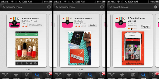
In the take no prisoners (new) world of App Stores, good curation is perception management. It also sets publishers up for success. Read about the story of the iOS app "A Beautiful Mess" and how they have been playing Whack-a-Mole with evil copy-cat apps. Apps with the same name and icon trying to get downloads on the back of A Beautiful Mess's success. With a more aggressive policy on this kind of stuff, the iOS App Store could help the folks at A Beautiful Mess focus on their app, and not an endless defense of their own online brand.
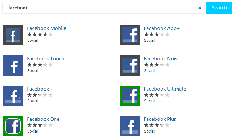
That's a mess, even with the victim actively trying to fix the problem. It's worse if the brand in question isn't paying attention. Look in fear at the Windows 8 App Store when you search for "Facebook." Every single one using the Facebook name and Facebook icon. And every single one likely sucks.
Remember Broken Windows Theory, with my modifications.
The theory states that maintaining and monitoring [App Stores] in a well-ordered condition may stop further vandalism and escalation into more serious crime.
You gotta fix those broken windows before your App Store turns into a bad neighborhood.
Sponsor: A huge thank you to my friends at Red Gate for their support of the site this week. Check out Deployment Manager! Easy release management - Deploy your .NET apps, services and SQL Server databases in a single, repeatable process with Red Gate’s Deployment Manager. There’s a free Starter edition, so get started now!
About Scott
Scott Hanselman is a former professor, former Chief Architect in finance, now speaker, consultant, father, diabetic, and Microsoft employee. He is a failed stand-up comic, a cornrower, and a book author.
About Newsletter
I'd be nice if there was an app store filter option for "first party" apps. Meaning if the app exposes a social network, only show the app developed by the social network. (Of course that would mean the Windows Phone 8 YouTube app would get filtered out....) I guess that's why you are advocating for app duration. 😊
How to maintain a balance between curation and healthy competition?
I get that doing a "select * from apps order by date desc" is easier than having a human pick a list of featured apps, or building a smart recommendation engine, but I think Scott is right that a lot of the perception of the Windows 8 app ecosystem is damaged by how lazy the store is about highlighting quality stuff.
Disclaimer: I haven't seen what the store looks like in 8.1 RTM, I'm running the 8.1 preview. But I'd wager it's not appreciably different.
Thanks for reminding me why I chose not to get a windows phone ... Wish I could get Microsoft to buy back my parents windows phones I recommended - they can't get any apps!!
As for garbage apps, the sad thing is that Microsoft paid money to pollute its own pool. To make it appear as if there was solid uptake for the platform they rewarded MVPs and other developers to submit any old crap in volume. Some professional curating should include deleting garbage like 'Indian Prime Ministers'.
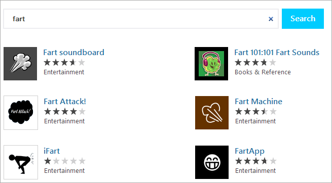
On another note, I just got a HTC 8X and was thus pondering what my first phone app should be. I teaslingly told my wife that all the fart apps had already been written. She was grateful for that:)
Agree with curation but new apps should be a filter available to those who want it.
Also check out my colleague Mads Nissen's post on enterprise apps stores in SharePoint. Written before the launch of the SharePoint Store but still relevant, http://www.puzzlepart.com/Pages/Envisioning-a-perfect-App-Marketplace-in-SharePoint.aspx
Comparing it to apple or android is just silly, there are practically zero useful app, and such a tiny user based there never will be! There is a Ton of cool device app for Ios and android, having to resort to new release section for comparison is just plan sad. I you want a gut busting laugh check out http://metrostorescanner.com/
Who the hell needs an app for a full blown computer??
Answer: no one but Microsoft, oh wait maybe just no one at all!,
http://www.windows8appstore.com now redirects to bing, ballmer leaving, hmm thing are looking up!!
BTW how’s that app store app going Scott ? hanselman hangman,tic tac toe, coin flipper,tips calc, checkers for windows 8 maybe?
Face it Scott Metro/Modern/App Store is dead, I mean it kind of always was DOA, but now its funeral.
It would make that embarrassment of an app store look better. You could even charge publishers to have their apps in there.
Either way a good post Scott.
What I'd rather see than curation is some simple heuristics.
1) If an app developer uploads more than 5 apps in a week, and that app developer has not been marked as a major developer, leave their other apps in the queue and flag them for a manual review. After several manual reviews, flag them as ok.
2) Programatically check for app titles that start with a registered trademark, or an article and then a registered trademark. Include the Bing typo correction. E.G. "SimpleShare for Facebook" is allowed in an app name, but "Facebook Super-Awesome-App" is flagged. If the registered trademark has the correct company name and address -- that is if they match between the registration and publisher -- then allow it. If they do not match, flag the file for manual review.
Just those two checks would kill most of the bad apps, and both of those would impact a very small percentage of legitimate developers for a very small period of time.
If you look at Blackberry, they had 47000 apps submitted by the same guy, in under a month, of the 150000 apps. So roughly a third of their apps were by one person, so I bet you can imagine what flavor of apps those are.
@David Hanson:
Write a small metro app, and have it download the installer.
When you open the installer, the user will be prompted for admin permissions -- and then the desktop app will install. Or at least, it works that way from LiveDrive and SkyDrive and so I assume it'd work fine if you did the whole job programmatically.
No idea how Microsoft would feel about listing the app in the store, but I don't see how this is materially different from them listing Kaspersky in the store, then linking to an install file on the Kaspersky website. Or Office 2013 in the store, for that matter.
If you were clever, you could leverage this to gain access to WinRT mechanisms that Microsoft has not exposed to Desktop.
A question that bothers me every time I try to sort anything based on rating (from products sold on Amazon to phone apps) is why in 2013 no one seem to have been able to come up with an algorithm that incorporates the number of ratings into the score. What I mean is that an item that has a single five star rating should not be rated higher than an item with a 9,138 rating and the average score of of 4.5 stars. This should not be hard to include in the algorithm, yet, no store I know is doing this.
Btw, it would be helpful if Windows Phone Store allowed to filter apps by cost.
11th word.
The current Windows 8 store is the worst, though. First off, after the store loads which always takes a lot longer than it should on my i7 with 8GB RAM, all that you're presented with is a mostly white screen with a few large icons on it and a very small poorly placed and difficult to see heading telling you that this is the "Spotlight" section. What does that even mean? Then, if I want to go find something else, I have to scroll seemingly endlessly and hope that my scrolling speed isn't too fast to actually catch what the tiny heading of each sections says. And what if I want to see more of these so called "Social" apps? I click on the tiny heading and it takes me to a MASSIVE wall of tiny icons that have no discernible order other than "noteworthy" (whatever that means to Microsoft) and the icons are just difficult to read as well.
Fortunately 8.1 improves this a little bit with added filtering options and more options from the swipe-down/right-click menu, but it's still not great.
And I haven't used the iOS App Store in some time but I recall being frustrated with app discovery there as well.
Comments are closed.


