Best Outlook 2007 Improvement - Include Calendar
 Sometimes when you download multi-gig ISOs and have trouble installing, you look for little features that "make it all worthwhile." Little usabilty stuff, you know.
Everyone's raving about the Ribbon interface, and the Outlook "To-Do Bar" but my choice for the best new feature in Office, and Outlook in particular?
Check out the "Include" section of the Outlook New Message Ribbon...this makes it all worthwhile. It's bloodly brilliant, and it's about time. Click "Business Card" and you can add your VCard in one click. Click Signature and you can add any of your email sigs in replies or mesages where it was removed.
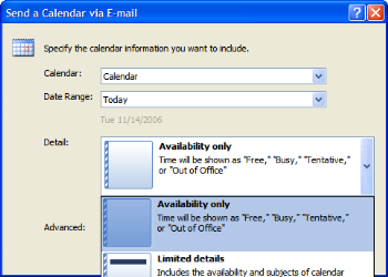
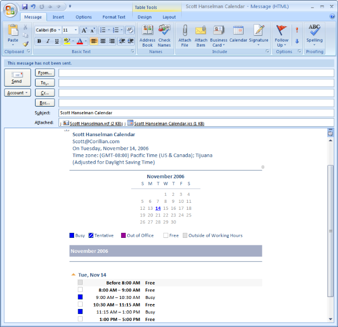
And the very best option? Include Calendar - a flexible little item that lets you include not only an ICS attachment with your free time, but also an HTML rendered schedule with your Availability and/or Details.
Sure, we all wish there was a cross-platform universal Free/Busy service, but until Google does it ;) we have this very clean, elegant and simple solution to one of life's daily irritations. Fabulous.
About Scott
Scott Hanselman is a former professor, former Chief Architect in finance, now speaker, consultant, father, diabetic, and Microsoft employee. He is a failed stand-up comic, a cornrower, and a book author.
About Newsletter
> but until Google does it ;)
I don't understand. Google does do it. It's called Google Calendar and it does exactly what you describe.
http://www.doodle.ch/
Check the example. Another example of doing one thing and doing it well.
Comments are closed.


I'm over getting a 50kB vcf plus a few images from every outlook user who emails me, and some of the mailing lists I've joined (briefly) are ususable because the minimum message size from the most prolific posters is over 200kB. Not to mention what it does to the list archives. Adding a MS-type 30kB calendar to the vcf, company logo, certification logos, cat pictures, theme song, company disclaimer and complete copy of every message in the thread so far is not going to help matters.
What I'd like to see is much more use of text+html for these things. If you want that sort of cruft, it should be included as a URI, not an attachment. That way those who haven't ever seen an MVP logo before can visit the link and the rest of us don't get sent 20 copies of it every day.
Before you say "disk space and bandwidth are free", I only have 256kB/s downlink and my email archive (text only) is 2.5GB. There's a couple of MS developer lists that I won't put up with, because they run to >5MB/day with all the attachments.