Email Signature Etiquette - Too Much Flair?
The topic came up on a mailing list this morning, when a colleague (whom I respect and am friendly with, to be clear) posted an email where his email signature was, according to Scott Stanfield's measurements, about 810 pixels tall. It is recreated here in a two-page format, because the signature was too long to fit on one page.
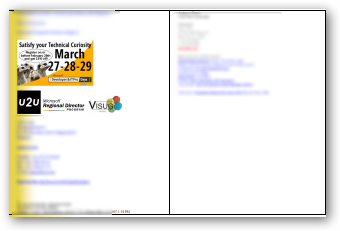
I responded, in jest,
Could you speak up? I couldn’t hear you over your email signature…
...and a discussion about Email Signature Etiquette ensued. Adam Cogan has some good suggestions on signatures:
- They should include the phone number – if you want business
- They should *not* have the address/location – rarely needed so find it on the website
- They should have a URL
- They should have a tag line (Scott: I disagree)
- They should *not* have the email address
- I don’t believe in images in footers – although I now have an exception for photos as they make things more personal
- I believe in a tiny bit of corporate colour – for branding purposes
- Your big signature should only be included *once* a thread
Looking back in time through the list server, with Scott Stanfield's help, we see a lot of different email signature styles.
Now, none of these are REALLY obnoxious...Some are classy and understated, with small icons as flair:

Some are a little louder and include a picture of a bull horn and a human ear:
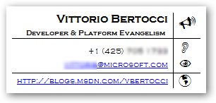
Some are quick minimalist and to the point. Phone, Messenger, Blog. Full stop. I like.

Some use five different fonts and 7 colors, without being too garish:
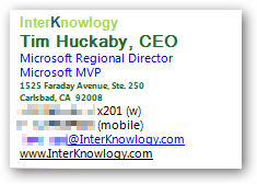
Some have the audacity to include a picture of the author's huge head and an animation. Apparently you can get banner ad space on the forehead for a price.
Some have logos and certifications as pictures...

Others include everything there is to know about that person, including a quote from Einstein.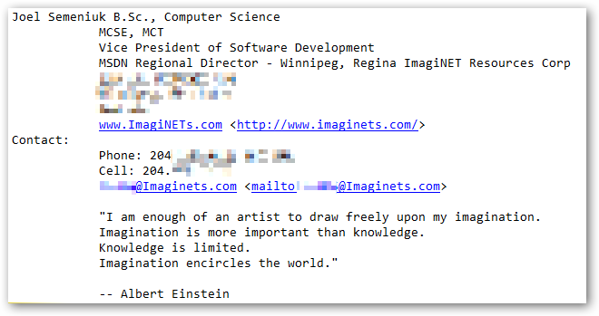
After we teased him, Joel went minimalist, and it was good.

The he went more minimalist...

Then he, apparently, became a Buddhist, threw out all his worldly possessions and became like Prince, recognizable only as a symbol. ;)
I think a good email signature says what you need it to say without distracting from the message.
As far as the address to my work, my phone number, these are things I'll send them out of band via Plaxo or IM, or whatever. Email is the primary way I start a conversation, and phones, IM, and other things are easily exchanged later, so I don't need them in my sig.
Now, go audit yourself. How long is your signature? Are you including inspirational quotes that might not be germaine to the conversation, or is your address and phone number on 8 lines instead of 2? Maybe we need a Daily WTF for Email Signatures?
If you have some REALLY obnoxious signature examples, post them on flickr, or on your site, link to them in HTML in the comments, or link back to this post.
UPDATE: I've since changed my mind and I'm against pics in signatures. I just have two dashes, then my name and domain. Like this:
--
Scott Hanselman http://hanselman.com
About Scott
Scott Hanselman is a former professor, former Chief Architect in finance, now speaker, consultant, father, diabetic, and Microsoft employee. He is a failed stand-up comic, a cornrower, and a book author.
About Newsletter
One, because if your email goes through a string of replies, is converted to text, etc, it's possible that the header info with your email address will get lost in the muck. Some email apps will list a friendly nickname instead of the person's actual email address (if they have them listed as a contact for example)... poof, your email address is no longer listed in replies. Including it in the sig ensures they'll have it in the body of the message.
Second, because the @microsoft.com of my email indicates who I work for, I can skip the company name in my sig.
It's interesting to note you forget the "standard" signature prefix, two hypens, a space and a newline which the better email clients (read "Not outlook") use to strip a signature when you hit reply. And of course there's the old usenet standard of no more than 4 lines (unless you're Biff). See http://en.wikipedia.org/wiki/Signature_block for details.
Now if only Outlook would understand that prefix and act as clients do.
Barry, I'd forgotten the old USENET stuff...
--
Scott
The prefix isn't just usenet; it snuck into email quite early on. I always find it frustrating when I see a long email thread, with 25 sigatures at the bottom taking up space that really isn't needed. Especially when you find that half of them are from the same person.
OutlookQuoteFix did all this for me with Outlook 2003 (and fixed Outlook's awful awful quote handling in plain text messages), but it's not compatible with 2007. And of course as hardly anyone uses the prefix any more that feature is no longer that useful. If only Outlook would put it in for user signatures by default.
- Executive Board (Full names of every member)
- Board of Directors
- Register Court
- Place of business
Next to the typical information you'd include (like phone, address and stuff) this is just so annoying and verbose.
:-(
My company recently dictated an email template that includes not only the footer, which is almost acceptable, but a header as well. Not only does this take up about a half inch at the top of the email, but it requires an additional tab when going from the subject field to the email body. That may not sound like a big deal, however I find it quite annoying and more often than not I (and many others) begin typing in the wrong spot. ugh!
Hey Scott,
I see those discussions about E-Mail Signatures popping up quite often the past days.
I think it's a thing of personal taste even if I have to agree with you in most points.
A E-Mail Signature should contain the most important info compressed, but since it gives you the chance to tell the guy / girl on the other side more about you it also has to be outstanding and something people like and give them a good feeling working with you.
Today I put together a Screencast on how to create a really nice, simple and still outstanding Signature just with Outlook & Word 2007 and took you as an example, no applications like Photoshop needed. I think that fits quite nice in your view of Simplicity.
Everyone else is invited to check it out and provide some Feedback as well. Just check the link below and click the second video in the list.
Screencast
Cheers,
Bjoern
It's not true that if you "want business" you must include your phone number. Maybe if you're a salesperson, okay, but for most people if you need to call, you just ask for the person's number, simple.
I like the Usenet standard of no more than 4 lines... text only.
Personally, I prefer just a name. If I need to contact you or know more about you,
I can find your contact info.
It gets tiring if I have to see the same big sig all the time from active users.
Kyle the Contributing
Have you ever got the Email sigs that are virtually the person's real business card down to the minute details? Definately a pain when you get those emails. I am a huge fan of the simplistic text based with name, number(s), and email.
I can't get it to look even remotely similar to yours ;)
http://www.timken.com/signature/addrbook.asp?template=The+Timken+Company&language=English+(U.S.)&taglinealign=1&name=Your+Name&jobtitle=Your+Title&address=1835+Dueber+Avenue,+S.W.%0D%0AP.O.+Box+6927%0D%0ACanton,+OH+44706-0927+U.S.A.&mailcode=ABC-00&telephone=(330)+471-0000&facsimile=(330)+471-0000&email=your.name@timken.com&first=Your&last=Name&street=1835+Dueber+Avenue,+S.W.%0D%0AP.O.+Box+6927&city=Canton&state=OH&zip=44706-0927&country=USA
The actual business card part is what's in the e-mails. The HTML on the web page is the exact same as in the Outlook e-mail. It looks pretty sharp in an e-mail, as long as the email servers don't screw it up. Lotus Notes doesn't like it all the time, and blackberry's really screw it up. If you use Word as your email editor, it doesn't look right either. This company actually had to add warning to the utility telling people that the signature won't always go thru properly. So getting fancy like this seems like a nice idea to the marketing people, but it doesn't always work too well in pratice.
I also created an email stationery for them so their emails can look just like their printed stationery. Yahoo!
By the way, the idea came from Plaxo (www.plaxo.com), which lets you create business card-like signatures
Read this : a@http://dheera.net/projects/blur.php is why you shouldn't mosaic effect to hide information.
Thanks!
Lucas.
Your company registration number,
Place of registration
Registered office address.
Which has resulted in double signatures from many companies - i.e. the users personal and then the business wide "registered details" one...
<p class=MsoAutoSig>Scott Hanselman<o:p></o:p></p>
<p class=MsoAutoSig>Chief Architect - Corillian Corporation<o:p></o:p></p>
<p class=MsoAutoSig>
<img src="http://www.testingoptusnet.com.au.gif"
style="border:0" alt="Scott Hanselman's Blog"/>
</p>
</div>
Comments are closed.

~Tod Hilton
SDET - Excel & Access Services (XAS)
As far as gawd-awful auto-signatures...we have a whole public folder devoted to them at work. People see one come through on a thread and then paste it into the folder. Some craaaaaazy stuff, for sure. :)