How To: Use Google Earth and SketchItUp to Visualize a New House Lot - Part 2
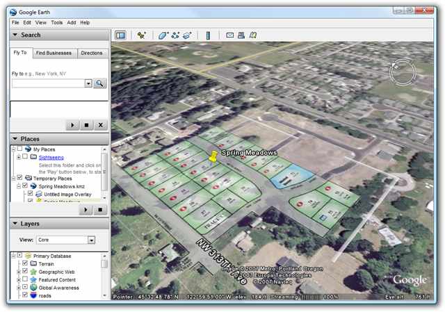 A while back I posted on How To: Use Google Earth or Virtual Earth to Visualize a New House Lot - Part 1. We took a PDF that the builder gave us of a house lot, made it transparent, sized it and overlaid it on the empty lot we found on Google Earth and then even better Helicopter Flyover imagery we found on Virtual Earth.
(Disclosure: This is an example location. It's not where we moved.)
The next step, of course, was to work with the builder and design the house. Ordinarily one works with an architect, and we had one, but we also took the basic 2D PDF plans and used them as an overlay in Google SketchIt Up and "traced them" in 3D.
I taught our Real Estate Agent how to use SketchItUp in a few sessions and he went nuts - in the very best way. Turns out he has a knack for these things and we work well together.
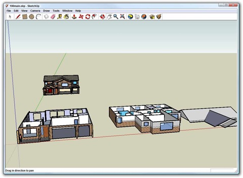
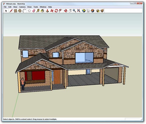
First, he modeled the house, floor by floor as seen below, including the roof.
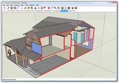
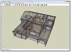
Then he assembled the house by snapping the floors together. Here's cut-out view with the house cut in half diorama style next to the house in X-ray style.
Next, I textured the house with our paint colors, cedar shake and exterior choices, etc.
Fast forward and now the house is finished. It finished this week actually and we're moving in slowly over the next month.
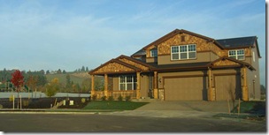
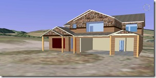
Just to prove that this was a useful exercise, here's the virtual house exported and placed in Google Earth on the actual lot, next to a picture of the real house in the same orientation, Notice the big hill behind us in both the Google Earth and in Reality. The circular shape on the ground in the Google Earth shot became our cul-de-sac.
This wasn't very hard to do, and just required in total about two days of amateur 3D modeling by the agent (who was having a blast) along with two hours of modeling by me and two hours of texture mapping and placement by me. This helped Mo and I visualize what our big empty lot would look like, what our paints, floors and carpets would look like. I'm sure if we knew what we were doing as far as 3D is concerned it'd be even better. We didn't even scratch the surface with the potential textures, furniture, etc that we could have done.
Tools used:
- Google Earth
- Paint.NET (or any editor that does the PNG format with transparency)
- WinSnap or WindowClippings (or ALT-Printscreen) to do screenshots
- Possibly Acrobat Reader
- Google SketchUp (for Part 2). Follow it's tutorials, use it's forums and understand its relationship with Google Earth.
Enjoy!
About Scott
Scott Hanselman is a former professor, former Chief Architect in finance, now speaker, consultant, father, diabetic, and Microsoft employee. He is a failed stand-up comic, a cornrower, and a book author.
About Newsletter
Anyway, great series on your home, very interesting reading.
Great job...and please post more on your home network!
Comments are closed.

I'm very envious of the size of the housing plots (and houses!) you have in the US - in the UK they would jam 6 poky houses on your plot. And each one would probably cost as much as your did. :(