Reading Documents on your Screen Effectively
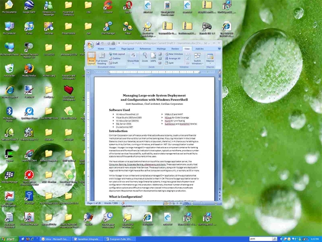
I was at Fresh Thyme Soup earlier this week (fantastic place, seriously, go there, it's all made from scratch) and there was a guy surfing with their free wireless whose desktop looked basically like this (this is mine, for illustration.) He was actually running Ubuntu and running what looked like AbiWord, but that's not the point.
Why is a guy who's _______ (insert adjective here...perhaps "savvy?") enough to run Ubuntu reading a document with the window sized like this?
Seems like I'm forever doing this series of keystrokes in Word: Alt-V, then Z, then T, then Enter, to return Word to the Text Width Zoom level. Then I use Alt-V, then U, for Full Screen mode, especially when I'm forced to present a Word document via projector.

Is this the fundamental issue with a Windowing interface that lets you size things willy-nilly.
I've been using a MacBook Pro for two weeks now and I'm still, even now, never sure what I'm going to get when I press the little Green dot that I think of as "Maximize." Sometimes a window gets really tall, other times really wide. With the Finder, it's a roll of the dice.
Same thing with Windows, and Ubuntu. I'm FOREVER forced to rearrange things. There's got to be a middle place between Full-Screen/Maximized and Minimized that "knows" what I need. The fact that the "middle place" is currently "size it however you like" is starting to wear on me.
I'm not sure if the infinite possibilities of window resizing is more sad than the fact that anyone who has a 15" or larger screen wouldn't take the time to maximize their window for readability.
If you've got an LCD, for goodness sake:
- If you've got bad eyes, make the icons large and the fonts large. Really. Don't run your monitor at 1024x768 if it supports 1900x1600. You're doing yourself and your a disservice. Turn on ClearType.
If I had a nickel for every time I went into an Executives office and had this conversation, I'd like like 65 cents. At least.
- "Hm, you're running your laptop at non-native resolution..."
- "I am?"
- "Yes..." click, click, right-click, enter, boom.
- "Oh, wow, that is clearer. But the icons are small now"
- "Ok. One sec" click, click, Large Icons, boom.
- "Ah, that's nice. That text is kind of jagged."
- "Ok. One sec" click, click, ClearType, boom.
- "Wow, that's like getting new glasses."
- "Yes. Yes, it is."
Make your pixels work for you, Dear Reader.
About Scott
Scott Hanselman is a former professor, former Chief Architect in finance, now speaker, consultant, father, diabetic, and Microsoft employee. He is a failed stand-up comic, a cornrower, and a book author.
About Newsletter
Linux only, of course. It's the only reason I miss Linux. (I used ion3, but this seems to be the successor to it).
http://www.thewonderfulicon.com
@Stuart - I'll check it out, thanks!
What I think I'll miss is customizable keyboard shortcuts. In ion3, I would have Vim covering the left side of the window, then two terminals on the right set to ctrl-1 and ctrl-2. Because vim was on the left, there was a keyboard shortcut to move to the left that always got me there. This way, I didn't have to alt-tab through windows, I could learn commands to go exactly where I wanted to.
But! Something is better than nothing.
Also, I meant wmii, not wmill, but username sequences are hardwired into my hands.
Not the point of this post but...
The "maximize" button resizes the window based on the contents of the window to the best fit for the screen size. Basically, it tried to get rid of any vertical or horizontal scrollbars that it can. Long documents get taller, wide documents get wider. So to a certain extent you can guess what you're size you're going to get. Try this, open a PDF using Preview (side note: Why can't Windows have a PDF viewer built in that works as well as Preview and can tell Adobe Reader to shove off if it gets installed?) Then zoom in a click or two, the hit the green button. Open the drawer in Preview and hit the green button again. It's a little hard to get used to when you've had nothing but the "Restore" button for years. Sometimes the "restore down" button makes my windows larger than the screen size?!
As for Finder. Finder sucks. It needs a re-vamp badly. If Leopard doesn't include a new Finder, expect a LOT of posts from Apple fans decrying that fact.
The bottom line is that there is an optimum line width for any type size. If you size the text too wide your eyes can become fatigued when moving from the end of one line to the beginning of the net. David Seigel's Web Wonk used to expalin this very well. However, it doesn't appear to be on his site any more.
Now, if your wondering why he didn't maximize an enlarge the font, I don't know. Perhaps he didn't want people at the next table reading his document. Not that anybody would look at someone elses computer.
Bob
Comments are closed.

Many (many, many) Windows programs do not scale appropriately when you up the font size. For that reason, I switched my Dad's monitor to non-native resolution. Some programs literally became unusable.
Arguably the problem is with the application developers, not the system. But the end result is the same.