The Ultimate Guide (of Five Things) for New IE9 users Who Fear Change
DISCLAIMER: I don't work for the IE Team. I don't have any magic internal knowledge that wasn't found on Wikipedia or a public bathroom wall. Any errors here are mine and any speculation here is likely nonsense. If you quote me in a news article and say something like "Microsoft's Principal Program Manager Scott Hanselman sez all your base are belong to IE9" then you're a dork, because there's like 5,000 of us PMs. We're like cockroaches. Don't imply a product or company or unit has a single PM.
I run all the browsers. Is it because I'm a techie? Because I'm a shill? Mostly because I honestly can't decide. I run IE8 for intranet sites because it's compatible, I run Firefox because I have a bunch of nice add-ins I like, I run Chrome because it's fast, I run Safari...ok, I don't run Safari...I run Opera in case I might miss something cool that those wonderful Norwegians might have thrown in when I wasn't looking.
I run the latest version of everything. I want to see the new features and I want to see what old features get removed or hidden.
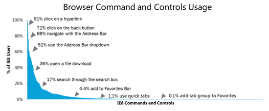
I installed IE9 Beta today and noticed that a lot of stuff was removed. I saw this great graph from Jane Kim on the IE team on their blog today show what features folks use in the browser. While I find the high end numbers a little suspect (seriously, who are these 29% of people who aren't clicking the back button? Grandma?) the point is that once you really dig into the telemetry, after the basics, folks just aren't using all the bells and whistles. Why not just get those bells and whistles out of the way?
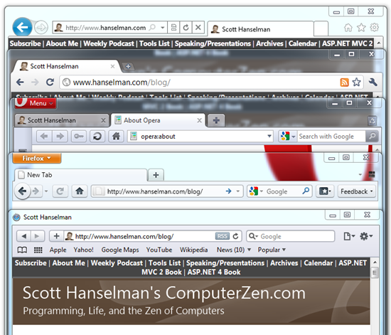
IE9 Beta's interface is extremely minimal, it seems. Check these shots of IE9b, Opera 10.61, Chrome 7.0.517.5dev, Firefox 4.1b6, and Safari 5.0.2, all with their default settings.
Looks like all the browsers are starting to get out of the way of the web and include less crap. There's interesting "pairings" in the interfaces, like the back button in IE9 and FF4.1, the colored button in Firefox and Opera, the settings gear in IE9 and Safari, and the refresh button in all browsers. There's only so many ways these metaphors can be presented, right? At least we all agreed on address bars and tabs. ;)
A number of long time IE8 users have emailed me and said "looks like a good start, but x feature is gone."
Here's...
The Ultimate Guide to New IE9 users Who Fear Change
...taken directly from emails or comments I personally got on launch day.
1 - "Does it render text blurry for you? It does for me."
It renders different, for sure. When IE9 renders in it's, well, IE9 mode, it's using DirectWrite to render the text. This means the text rendered is not only potentially hardware-accelerated, but it also means we get (directly from MSDN):
- A device-independent text layout system that improves text readability in documents and in UI.
- High-quality, sub-pixel, ClearType text rendering that can use GDI, Direct2D, or application-specific rendering technology.
- Hardware-accelerated text, when used with Direct2D.
- Support for multi-format text.
- Support for the advanced typography features of OpenType fonts.
- Support for the layout and rendering of text in all supported languages.
- GDI-compatible layout and rendering.
But when you render using IE8 compatibility mode, you're using the regular GDI rendering that you're probably used to.
OK, so what, right? Well, if you've got some CSS, as I do on my podcast site http://hanselminutes.com/ for example, that says "8pt" that means I have asked for an 8pt font. Not pixels, points. That's a typography thing, not a Windows thing.
When a page like mind asks for font-size: 8pt that converts to a 10.667 pixel font size. If you're using GDI (IE8) rendering that will round up to a nice round 11 pixels, and it'll look exactly as if I'd said font-size: 11px. Which I didn't. But, it'll snap to a pixel, right?
However, if I start to scale a page with that GDI rendered font from 100% up to larger sizes using the Ctrl-Plus hotkey, check out what happens with my text. It's breaking and wrapping differently at each zoomed text size. Those rounding errors are catching up with me.
With DirectWrite though, I get smooth transformations all the way up and down. If I ask for 8pt, I'll get 10.667px "exactly" in the sense of "you asked for it."
It's subtle, but it gives the designer more control. If you really feel strongly about it, ask for font sizes that will snap to pixels at small sizes. I'm noticing only at really small font sizes, myself.
This kind of more accurate font rendering is coming though, so get ready. It's in Firefox's betas, and Chrome's nightlies. I'm sure that someone from the IE9 team who actually knows what they are talking about will do a post on this with WAY more detail soon. Before then, here's some text for you to stare at. Note the CSS change in the 3rd shot that makes the fonts "clearer."
IE9 running in 8 document mode:

IE9 running in 9 document mode:
IMPORTANT: IE9 running in 9 document mode but with the font-size changed to 11px:
Firefox 4 Beta 6:
2 - "My bookmark bar is gone and I'm freaking out. I get that Microsoft is making it simpler, but stop moving my cheese."
You can right click in any of the 'whitespace' (it's actually transparent) and get your precious Favorites Bar and/or Command bar back.
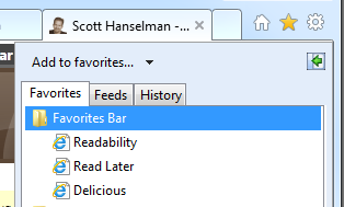
Personally, since I DO use bookmarklets (see my links?) but I also like minimalism, I have decided against showing the Favorites bar ("bookmarks bar") and am clicking the little Star/Favorites button. My stuff is still there, it's just one more click away. Your call.
3 - "I'm using to selecting Print from the File Menu but the whole Menu Bar is gone."
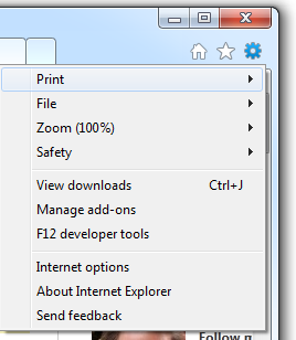
If you click the Gear icon, you'll find most interesting stuff that you'd want is duplicated in there.
See that Print is the first thing? Also, if you're used to Hotkeys, as I am, know that the Menu Bar is actually there, hidden until you use a key, like Alt-F:
4- "Pinned site features are great when you want them - but...[I want to] prevent IE9 from creating a pinned site every time you drag the icon into a folder"
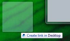
Right now in IE9b, if you start dragging from the "favicon.ico" (that's the websites little icon in the upper left there) you’ll get a pinned site and an icon like this mid-drag, and a pinned site when you drop.
However, if you already have shift down before you start the drag, you'll get a regular internet shortcut that is NOT a pinned site.
5 - "I can't find the Quick Tabs feature and I think I'm going to die."
You could remove "Quick Tabs" and insert just about any feature out there that folks get attached to. Most of the obscure stuff that no one uses (refer back to the chart above, 1.1% guy) is still buried in the settings but turned off. In the case of Quick Tabs, I think Aero Peek is a cooler feature.
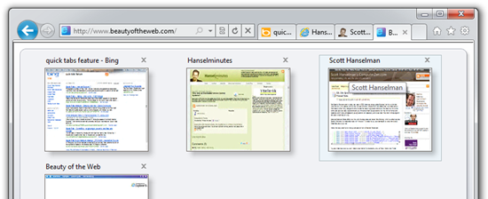
If you really want Quick Tabs back, go to the Settings (Gear) menu, then Internet Options, General, Tab Settings, and turn it back on. Ctrl-Q is the hotkey. This is an IE7 feature, so don't get all excited. It'll get you this:
But forget about it because you already know that Aero Peek gives you this by just hovering over the Taskbar Icon. And, remember that these peek thumbnails are live. That means videos, animations, everything keeps running and you can see it in the thumbnail.
Enjoy, and I hope this helped you find your cheese.
About Scott
Scott Hanselman is a former professor, former Chief Architect in finance, now speaker, consultant, father, diabetic, and Microsoft employee. He is a failed stand-up comic, a cornrower, and a book author.
About Newsletter
One of the things that I find is still holding IE back is the lack of obvious configuration options. Opera, Chromium and Firefox all have a mass of settings that are available in multiple ways (I know at least that all of Opera's settings can be manipulate through the opera:config URL, as well popular settings through a standard config GUI) whereas IE still doesn't have a devoted area for config. You have to open the standard "Internet Options" dialogue and then really trawl to find what you're after.
They've also removed the little "open in new tab" arrow on the individual favorites (still there on the folders) which I use all the time when opening multiple favorites at a time. Yes, you can wheel click them, but I don't have a wheel on my laptop so it's a pain in the neck now :-(
Hahah, I love how I'm in the 0.1% who use the add tab group to favorites feature.
But in any case, IE9 is a beta and I expect it to improve.
Looking at the 3rd screenshot that you say is clearer still looks as blurry as the others to me (except the "IE9 running in 8 document mode:" one)
I have Win-Vista Business, SP1
What can I do Scott?
And FWIW - the rest of the browser is working great... no issues so far.
1.1 percent of IE users is millions of people, not "no one"
I don't use or like Qiuck Tabs, but there's a fallacy in your reasoning.
http://www.theregister.co.uk/2010/09/16/no_ie9_9_on_windows_xp/
What are the other 9% doing?
David - I'll pass it on to the team. Note that FF and Chrome are going to turn this feature on soon as well. It'll be interesting to see how folks take it.
BrianB - Good question. I'd personally prefer any link outside my "apps" domain to open a new window.
J - Valid point.
Cyril - Isn't Vista on SP2?
http://imgur.com/BfkMD.jpg
No, just us 4(+)-button-mouse users. Backspace will do it too.
The only time it's worth the effort of actually moving my mouse allll the way to the upper-left corner of the screen is when I want to jump back more than one step.
-Peter
observation: on windows logging out has always been initiated with the start button. No matter how hard everyone tried to laugh to make it seem ridiculous, it made perfect sense to me, and I would defend it. But, seriously, Ctrl+Q for a Quick-Whatever feature?
at the backspace/browser back discussion: we've been there before on this blog (on browsers and custom keymaps). Simply use Opera. You won't even have to use the mouse in order to go back multiple steps in history.
No browser can navigate me quicker than Opera. I seriously dig it for all non-cursory browsing.
This is also a great tool for IE8 transitioning to IE9!
Cheers,
Kyler
IE Outreach Team
I guess it's really a user-preference but I didn't like the new-window feel...
I think it looks like a good browser, and I keep trying to use it, but every time my eyes start to hurt, I go back to FF. And yes, I did run the clear-type tuner (3 times yesterday), and yes, I've fiddled with the placebo 'clear-type option' in the advanced settings, but I wasn't fooled.
Funny enough, clicking the 'broken page' button does (among other things) get the text rendering fixed, so if there is an option somewhere which allows just that one bit to be adjusted, it would be nice to know about.
I'm not going to choose a browser which makes me squint over one which doesn't, end of - let's face it, there's not much to differentiate any of them.
Since I am a human being and not a finicky designer, I prefer readable text to knowing that my lines always break the same irregardless of zoom. There is not THAT much value in controlling the line breaks.
This technology would become okay once the monitor resolutions start to match the print resolution. Until then, the screen is a very different beast than a printer.
Improve the system as much as you want, but please, really, don't forget people like me and provide an option in the browser to disable sub-pixel rendering.
(Live Id not recognized??)
The apparent bug was this:
Went to YouTube, typed in YouTube Search "Whose line", got a drop down
menu of about ten items, (eg "whose line greatest hits" etc)
I could not select any menu item...nothing happens.
No problem in IE8
Even if they do fix all this, I will stick with FF until I get an integrated spell checker.
I am curious though: does Peek show individual tabs on a given window? Your screenshot isn't clear, as there are multiple IE9 windows open, but you seem to be implying that functionality. Any chance of clarification?
What I don't think I can live with, is the blurry/fuzzy text - Facebook-status messages in particular are horrible to look at, at the moment (2010-09-21 - 21:06).
My own webpage www.madsd.dk is also suffering a bit under it - it seems. And here's where I don't get it: Which one is "better" to use for IE9-font-render-compatibility? Should I use px or pt in my CSS? I use 12px atm, but from what I understood, it was, if you use fx 11pt that it "breaks" the rendering... or... hmm. Maybe I'm just confused.
Anyway, just here to express my concerns about font-rendering :)
I did notice that SharePoint pages render 10x faster in IE9.
Also, I appreciate all the ideas they borrowed from Chrome and will be happy knowing Grandma has something closer to Chrome.
PS: Scott, after OpenID auth, I get redirected to 404... is it broken?
"This kind of more accurate font rendering is coming though, so get ready. It's in Firefox's betas, and Chrome's nightlies."
A: More accurate? Who cares, if it looks like crap? The people that do fonts for the rest of Windows and Office obviously understand clarity is important. WPF went through all this too. It's sad to see the IE9 folks didn't learn.
B: Sounds like you're aware that users hate this, and are trying to justify it by saying other browsers are eventually going to suck, so we should forgive IE9's bug? Well, I guess if Chrome added this with no way to turn it off (the IE9 option for ClearType didn't seem to work), then that'd eliminate IE9's disadvantage, true. But that's pretty sad.
I'm so annoyed too, because I've been looking forward to giving IE9 a try, and I just can't use it like this.
It's a dumb feature to introduce, specially after a decade where people pointed out that using pixel specific fonts is bad, as it renders to small on people with larger screens. This was specially a issue 6-7 years ago, when larger LCD screen were made available in a price range for the average consumer.
Also, the IE team should realize that the vast majority of websites DO specify a font for the text, and it's extremely rarely / never a proprietary, Microsoft-owned, Windows-only font. As for free, multi-platform, ClearType/AntiAlias enabled fonts, there is none or they're not used.
And making 99% of all websites in the world unreadable, for then just to say "just change your font settings", simply won't cut it. Specially not when the fonts used aren't capable of that on any level whatsoever. Your own screenshots proved that.
And what I've seen of Chrome and Firefox, it's not something that makes text on bing, stackoverflow or even your own blog, near/completely unreadable.
- Stackoverflow - Problems with the menu.
- Wikipedia - No Problems
- Bing - Problems with the bold menu fonts (Internet/Pictures/News)
- A List Apart - Again, no problems in either browser.
Bold seems to be a major issue. All in all it strongly reminds me of the issues with XAML (Silverlight/WPF) before .NET 4.0 was released.
I still remember your presentation of the Release Candidate of VS2010 saying that the WPF Font Blur was solved, and indeed it was.
So all those guys at IE9 devel have to do is making the same " Vudu.. Magic " - ;)
I really hope there's some workarround for this, because i too feel my eyes tired of that font's Bluriness....
As a developer I'm not satisfied with the fact that you can't install different versions side-by-side and need to maintain VMs for all the different browser versions... :(
Do you have another idea? (this will help me move to IE9)
I use the simplest tool that does the job. When IE added Tabs & minimized security risks, I had no need for another browser. I still have Firefox installed for special situations but don't use it for everyday browsing.
minor typo: 3. I'm using to => used to
Seriously... we've had this problem with Silverlight, took 4 versions to get it right. Windows Vista and 7 force you have it use ClearType. You can disable it but it still uses it in some places. You can fight it some more with some registry magic and manually replacing fonts and you bring it back to non-blurry mode. We've had the same issues with early version of VS2010. Now IE9 comes out and it's blurry again. I'm convinced the Microsoft folks who made this code are either using some insanely high dpi monitors from the future or just don't see clearly and should have their eyes checked!!
Comments are closed.







And, is it possible to have a 'full' line for tabs ? there is so little space there ! above 5 or 6 tabs and this is already full, this is hell with 25 tabs.
For me there is 6 things.